Park / Sommerrodelbahn Züllerhorn
-
 02-April 20
- Views 4,227
- Downloads 661
- Fans 8
- Comments 20
-
 66.00%(required: 65%)
 Design

RWE 75% Jaguar 70% pierrot 70% robbie92 70% WhosLeon 70% bigshootergill 65% CoasterCreator9 65% Faas 65% saxman1089 65% csw 60% posix 60% Scoop 60% 66.00% -
 Description
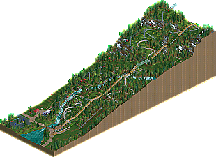
Inspired by hiking trips to the Alps and Spacek's custom alpine coaster ride. Enjoy your downhill ride!
Submitted in the categories design, most german name and longest lift hill. -
8 fans
 Fans of this park
-
 Full-Size Map
-
 Download Park
661
-
 Objects
152
-
 Tags
Tags
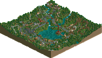
![park_4118 [H2H8 R4] Mount Haystack Ski Resort](https://www.nedesigns.com/uploads/parks/4118/aerialt3883.png)
This is a really cool little design. Very unique and I see so many fun things I recognise from my own ski trips.
The alpine coaster itself was very well executed. I liked the way you made the little bridge over the ski slope.
Some other details that I liked:
+The guests sitting on the rocks eating sandwhiches at the top of the ski slope.
+ The (abandoned) ski ramp was cool, although I would have liked to see some more details like maybe some bleachers at the bottom of the ramp.
+ The gondola station was pretty nicely done.
+ Foliage and landscaping was pretty good and the whole scene looks very realistic.
+ The parachute peep coming down the mountain is pretty cool.
The only thing I didn't like is the architecture. The ticket booth buildings at the bottom of the mountain are basically the only architecture on the map (not counting the station buildings of the gondola and the coaster ride) and while the ticket booth at the coaster ride is okayish, I think the ticket booth near the gondola is not very good if I am honest. It is very simple and lacks details, I also think the objects used are not the best although the windows used were quite smart.
The station for the gondola is executed well and the station for the coaster while executed cleanly is very simple, maybe a bit too simple.
Overall I fear whether or not the scope of this map is big enough for a design win. I really like most of what is on the map though (besides the architecture) and I applaud you for doing such an original concept. Nice work !
!
Dang, this'll be interesting to see what the panelists vote! The terrain and foliage is top notch. There seems to be a grass slope that cuts across the map and I imagine that would be a ski slope in the winter? If so thats a cool detail. If not, I still like it!
The river and the little waterfalls add a lot to this.. which it needs to because as Recurious pointed out, theres not much archy to look at here. Speaking of which, I agree that it seemed a bit too simple.
Lastly, the layout.. really original to see an alpine coaster in the game. The agonizingly long lift into such a windy layout was fun to follow cars through. Can really visualize riding this. The bridge with the MCBR and lift was really nice as well.
Overall I'd say 65%.. great layout, great atmosphere, but the architecture was lacking.
This is instantly recognizable to me, and an Alpine Coaster is a bold pick for a park. I've wanted to do them a few times, maybe do a ski resort dual map with a summer and winter save?
Anyway, as far as alpine coasters go, you pulled it off. I might have liked to have seen a summit station for the gondola leading to a top station for the ride itself, but I'm not sure if the way you did it is more unique to Europe. That picnic area up the mountain is absolutely adorable and I love it. Makes me want to see all of this on a grander scale.
I think maybe the underbrush is a little underdone, and the architecture leaves a lot to be desired. I think you absolutely accomplished a lot of what you set out to do with the coaster itself, but the architecture is far too simplistic for how little there is.
I'm on the fence with my final score, but I really have to congratulate you on the coaster and mountain itself. Super job.
This is so charming CHE, really enjoyed it. Pretty amazing landscaping as well. Very happy to see more RCT from you.
For me, your work is great.
this is very neat, haven't seen one of these done full-scale in rct before. I think you pulled it off well. I love the open grass with flowers and butterflies, and the clearly discernable ski slopes throughout.
Thank you all for your kind responses! Glad you are enjoying the small scenes that I put on the map. I admit the architecture is kept quite simple as I was focussing on the coaster itself and the landscaping which was pushed to the height limit.
Couldn't have done this design without Spacek's custom rides, so shout-out to you!
The idea of the double bridge going over the ski slope is by the way inspired by the Alpine Coaster at Park City Mountain Resort.
I really enjoyed looking at this CHE!
The ride layout is excellent and I can't imagine it's easy to make this type of ride look good because of how long and linear the overall footprint is. But you made it flowing with a sense of purpose and character in each sequence of elements (rather than just slaloming down a hill.)
I'll pick out some of my favourite bits which should illustrate what I mean:
-I've never seen switchbacks look this flowing before, and look at the subtle way the scale increases! Great use of open space too:
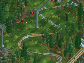
-The doubled up bridge is smart, and it's super cool how the downward helix brings the track from being above into parallel with the lift hill:
-Switchbacks again, but this time through the trees, and taken quite fast - I can imagine this being quite thrilling:
-Final beautiful helixes alongisde the waterfall. I had a hard time picking which angle to screenshot from because it looks great whichever way:
And it goes without saying that the foliage and landscaping is fantastic too. Great release!
Lovely job with this, CHE! Others have hit on all the positives already, so I won't repeat them. The only thing I think could've added to this map is some kind of lodge at the base. Nothing huge or expansive mind you, just enough to be able to have the level of skill in architecture meet the other skills you've shown off in this map.
This is the most realistic Rodelbahn i've seen in rct yet. So well done with beautiful layout work, as well as outstanding landscaping and foliage work. And all without damn quarter blocks. Every piece of open grass, rockwork, Enzian or ice patch makes sense in this. I agree with saxman that room of improvement is there in the architecture at the bottom of the mountain. Maybe also a little Almhütte at the Wanderweg could have been nice.
Bu all in all still an awesome release. You can be really proud of this. I must say i'm a bit jealous haha
Loved it, gold or design, depending on what submitted as. Great job!
I don't look at the parks on here much, but this is great. I love mountain landscapes in RCT2. The animated birds and butterflies were really cool.
My only criticism is that the paraglider object only has four angles rendered, which makes the animation pretty jerky. I'm not sure if that's deliberate though as it kind of makes it look like it's being blown sideways by the wind. (Also, it looks more like a parachute than a paraglider).
I truly hope this wins design, the ambitious and pretty unique ride choice is something seldom seen as a centerpiece. To summarize my thoughts on the park:
+The scale of this is something that has to be admired... the ride's lift is as tall as a gigacoaster and the landscaping is massive... I can appreciate the ambition in a 300 foot tall mountain stretched across 150 tiles.
+ The small details definitely give this life, the ski-lift, abandoned run, butterflies, birds, the snow object to smoothen the terrain, not to mention the people sitting on stones, which is a brilliant idea... kudos to that.
+I enjoyed the layout... there's not a lot of possible elements in a mountain coaster but the pacing is very nice, which probably isn't easy to accomplish with such a large, but still family-oriented ride. There's a few break runs but they're not particularly conspicuous.
+The landscaping overall is really good and I like the stream. I'll say more on this later...
-There's very little architecture here, which makes sense, but most of the buildings here are kind of disappointing.
-Dear god that chainlift is really loud and inescapable, this isn't an issue that should affect scoring and it's kind of inevitable though I guess.
~mixed feelings on the empty surroundings at the bottom of the mountain... it's kinda dull and gloomy. But at the same time I kind of like it... feels very clean and in many ways more realistic. Most forests, especially coniferous forests, aren't impenetrable jungles like they're often portrayed in RCT2.
Overall a very refreshing release with a certain level of authenticity to it. And as mentioned earlier, a seldom-seen ride type on a seldom-seen scale... I definitely enjoyed this.
https://www.youtube....bsFI52NKk&t=10s
Nicely done! I really enjoyed seeing this ride and an excellent attempt on a ride we don't see often. A well deserved win.
Congratulations CHE on your first Design accolade win!
I think this is pretty much a perfect score. Really spoke to me as I love this aesthetic and concept as a whole. The architecture really held it back for me (honestly might have gone 5% higher had it not been there at all...) but all in all, well deserved.
Amazing release Che, congrats with your first design as well! This is the best and most elaborate alpine coaster we've seen on NE. It is so believable and recognizable. Awesome work on the foliage and landscaping, it is truly the highlight of this map.
The coaster itself is greatly designed, as Alex showed. The bridge with the midbrakes on top is just genius. As far as archy: I don't miss anything more, all there is in real life is here on the map. This might as well be a recreation of a real life alpine coaster somewhere in Germany.
Congrats Che!
Congrats! This is a very unique and clean design! Always great to see new work from you.
Congratulations on the design! From the uniqueness stand point, very much deserved! I can't think of many other alpine coasters in RCT, and certainly not being the main feature of a map.
Strong points:
I loved the landscape being built up from the valley to the tops. I like how the foliage changes the higher you get, and it had some fun little details like the paraglider and the rock benches. I've also never seen those warning signs in RCT before you used for the coaster, so that was fun!
Lesser points:
There wasn't tha much archy. You didn't necessarily need more, but the archy that was there was pretty basic and could've been better. Also, that noise from the chain lift....
All in all pretty minor weak points. Big fan of this, and I hope you keep coming up with original ideas in the future!