Park / Glove World!
-
 02-April 20
- Views 5,267
- Downloads 674
- Fans 5
- Comments 33
-
-
 55.50%(required: 50%)
 Bronze

Cocoa 65% G Force 65% robbie92 65% ][ntamin22 60% bigshootergill 55% Camcorder22 55% RWE 55% CoasterCreator9 50% posix 50% Scoop 50% WhosLeon 50% Liampie 25% 55.50% -
 Description
The day you've been waiting for is almost here! That's right! Glove World has a new ride! It's big! It's fast! It's painful! The Fiery Fist O' Pain!!! Opening tomorrow only at Glove World!
I would recommend using the LL land textures in order to view this properly; also the fiery fist o' pain may cause spine loss. -
5 fans
 Fans of this park
-
 Full-Size Map
-
 Download Park
674
-
 Objects
289
-
 Tags
Tags
Get off Liam's case - he didn't like the park, plain and simple. Although I agree that calling this "accolade inflation" is rash.
Calm down people, I'm just theorising. I never made any accusations. When I have time I can elaborate. It's an interesting debate when it's not personal mud slinging.
Definitely agree with this.
Congrats on the bronze!
Man this park is wild. Especially love the anchor and the gumdrop explosion thing. Cool stuff.
I suspect that there seems to be a sense among people that any park with merit is instantly worth bronze at least, which to me means that the score goes from 50-100. In the past, many fun parks worth looking at missed bronze, and not just my narrow margins too. This was uncontroversial and consistent.
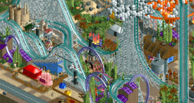
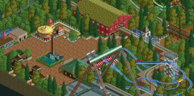
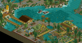
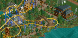
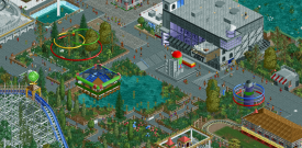
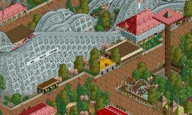

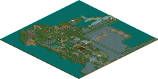
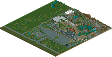
I gathered a few screenshots of accolade scored parks that were deemed not good enough for Bronze, that I also think are better than this. I mainly looked at Jaguar's own string of parks from when he was on a quest to win an accolade, but I also found a good comparison from BelgianGuy. I like all parks I am about to show as much as I like Glove World at least, most of them I would rate higher. I can imagine some of them would win bronze now, or at least get a lot closer to it than back in the day.
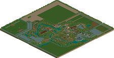
First, for reference, this got 56%:
This got 27, 30% lower:
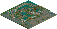
31%:
43%:
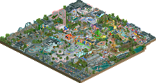
44%:
46%, now only 10% away from Glove World:
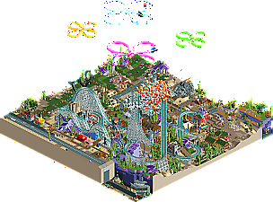
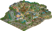
Glove World again, to see if it's indeed the superior park from this bunch by a 10% margin:
I stand by my vote and I stand by my theories. I'll add another theory: we've only had to vote on parks with a 45% community score minimum. We never get to vote on lower quality parks, so maybe we've forgotten what 20%, 30% and 40% parks actually look like. Definitely different from shit, which would be the 0% and 10% regions. I also think that most of the current set of panelists weren't around when we were still voting on these parks.
I have to be honest, the only thing I'm getting from those screens is that you have a higher tolerance level for flat and boxy and I must have a higher tolerance level for whimsy.
The screen from this release clearly shows a lot more craft, at least to me, and I'm only vaguely familiar with Spongebob so it's not nostalgic for me.
I'm not trying to rekindle the fantasy vs. realism thing, but could it just be the case that there isn't enough sub-Bronze fantasy work to extrapolate this below-accolade line you reference?
I kind of think this park's score could be in a small way compared to Asteroid Fields win in H2H7 and it's Gold Accolade. Our park went up against a couple other parks that were much more refined, especially Paradise Pier, which was crafted to perfection. Why did AF win the hearts of the voters? It was the barrage of exciting little ideas tucked in, implemented and placed all over the park. They figuratively became kids in a candy store, there was so much to explore.
I think that's the case with this park. The refinement of this release is clearly lacking, no question about it. However the ideas are plentiful and fun, and for some, a little bit nostalgic of their childhood. I couldn't care less about Spongebob . But I loved some of the ideas enough to feel it deserved 55%.
Congrats on the Bronze jag, but I'd be pissed if you were awarded Silver!
I'm with Milo.
Liam, I would actually say that through your example screens it's possible to see why this should be a Bronze in comparison. I think it's quite clear that Jag employs a more sophisticated line of creation thinking here compared to the linear and boxy "primitive RCT" if you will you posted. Take for instance the gumdrops sculpture, the complex land texture use (and aesthetically intentional use of the green path here), or the tile inspectored rides in combination with all the odd objects, again in the hope of achieving a different and interesting look. You can dislike the outcome visually, as per taste, but I would say this intention of the creator separates itself quite noticeably from the examples you posted, and thus in my opinion must mean a merit.
I thought the park was very refreshing, even if it visually appeards perhaps more like a quick sketch/mockup than a fully fleshed out park. Plus, I can resonate with packing a map brimful of references (Ghibli) that you'd have to be willing to look for.
I also do agree with Milo that those screens Liam is showing actually help to justify Glove World's higher score rather than something below 50%. The screens, while definitely proving that their creators are showing an interest to gain a foothold in the NE style (even if early versions of it), are nowhere near as full of innovative little ideas and references. There are some neat ideas and funny details in Glove World, that are very much based on rct experience. The map just doesn't seem to be meant to follow any traditions though. That seems to be the reason why there's a debate about the score here.
I think your object selection argument also falters, Liam. Clearly the object selection is intentional, the bench might as well have been picked by Julow. If we're going to penalize people for using weird objects, then lets lower the scores of all the disaster bench maps, and lets scrap the acceptance of NCSO, because it doesn't compare to CSO's quality. I appreciate that after almost 20 years of rct2 people are still exploring and experimenting with new/more abstract forms of rct to bring an idea onto a "canvas" that they've always been wanting to depict.
That's what I enjoy about this park.
Creative thinking doesn't necessarily mean it's well-executed or deserving of an accolade.
This is a real chaotic mess with some good elements thrown in. I expected it to be an interpretation of a theme park in the spongebob world, but what i got was a smattering of spongebob references smashed into a space so small that the second most iconic building in the show is 75% hidden by a giant roller coaster.
I did like a lot of parts of this, like the kelp fields, the jellyfish hack, and the flower clouds. They were all executed well and represented some nice skill. The kelp fields especially was a nice break from the chaos of the map and was a refreshing and unique way to do foliage that read very clearly.
I think I'd have liked this more with more room to breathe and more planning, because there's good elements hidden in the chaos, but as it stands now I can't personally rate it higher than a 40.
I think you've just made your case worse Liam.
Those screens are a lot worse in quality than Jag's IMO. They have no atmosphere are boring and don't have a whole load of skill to make up for it.
Jag's screen is well composed, creative, exciting to look at, oozes atmosphere and is fun.
Guess we have to agree to disagree there. Well composed is the last thing that I think of for Glove World. I'd like to see an analysis of how and why it's well composed.