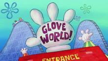
Park / Glove World!
-
 02-April 20
- Views 4,461
- Downloads 541
- Fans 5
- Comments 33
-
-
 55.50%(required: 50%)
 Bronze

Cocoa 65% G Force 65% robbie92 65% ][ntamin22 60% bigshootergill 55% Camcorder22 55% RWE 55% CoasterCreator9 50% posix 50% Scoop 50% WhosLeon 50% Liampie 25% 55.50% -
5 fans
 Fans of this park
-
 Full-Size Map
-
 Download Park
541
-
 Objects
289
-
 Tags
Tags
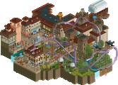
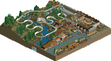
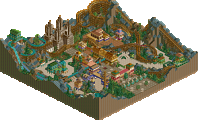
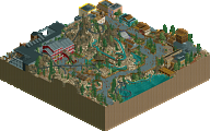
Downloaded this looking for the mitten, was not disappointed
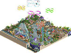
Damn a Spongebob park? This is so cool. Feels a bit cramped by the Krusty Krab though. The coaster layout was cool. Seems about as close as you can get to the Fiery Fist O' Pain and still make it aesthetically pleasing. I should probably get around to getting LL textures too.. definitely missed out on some of the vibe you were shooting for.
Super, super recognizable. Love the way you did the jellyfish! Very clear and fun Spongebob references, though in some areas it feels like it's there just to be there (Like the Fancy! restaurant). I appreciated them nonetheless. Nice work on what I think is an under represented idea for a park.
this is awesome. thats all there is too it
fuck yeah, I love this. I adore spongebob and theres so much recognizable stuff here (altho i refuse to install LL textures lol)
the coaster is actually pretty decent as a lyout, and sets a great vibe. I love the huge anchor, and all the bikini bottom structures- altho i wish you hadn't hidden the krusty krab in the middle of the coaster! rock bottom is sick too.
crazy cool jag stuff.
This is so good, i love it. Only bad thing is i need to cross this off my h2h idea list now you've already built it haha
Finally someone did it! Spongebob is awesome and this park is so recognizable. Somehow weird and crazy but cool too. Love that you included Rock Bottom too.
This is a great idea, and full of great ideas!
Strong points: it's so recognisable! I loved the Firy Fist 'o Pain, and the of course The Mitten. Love the anchor and the flowers in the sky. You didn't need to add those at all, but it helps make it feel so much more. I'm very impressed you did this with NCSO as well.
Weak points:
You wanted this to feel so much like Spongebob you kept adding references and injokes in here. Too much tbh. You didn't need the 'Fancy' restaurant at all, or some other buildings near the edge. This made the feel overfilled. combined with the amount of trackitecture, it makes it feel cluttered in places. I had for instance a hard time looking at the Krusty Krab because there's so much in the way of it.
Still a great idea, but perhaps hindered by it's own size. I've said this before, but I really wish we could see the creativity from Deurklink's NCSO members on a larger map.
That's awesome. Very funny to explore. Quite creative and fore some reasons RCT2 fits quite well with the universe of Spongebob.
The anchor is amazing. The wooden coaster too.
On the other hand, at some parts it felt too chaotic and unrefined... The orange mushroom "explosion" for example. I also wasn't so much a fan of the trackitecture with the pink coral coaster, but I don't really like trackitecture in general so it's maybe me.
Some nice bits like the anchor hat reveal that there is some real skill involved here, but honestly the majority of this map looks like object spam from a toddler.
Outstanding in spots and a little lackluster in others, but overall a fun and imaginative park. Rock bottom and the bikini bottom architecture are exceptional, and I absolutely loved the jellyfish. Great use of the rapids and saucers for the landscaping cutaways, that artifical buildup for the cliffs works surprisingly well. The flower motif in the "flower clouds" and the saucer hack to get seaflowers everywhere is also a great touch.
As for the park content itself, well.. Fiery Fist is suitably over-the-top, but it just doesn't really look that good in RCT, and the rest of the architecture doesn't read as nicely with the jumble of WW/TT textures. It's hard to tell what's going on around/under the coaster and I would have liked to see more of a full park package explored.
I think that's quite an exaggerated, if not rude, take on this getting a bronze. I think this park had some novel, exciting execution of things we've haven't seen in RCT before, with a great attention to detail from the source material. I think this is a perfect candidate for bronze, not too big, not a ton of material in the park, but still executed in exciting and novel ways that merit some praise.
I agree with rob, theres some fantastic stuff here, and in a style I enjoyed immensely considering the source. Sure prefer this over basically all other Bronze parks we've seen in the last few years, even to some silver's as well.
Thanks for saying this Rob, because it needs to be said. There's no need to trash the entire accolade panel and say they're "accolade inflating" when your vote just didn't match the rest of the panel this time.
Sorry, but 25% is a joke. I agree with Rob, it's a very rude and a ridiculous take from an admin.