Park / SeaWorld Barcelona
-
 29-March 20
- Views 8,846
- Downloads 905
- Fans 8
- Comments 25
-
-
 86.00%(required: 80%)
 Spotlight

Camcorder22 95% yes bigshootergill 90% yes CoasterCreator9 90% yes Jaguar 90% yes robbie92 90% yes G Force 85% yes RWE 85% yes saxman1089 85% yes SSSammy 85% yes Cocoa 80% yes Scoop 80% yes WhosLeon 80% yes 86.00% 100.00% -
 Description
What began as a small 50x50 map for a RCTgo contest in May of 2019 has grown into a fully realized large-scale map. Built initially as a collaboration between myself, Henkert (6crazy6king6), MattK48, and MK98 (with Bubbsy41 and Jappy to a lesser extent), I decided to greatly expand the map size and create a full park. Fortunately the rest of the guys were onboard with the idea and continued to work with me on this, despite the contest ending prematurely. Henkert in particular was a massive help in pushing this project towards the finish line. While all of the guys were an amazing help, he truly went above and beyond to make the completion of this park a reality.
Being from South Florida, I used to visit SeaWorld Orlando and Busch Gardens Tampa as a kid and have always felt a sense of nostalgia when thinking of them. I wanted this park to be it’s own - just as if it had been built in a large city and expanded naturally over the years. It’s not a recreation of Orlando, San Diego, San Antonio, or Busch Gardens Tampa - but takes some bits and pieces from each one while introducing brand new ride designs and concepts from my own imagination. I developed a realistic lineup of rides, shows, and exhibits comparable to what I think SWP&E would have in a real park. I wanted to be sure to include the classic stadium shows and classic SeaWorld rides (Journey to Atlantis, Stingray Lagoon, Shark Encounter, etc) - but also build some newer attractions that haven’t been recreated in-game very much: Sky Rocket II (Moray), Sky Warp (Hammerhead), Infinity Falls, and the brand new Icebreaker. (Although our version of Icebreaker is a completely different layout than the one in Orlando). I think we did a decent job in ensuring the park ‘feels’ like SeaWorld aesthetically. We also chose to build a SeaWorld Rescue and Rehabilitation Center to recognize the contributions SeaWorld has made towards real-life conservation. Also, I am fully aware that Wawa doesn’t exist in Spain. But I wanted to build one, so there you have it.
This park was not built with the intention to fit any type of specific build style or RCT genre. I just built what I thought looks cool. And to their credit: the guys were able to combine with my build style seamlessly. I loved every minute of working with them all, and truly appreciate all of their hard work.
Thank you for looking. I’m excited to work on something new!
Josh -
8 fans
 Fans of this park
-
 Full-Size Map
-
 Download Park
905
-
 Objects
604
-
 Tags
Tags
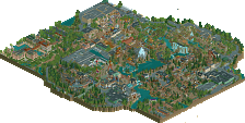
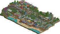
Incredible park Josh and co, you should be very proud of this. A well deserved spotlight that's been exciting to see progress from the little contest park it started out as and really cements you among the top league of players on the site.

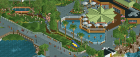
Starting off at the entrance, I think you did a superb job building something that's both instantly recognizable as Sea World and still retains that individuality of your style. The parking lot entrance is also a lovely point to open on and allows the viewer to guide themselves toward the park, as well as being framed by some beautifully manicured foliage. The entrance area is a wonderfully calm spot and one of the most nicely composed areas of the map I thought, with the hospitality house being situated in a lovely little enclave and the flamingos providing for a nice pairing.
I decided to move towards the rapids next as it caught my eye; specifically, that lift structure which you've recreated brilliantly. I'd say the rapids showcases some of the best landscaping and foliage work on the map. You've also done a really classy job with the Waterway Grill recreation too, and the backstage work on that building is prettier than I'd expected. Anaconda has a really gorgeous layout and I thought having it placed between the parking and road felt quite realistic and a great use of the space there.
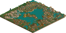
The Dolphin show nearby is rather nicely made but I also find it's rather crushed in and as a result this is the area that suffers most from a composition perspective for me. I really love the Caribbean aquarium, and the Turtle Trek building is solid too, lovely curvature on these. Next up is the original map from your RCTGo Rush contest and you've built outwards from this into the rest of the park quite nicely, but an unfortunate consequence is that the park isn't entirely contained within the map as there are parts where the path ends at the map edge. Obviously you couldn't have foreseen this so I'm not going to hold it against the park or anything, but it just harms the overall completeness.
Nevertheless, this area is still a real treat to explore. The Shamu stadium is excellent and I love the little pirate show next door. I also like that you tweaked the original area a little bit by moving the Sky Tower and replacing it with the pedal boats, which gives the space a lot more breathing room and allows the stadium to become the focal point. Theresher is another strong layout with a brilliant station utilising those awnings, and your Journey to Atlantis was really fun and vibrant, and is a solid homage to what I consider an underappreciated ride. Some great backstage details here as well that show the great deal of care and thoughtfulness that can be found everywhere.
Moving toward the back of the midway and there are some great little gems here such as the pearl-diving attraction. Loved the Mediterranean feel and I think the Skyway being moved here was a good choice. But the standout here is Mako. You've captured the layout really well, especially that ending turnaround over the path which is such a gorgeous scene. The Shark Encounter building is probably my favourite of the map, excellent use of sharp lines and diagonals to create such a distinctive shape.
Sesame Street was a really cute area, felt very faithful to the real thing and was a great use of that corner space. The Big Bird object killed me
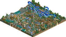
The final area of the park to talk about is probably the most eye-catching from the overview. Wild Arctic, which you've done a brilliant job with. Ice Breaker is a solid layout and I loved the positioning of the queue right underneath, as well as launch and backwards spike going right over the path to make for a stunning viewing spot for peeps. The blue rocks were an interesting choice and I'm still deciding whether I like them or not. On the one hand I see where you're coming from in that they're supposed to be fake ice scenery in a hot climate, but way the blue shade kind of washes out is rather ugly imo. However, the best colour use on the map goes to the station building because wow, that white and orange combo is stunning.
The whole Rescue Center area is another of my favourite parts of this park, an excellent additional bit of content that really pushes this release that bit further. I adore the way you made the rounded netting over the turtle tank too.
I think Cam's comments about this and parks like it representing a new shift in the meta are accurate. I also want to add that the foliage is probably going to be overlooked but I think it was one of the standout aspects here - so lush and colourful. Other things I want to mention that I found elevated the park were the extensive custom signs and objects which were great, as well as the excellent graphic design work on the park map and readmes. It's clear you're aware of the compositional issues with the park layout so I won't harp on about that. In any case this wasn't a huge issue for me and the park is still a clear spotlight. Massive congratulations.
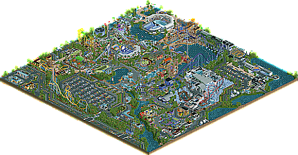
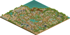
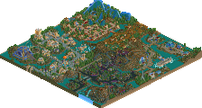
I'll finish with a few screens of my favourite parts of the park below.
Congratulations Josh. This park felt fresh from day 1, and is fully deserving of the spotlight. It's super immersive and just well designed all throughout. You're clearly among the top 10 players of the site now. Can't wait to see a new project of yours.
congrats on the spotlight! was so exciting seeing this develop so quickly. You guys did a really great job building this up into something huge, and I've already commented on lots of specific things in our discord forums.
My 80% yes is maybe more about the consistency than everything. Theres heaps of 90+ structures and moments of atmosphere and composition in the park. I particularly think of those 3 places xtreme posted above. Love that stuff so much, especially the foliage and watersides. Theres also a similar sized chunk of just "good" work, like 70-80 level structures which feel some mix of boxy or plain or awkward, or in general compositionally weird chunks of path or park. The mixture of those things in the end doesn't take away too much from my enjoyment of it and its overall spotlight quality, it just doesn't quite sail to the same heights in consistency and wow-ness that eg the similarly-vibed sfwod had. (Not that I want to compare the two parks, because they're fundamentally different in many ways.)
Anyway, I love an imperfect spotlight. Its fantastic motivation to remember that its better to just put stuff out there, get parks done, and you'll still impress us and give us memorable things. Advice which I'm sure I will promptly not follow.
Congrats on the unanimous Spotlight Josh. There's already a lot of comprehensive reviews on this so I won't say too much, but here are my thoughts:
+The ride design in this is excellent, I'm especially a fan of Hammerhead, the track looks so good and it just works really well.
+I love the exhibits, especially the dolphin exhibit... it gives me a lot of nostalgia from zoo tycoon marine mania.
+Architecture is great as expected... I especially love the polar exhibits... it looks really good with the underwater glass and the steel trusses for some reason
+Speaking of that exhibit, the animal scenery objects are a nice addition
+Lots of very cool and unique little aesthetic choices... the terraced terrain around Anaconda is really nice for instance. The miniature city and roads around the Sesame street area is also a great idea.
-A minor flaw but that hospitality house roof might be the glitchiest object ever.
~Journey to Atlantis is in an awkward position, but this is understandable due to having no control how it expands, it's still one of the best rides in the park though
~The blue rocks around Icebreaker look odd but cool.
Overall this is an amazing park and even though we're not far into 2020, it wouldn't surprise me if this already won park of the year. As mentioned earlier, this does almost feel nostalgic it's like zoo tycoon 'but what if' you could build rides stack scenery. Yet at the same time it's very modern, refreshing, and seems, like Pacific Ocean Park, to be a pioneer of this new style of 'clean' realism.
Here's your review!
https://www.youtube....h?v=s5xEMXpKw8M
Sorry for the odd black space on the side. Will try and fix that next time!
Really appreciate the review! It's cool to hear very in-depth feedback from a realistic perspective. I definitely admit that there are a lot of little things that could have been done better and will take into consideration in the future. This park is meant to be very 'stylized' in a sense and not be 10000% true to life realistic, but simple things such as the bollards, the sign faces, path layouts, etc are great feedback to take into account.
Also i'm glad you noticed the little SeaWorld specific details in here that many others didn't pick up on. And yes, that is Mama's Pretzel Kitchen - although I didn't make a CS object of your pictures on the wall inside haha.
Thanks again all!