Park / SeaWorld Barcelona
-
 29-March 20
- Views 8,846
- Downloads 906
- Fans 8
- Comments 25
-
-
 86.00%(required: 80%)
 Spotlight

Camcorder22 95% yes bigshootergill 90% yes CoasterCreator9 90% yes Jaguar 90% yes robbie92 90% yes G Force 85% yes RWE 85% yes saxman1089 85% yes SSSammy 85% yes Cocoa 80% yes Scoop 80% yes WhosLeon 80% yes 86.00% 100.00% -
 Description
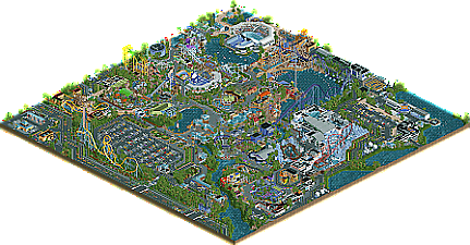
What began as a small 50x50 map for a RCTgo contest in May of 2019 has grown into a fully realized large-scale map. Built initially as a collaboration between myself, Henkert (6crazy6king6), MattK48, and MK98 (with Bubbsy41 and Jappy to a lesser extent), I decided to greatly expand the map size and create a full park. Fortunately the rest of the guys were onboard with the idea and continued to work with me on this, despite the contest ending prematurely. Henkert in particular was a massive help in pushing this project towards the finish line. While all of the guys were an amazing help, he truly went above and beyond to make the completion of this park a reality.
Being from South Florida, I used to visit SeaWorld Orlando and Busch Gardens Tampa as a kid and have always felt a sense of nostalgia when thinking of them. I wanted this park to be it’s own - just as if it had been built in a large city and expanded naturally over the years. It’s not a recreation of Orlando, San Diego, San Antonio, or Busch Gardens Tampa - but takes some bits and pieces from each one while introducing brand new ride designs and concepts from my own imagination. I developed a realistic lineup of rides, shows, and exhibits comparable to what I think SWP&E would have in a real park. I wanted to be sure to include the classic stadium shows and classic SeaWorld rides (Journey to Atlantis, Stingray Lagoon, Shark Encounter, etc) - but also build some newer attractions that haven’t been recreated in-game very much: Sky Rocket II (Moray), Sky Warp (Hammerhead), Infinity Falls, and the brand new Icebreaker. (Although our version of Icebreaker is a completely different layout than the one in Orlando). I think we did a decent job in ensuring the park ‘feels’ like SeaWorld aesthetically. We also chose to build a SeaWorld Rescue and Rehabilitation Center to recognize the contributions SeaWorld has made towards real-life conservation. Also, I am fully aware that Wawa doesn’t exist in Spain. But I wanted to build one, so there you have it.
This park was not built with the intention to fit any type of specific build style or RCT genre. I just built what I thought looks cool. And to their credit: the guys were able to combine with my build style seamlessly. I loved every minute of working with them all, and truly appreciate all of their hard work.
Thank you for looking. I’m excited to work on something new!
Josh -
8 fans
 Fans of this park
-
 Full-Size Map
-
 Download Park
906
-
 Objects
604
-
 Tags
Tags
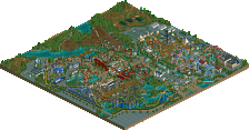
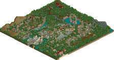
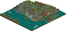
Full review coming but we spend way too much time at SWO and can confirm that the attention to detail here is insane. Easy Spotlight.
Also, nice to see that they have Wawa, Dunkin and post everything in English in Barcelona. I wouldn't have expected that. lol
I think it's a big misconception that this is set in Barcelona, Spain. This is definitely set in the US, judging by the foliage and the surroundings.
https://en.wikipedia...elona,_Arkansas
A couple things;
- I didn't realize I used WW/TT pieces. I believe its from the Killer Whale / Turtle vehicles. Try using OpenRCT2?
- In the 'Press Release' portion of the readme, I listed myself as making the layout for Icebreaker. I was just copy and pasting lol. Henkert (6coaster6king6) actually did the layout and some of the station building!
- The Hospitality House building glitches really bad because I converted it to a Large Scenery object to conserve object slots. Only issue is that I built this park in OpenGL mode and didn't notice any glitching at all. Apparently it glitches really bad in other modes, and I didn't notice it until well after I already used up the remaining object slots. It wasn't feasible to try and rebuild the building at that point. So if your computer is able to run OpenGL, I highly suggest viewing with that mode enabled!
- I fully understand the comments about Wawa not being in Spain lol. But I did it anyways because I really wanted to build Wawa
beautiful shit, a full review eventually. proud of u
Well Open RCT2 doesnt work either i had problems opening up my parks and i posted it and showed it here last year or two and i cant find anything to search and fix or help!
Congratulations on the release! I've been following this for awhile, as I'm sure you're aware.
It's been awhile since we've had a SeaWorld release (most recent since your own in 2011!), and I think this steps up the game quite a bit for realistic SeaWorld parks. You've put forward a vibrant park, full of life and color, yet maintained a high level of detail and thought put into the surrounding features and park infrastructure. The layouts are top notch, and this park really just has that SeaWorld feel.
tl;dr - 90%/Yes
The following is quite image heavy and I suggest you view the park before reading further!
You looked through the park yet?
Good.
I don't really know where to begin; this park somehow manages to feel bigger than it actually is (good thing). First off, love this little area below. There's a charming atmosphere with the seating area next to the little water feature. I also adore the lush foliage surrounding it; lovely pops of color and life.
In these images, I've picked out some highlights that I think showcase some thing I've noticed that I don't know if others will (though I'm sure many have). Love the whole arctic exhibit; very on point for the SeaWorld aesthetic. I especially love how the queue winds around beneath Ice Breaker (nice layout here too).
Additionally, this whole exhibit has a lot to love. Super cool that you included a tour ride within the buildings! Lovely architecture as well.
Excellent work on the live shows too. The big tail fin is a highlight for me here, but I love that you were able to include movement with the whales.
This is a layout we've seen done many times, but I absolutely love the colors and positioning as seen in the screenshot. It fits so well and I can imagine myself here very well. Might be a little loud for those watching the show next door though!
I thought Sesame Street was super cute.
This isn't a great angle of the area as a whole, but I love the helipad and I appreciate the details you included with the wildlife rescue facility.
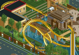
Another lovely ride feature - excellent work on Anaconda. I think it's pretty neat how it sort of fills out the area between the parking lot and the roadways, but still feels very lush and green along the layout. The layout is great too and I love how these elements stack with each other.
Finally, I know everyone is going to be talking about the lift of Infinity Falls, so I'm going to give the station and queue some attention. Love the little rock features and interaction that the ride has here. I admit I wasn't 100% on it when I first saw it posted, but the area has really come together and is highly appealing as a final product.
Really great work. I hope people seek out the unique elements you've brought to the table with this park, and I can't wait to see more from you.
Congrats on getting this done! I'll post a review soon.. really good write up too CC9. Hit a lot of areas that I really enjoyed as well.
Incredible park Josh! As I think is well known at this point I know next to nothing about real parks, so I can't comment on whether it is uncanny or not, but what I can say is that it looks great, has a really fun and vibrant vibe, looks incredibly well planned out, and has so many great little details that I don't think I'd hesitate to vote for spotlight.
What I found impressive is the diversity you have in your buildings, while still keeping it very realistic-looking. It doesn't feel like you picked a formula and just stuck to it, but instead it's like you had a unique idea for almost every single building - all while not making it look like a random mishmash of stuff. And there's a great variety between smaller and bigger buildings too.
What really stood out to me though is all the small, neat details everywhere inside and outside the park which gave life to the whole creation. The car driving around the parking lot looking for a parking spot, the storage rooms where you can see spare river rapids boats and benches, the peeps that you confined to the various establishments outside of the park so that they don't look so lifeless, etc etc. These ideas might not be brand new, but it's a telling sign that you didn't rush anything and that you enjoyed patiently building this massive map.
Only thing that I think could have provided a little cherry on top would be if you could have managed to make the surroundings a little less generic and more like something you could expect to find in Barcelona or at least in Spain. Even though the park probably wouldn't be built right next to the Sagrada Familia or anywhere close to the old town, I'm sure there would be a way to include parts of a residential or office area with a slight Spanish or even just mediterannean feel, which I think would have been enough to sell the idea. Or perhaps a small SEAT dealership or something like that could have done the trick. Even just including some signage on the outskirts in Spanish would have helped!
Congrats on finishing, I'd anticipate that you will bag yourself a spotlight with this one! Makes me proud too that I actually once upon a time got to build a tiny part of your old SeaWorld San Diego park haha
hahahaha lovely, I spent hours enjoying it and I still need to appreciate it more
This park certainly generated a lot of work
You are overcoming yourself, congratulations
Attached Thumbnails
Also, I honestly don't remember what bubbsy did on this park haha. I think some foliage maybe?
Thanks for the kind words everyone!
Wow what a park! Incredible work. My thoughts:
I absolutely adore the entrance area. Immediately upon opening the park and seeing this entrance area I was like: this gunna be good. And for the most part that feeling stuck with me throughout my viewing of the rest of the park. The Sea World logo at the entrance gate is something that immediately stood out to me as a nice little detail.
To prevent this from becoming to much of a ramble I will do this review going from ride to ride and discussing the surrounding area at the same time.
First up: Ice breaker.
I absolutely love this layout, probably one of my favourite layouts in the park. I think its super cool and original. The ice exhibit around it is also cool although I do think the LOTR rocks don't look super appealing, it somehow still works for me. The track type surprises me a little as it doesn't really fit the premier track style or the track style that ice breaker at Sea World Orlando, having said that, I do think the track style looks really good here so I forgive you. The white-orange architecture of the station also looks really cool.
The area with Hammerhead and shark encounter. First off, I love that you actually pulled of a skywarp coaster. One of the first I have seen done in rct and imo it works. Very cool. I also love the archy on the shark encounter building especially the glass roof is a cool touch.
The super grover coaster also has a fun layout and is nicely executed. The surrounding area (which is sesame's place I am guessing) is a bit hit or miss for me. I think the archy, especially near the yellow building looks a bit ugly. It's not bad or anything, but it just doesn't really stand out that well as other areas of the park imo. I also don't like how the two slides use the regular in game supports instead of some custom supports. Lastly some of the LOTR rocks in the water glitch quite a bit here even when setting openRCT to openGL, so that could have been better imo. I think that is something that bothered me in general throughout the park, the usage of LOTR rocks everywhere. In some places it really works but in other places it really doesn't for me personally.
The area with infinity falls: this area is sick. I love the elevator lift structure on the river rapids and the way you integrated the infinity falls sign, it looks really good. I also like the little water guns on the bridge and the building with the green roof. The skyrocket II is cool too.
Anaconda is probably my favourite layout in the park. Seriously so well done. The supporting, the setting its all great. It just looks so realistic.
The area near Thresher is fantastic. The ride itself looks great and is well executed. I love the way you integrated the queue it looks great. Only small nitpick I have is that the safety netting appears to be floating and you forgot to put the supports for that in! Not really a big deal though. This area looks fantastic. I also love the show building next to the coaster with the pirate ship. Very charming and it really has a cool feel, the scale also works well imo.
Journey to Atlantis. Overall I thought this looked good. Although I feel like some of the walls of this building could use some more details. This ride also glitches a bit for me especially near the splash down section with the supports at the edge of the map.
Mako: Overall well done. Only two small nitpicks I have is that you forgot to time the block sections so the train stops on top of the lifthill and I also don't really like the unbanked turn on the turnaround. Other than that this ride is fantastic.
Some general thoughts about the park: Overall I think this park is really strong. I think the rides and archy are really good although at some points the archy was a bit hit or miss for me. The landscaping I thought was also very good in general although the LOTR rocks were a bit overpowering/glitchy in some places. I love the little heli that flies around the park, I thought this was a fun little detail.
So yea, overall a very strong park. Definitely a spotlight contender and I would vote yes if it were up to me. Nice work!
congratulations Josh!
I'll pick out a few things that I particularly like:
Love how Mako forms a backdrop to this lake + jet ski stadium:
The orange accent against these icy blues and greys is gorgeous:
Cute how this entrance sign also functions as a foot-bridge
This station setup - Just the right amount of theming to get the aztec-y vibe across with the buildings and terraces rising out of the water:
Allright! Congrats Josh with the red name!
The park turned out great. It had a lot of potential since the day you started actually. As I said, it's really awesome that I had the chance to take a share in a park that has such a high level of quality. I also learned a lot from you. Well deserved and you can be very very proud.
I don't know if you've ever been to northwest arkansas but you're about as likely to find a dunkin donuts there as you are of finding one in spain
^There's actually quite a lot of Dunkin's in Barcelona haha. Stopped at a couple while I was there!
But yes, I understand that Wawas aren't international. But at the rate they've been building them in Florida, it's only a matter of time I hope
Congrats on finishing this park and your first spotlight! Well deserved for sure. It was a park I was looking forward to and since the release, I opened it a few times and it every times it succeeds to grab my attention and I just keep wandering through the park.
The strongest point of this park are the many cool structures and archy. I love the Carribean Life Aquarium, the whole Journey to Atlantis building, the Polar Rescue building... The stations of Tresher and the rapids were awesome. And the many stadiums were so great, the best stadiums I've seen in rct so far. The big orca fin was a great touch there.
Lots of cool rides too, hard to pick a favorite. They all do so well in their own way. They all fit a SeaWorld park so good. Cool work on the outskirts of the park with the rehab tanks and such... but here lies my only point of critique: it doesn't look like this park is set in Barcelona at all... I see no problem doing a Dunkins or Wawa's since those brands could come to Europe if they want to (just like SeaWorld, when are we going to get our SeaWorld Brian?!) but you've made them in a typical American style. They wouldn't look like that at all set in Barcelona, Spain. A bit of a shame you didn't took the effort to Spanish them up.
I'm excited for your future work. This park is awesome.
Congrats on this. I knew it was going to be special from the first screens I saw.
To explain my vote, I understand there's parks out there that are more technically proficient and "flawless". I could nitpick stuff like the spacing on the supports, sometimes the color/texture choices get a bit spicy, the glitchy building, etc. I think the name thing has been beaten to death already, its obviously looks more like its based in Florida but I don't really care haha. If there's compositional issues with the overall park layout, my brain is too small to see what they are.
All of that aside, this is one of the most unique and inspired full-scale parks I've seen on this site. I think parks like this one and PoP have defined a new NE meta moving forward. Its realistic but not obsessively photorealistic. Its vibrant and colorful in a larger than life way while still being a believable park. Its less of a snapshot of a park made for real life functionality, but composed to be viewed through the lens of the game. I can't even get into too many specifics because at every turn there was another beautiful scene, but the rapids, green coaster, and peach arboretum building was a highlight for me. The invert was another. Even if its a clone the colors and composition of the entire area were on point.
Overall this is one of the best examples of a park with a concise vision and an execution that is consistently true to its vision. Although you certainly deserve a break after an extremely productive year, I'm excited to see what you might have planned next.