Park / Gold Valley
-
 13-March 20
- Views 2,232
- Downloads 555
- Fans 0
- Comments 9
-
-
 Description
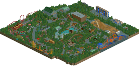
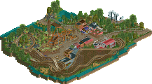
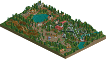
A Small western themed park secluded in a mountainous region.
-
 No fans of this park
-
 Download Park
555
-
 Objects
225
-
 Tags
Tags
![park_4800 [NEFC] Ghost TowNE](https://www.nedesigns.com/uploads/parks/4800/aerialt5001.png)
![park_3348 [H2H7 R3] The village and the park](https://www.nedesigns.com/uploads/parks/3348/aerialt2985.png)
This was pretty solid! Well, other than the trees ahha, definitely could have used some more nuance and variety with the foliage to make it feel more natural. Otherwise, I enjoyed most of it.
Pretty neat park here. Lot of cool little ideas and rides. The lack of a true park entrance and the over abundance of trees was a negative for me. Predator and Wild Junction were pretty cool.
Not bad. Although the foliage mix could have used one more tree type, I didn't think the foliage was actually that bad. You chose a foliage style and stuck with it.
My biggest tip is to avoid a situation in which all the rides are on their own seperate islands. Make sure there is interaction between peeps and rides, rides and rides, theming and rides, etc.
I wanted to vote this bronze, untill I realised there was no park entrance.
This is the work of a real artist. It looks like the "lightly brushed" scenario with a computer mouse. Of course, I'm not saying it's not much work. Cool devices, I think concepts from the head successfully poured into the bosom of a dense forest.
Flying Beast, Striker in particular, and Predator are my favorite favorites. I like wood as a material for shops and others. Overall, I think the work is modest and that this is how a good start should look like.
I encourage
I love how organic and curvy the paths are in this
My Favorite, very cool
Attached Thumbnails
not bad realism, with a cool dense forest vibe. I can't figure out why you hid the entrance so well though?? it took me ages to find. entrances are the best part of a park! some nice layouts too.
Since other stuff has been largely talked about, I'm interested in your layouts and architecture! I think Wild Junction is my favorite of the bunch, mine train comes up a close second. I think a lot of your coasters would have benefited from more breathing room - they feel very cramped and pressured along the sides of the maps. Your architecture is really quite good for the theme as well. A little unrefined and perhaps bare bones in places, but showing a lot of good thematic forms and promise. As others have said, the foliage leaves a bit to be desired, it's kind of just trees on trees with rides smacked in the middle.
All in all, a very good showing for a first submission.
I think this park shows a lot of promise for a first submission. There are some buildings, especially around the splash boats ride (the hot food/cold drinks shop is lovely), that show great design instincts and that's probably the strongest portion of the map. The layouts are all fairly strong and have nice flow, the wingrider and woody stood out as the best to me. The placement of the giga coaster right next to the map edge is a bit unfortunate though. I think the foliage was a bit too dense throughout the park too, and really suffocates the path and map as a whole. Besides that the park was a solid showcase of talent.