Park / Schwarzberg
-
 22-March 20
- Views 1,354
- Downloads 464
- Fans 2
- Comments 6
-
 Description
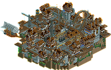
Eyeing the success of Mekkanical Industries's revolutionary airship designed by Sir Isaac Newton, Schwarzkopf Industries knew they had to develop something equally fantastic.
So when the renowned inventor Herr Gerstlauer concieved of the Dampfapparat (Steam Machine), Schwarzkopf Ind quickly agreed to fund his project.
A flurry of papers were signed and Herr Gerstlauer set up shop in The Black City, Schwarzberg.
There he created an absolute money maker.
Gerstlauers Dampfapparat attracted tourists from all over Europe, and Schwarzkopf Industries, together with Gerstlauer Elektro would go on to challenge the extremely profitable Mekkanical Industries in a battle of coin.
(Built by Mekkit for DKMP Eurofighter contest) -
2 fans
 Fans of this park
-
 Download Park
464
-
 Objects
177
-
 Tags
Tags

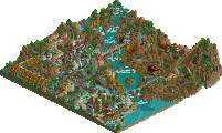
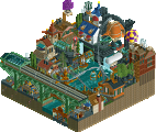
Nicely creative style - a couple big wins are the banners and the airship. The heavy expansion reliance somewhat loses that "NCSO feel" for me, but I do like what you've done. The verticality is very cool, but more room between some structures here and there may have helped translate that a little better.
Once again, I'm gonna start my review praising the Deurklink server in general... I admire how they're redeeling the WW and TT objects cast aside for so long by New Element and finding creative uses for them. They prove nice things can be made with them when careful and used right.
That praise also counts for this park which is a great example of WW/TT objects done right in combination with a creative idea and blended in with trackitecture and the standard objects.
Main main gripe with this is the lack of colour sadly. It's a sea of grey and brown. If only the coaster had a different colour, of those cranes, or a different path object to add some difference and contrast. It would've truly elevated this!
Nonetheless still a great little park, and a good statement to NE that there might be something of worth within WW/TT after all...
Great stuff as usual Mekkit. I really enjoyed the detail here.. but I agree with Jappy that more splashes of color would help. The blimp and the crane were cool features.
very cool stuff- love the originality and vibe. the wild mouse is easily the highlight for me. I think it needs a couple improvements on execution; one would be the coaster colors. the grey blends way too much- a simple color would make it pop so well! same with the dull wooden supports. alternatively non-tarmac paths may have helped break the monotony, possibly brick or even the more saturated wood color to really make itself distinct from the general dull wood supports everywhere. a few spots of taller/lusher green trees would do wonders also. that said, I love the map layout (although i wish there was more space to appreciate the blacktile canyon). its not easy to pull off a multilayered steampunk thing and not be too overwhelmed.
Damn, this park feels so alive and active, lots of movement and busyness that create an excellent atmosphere. The theming is the highlight of the map for me, you've managed to make something great out of that Dark Age expansion set and there's just enough variety in form to prevent it becoming stale. Some moments I enjoyed a lot were the airship which was stellar, and the castle banners made from lemonade stall. The coaster had a nice layout, but I would have liked to see it in a more exciting colour as at the moment it kind of falls away into the background. I'll also add that the smoke object is a bit distracting, a result of poor animation I think.
Edit: I also just noticed that you used a palette to achieve the blacktile effect. Brilliant, will be using this in future I think.
This is excellent, very atmospheric and it reminds me a little of Bioshock Infinite for obvious reasons.
There's mixed feelings about the colors and its criticism, as it's a little hard to read the coaster among all the grey buildings. Otherwise I kind of like the monotonous color scheme of this park... it makes everything appear seamless, which is hard to do with expansion scenery, and it really sets a foggy, gloomy tone that this theme usually implies.
I'm also a fan of that wild mouse... the parallel track looks great and it's fun watching it interact with all the buildings and machinery. Also that airship may be one of the best executed I've seen. Overall a very enjoyable, aesthetically pleasing map.