Park / Kingdom of the Moon and Stars
-
 23-February 20
- Views 4,382
- Downloads 578
- Fans 2
- Comments 25
-

-
 71.00%(required: 70%)
 Gold
Gold

saxman1089 80% Camcorder22 75% Jaguar 75% posix 75% RWE 75% WhosLeon 75% bigshootergill 70% CoasterCreator9 70% G Force 70% pierrot 65% csw 60% Scoop 60% 71.00% -
 Description
"The World's Most Extraordinary Vacation Experience"
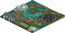
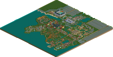
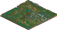
Welcome to luxury vacationing done right. Welcome to the Kingdom of the Moon and Stars, an immersive experience combining thrills and theatre. Not on stage, but all around you. Boasting high-end amenities, comfort-filled accommodations, and the best service, there's nothing quite like a vacation at the Kingdom of the Moon and Stars. -
2 fans
 Fans of this park
-
 Full-Size Map
-
 Download Park
578
-
 Objects
443
-
 Tags
Tags
this is sick. feels like a surreal piece of parkmaking, drawing on details from realistic european parkmaking but in a way that feels dreamlike and fantastical. alice-in-wonderland vibes. Just some really cool atmospheres and forms all over, really tickles me in just the right way. plus it seems like almost all of this (?) was totally original and not subtly grabbed from other parks (could be wrong though) and thats nice to see from you as an evolving parkmaker. keep it up, I really loved this.
Hello Jene, nice release here.
-Stargazer was quite good, I liked the surrounding area aswell
-Nice structure in the middle of the map, best building on the map
-The rest of the architecture was pretty nice.
-Alot of copy paste of buildings around the whole map didnt interest me
-I didnt like moondance
-Foilage was good
-The pathing works very well
65%
All I have to say is thanks for making this. The entrances are gorgeous. The launch coasters are fun to watch over gardens and water and style that is just fun for me. Posix said a lot of what I am thinking but can't compose here.
...but thanks, and those entrance signs are magical.
This is quite the creative park you got here! And i owe it a proper review.
The things I liked:
The whole setup of the park was quite special, being divided into two halves with the hotel in the middle. I really liked the building for the horel as weel. You've got a unique colourful style and an eye for shapes that I can very much appreciate.
The ideas behind the rides are also very well done. On both sides, there were some fun ideas like the double ferris wheels and the giant moon sculpture.
The things I liked less:
I'm not sure you really needed all those little cabins for the peeps to stay in around the park. Sure, a resort needs lodges, but I thought there were a bit too much.
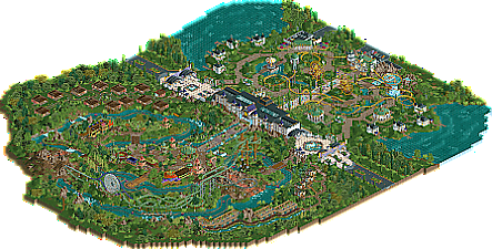
Late review but I really enjoyed exploring this park, it felt very fresh and whimsical with a ton of unique ideas. The layout is really interesting, with the two different halfs encircled by the houses which I loved. The double entrances were nice, and the main hotel building made for a superb centerpiece.

The stargazer side felt really playful and the green/white/gold colour motif is gorgeous. The coaster layout is a little unconventional but it's very lively with the several cars running at once. I also loved the restaurant with the diagonal facade, nicely framed by the seating areas. Lovely stuff.
The moonlight side is brimming with atmosphere and it's a very fresh take on the jungle theme. Moondance had some great moments, especially the first hill with that moon mural. The river rapids however was a bit overstretched and the latter half of its layout didn't seem particularly exciting. The foliage mix was also a bit strange on this side with perhaps too many textures and shades to fully work.
Overall though this is a really unique piece of work, congrats on the Gold. I'll post some of my favourite parts below
I'm trying to catch up with some parks I never really got a good look at and never managed to leave a review. This is one I certainly wanted to inspect, since I really like your distinct style. First of all, neat park name and layout. Central building is great, although the side facades are rather ugly.
I'll take a look a the moon side first as it's my least favourite. Foliage and landscaping leave something to be desired here, it doesn't mesh well. Moondance is kinda cool, especially with the tall element look good. Maybe too heavy on helices and with some poor bits that don't flow too well. The central plaza is the best part of this area, seems the most developed to me. Djembe's cover is a bit weird but it looks very nice!
The stars half of the map is more open and 'empty', but it totally works here! This area is very cohesive and flowing unlike the moon area. Fantastic archy, beautiful central avenue; the two buildings at each end, sandwiched by the mirrored ferris wheels, should make for an amazing view. Stargizer is again not the best layout but the idea of a large, multi-launch spinner is great, and that first launch definitely is a great setpiece. The last half of the layout is a but uninteresting, but the landscape becomes more interesting here with a nice network of streams and waterfalls perfectly blended with paths. This bit of the map is probably my favourite. Stellar, pun maybe intended.
Lastly, I like the unique take on a park that is also a resort, with all the different types of bungalows and shacks in and around the park. I especially like the modern looking ones facing Moondance, but also the mini-mansions in the stars area.
Overall I think this park is still a bit too crude to be a gold, I think I'd vote 65%. But 71% is not unreasonable. Very nice park, looking forward to your next.