Park / San Esteban Fiesta Village
-
 12-February 20
- Views 5,872
- Downloads 713
- Fans 5
- Comments 17
-
-
 75.50%(required: 70%)
 Gold
Gold

bigshootergill 80% Cocoa 80% Jaguar 80% Camcorder22 75% CoasterCreator9 75% G Force 75% Liampie 75% RWE 75% saxman1089 75% Scoop 75% csw 70% robbie92 70% 75.50% -
 Description
It's all good, from Diego to the Bay
Your city is the bomb if your city making pay
Throw up a finger if ya feel the same way
FredD putting it down for Californ-I-A
- Be aware that I used some custom ride vehicles which might not are shown correctly when you first open the park. In that case, re-open the game and it should be fine - -
5 fans
 Fans of this park
-
 Full-Size Map
-
 Download Park
713
-
 Objects
504
-
 Tags
Tags
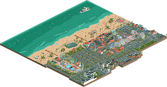
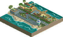
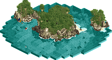
Congrats on completing this project! I figured I'd share a few spots that I really enjoyed in a few screenshots below:
Such a gaudy night club but it's awesome. Honestly could've used one or two more night clubs for an entire nightlife district.. unless Pink Crab is a bar??
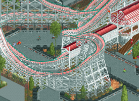
I assume most will comment on the layout of California Dipper, but instead I'm highlighting the Eurofighter. This area of the park was super colorful and would be quite an eccentric place to be at night.
Lastly what a cool skate park with a bowl. So well done given the confines of rct.
This looks awesome. Thanks for sharing it with us.
*********************************************************************************
» Das Glückwunsch-Team ist jetzt großartig hehe
The beach was great, and the beach walk is perfect.
I was excited, I need to appreciate more.
Beautiful work without a doubt. ♥
Review Time!!!
This is... by far... your best work, I think. I think Jappy's boardwalk park had more charm and character to it, but this gives me a very similar vibe to Roy's GTA 5 creation (maybe that's because of the palette though).
Everything made sense as to where it was and was very believable in the fact that it could be a real place. This also has the best architecture from you as well. If you need proof then look no further than this screen.
i do have some nitpicks though,
Like I said in my testing look through, I think the two cop cars chasing each other would've been better as one cop car and another "speedster" or something like that.
I get why it's there but I think it should've been on the top floor, only because there is plenty of shade provided by the floor above.
this is the only instance I can find of this but the clipping is a bit off so the transition from terrain to foliage is a bit jarring.
some more action of here would've been nice too, feels a bit dead in comparison to the rest of the map.
Now on to some Awesome shit:
We haven't really seen this vekoma model in game yet I think and this is executed pretty well.
Might be the best disko we've seen on the site. Easily my favorite at least.
Thought that bar was really sweet even though it was so basically shaped.
Easily the best ride in the park imo.
couldn't help but laugh a little at this.
Anyways before I make this a whole page of a review on NE, Nice job and I can't wait to see you improve further!!!
Really great park! Tons of quality stuff and details in it. Favorite area for me is the area opposite of the university (which is probably the best building in the whole park, just perfect), probably because the different, lighter path which makes it stand out and look more lively.
The skatepark and the basketball court are executed perfectly, and the whole boardwalk area is really neat - minus possibly the tan path stretching along it, because at certain angles there's a black line along the edge which looks a bit funky, and overall it sticks out a little too much.
All flat rides are incredible, with great queue interaction. Also loved how the gokart interacts with the woodie.
Overall superb park, size-wise and content-wise too small for a spotlight but I think this is obvious gold-quality.
Just one unfortunate thing though:
Pretty intense peep-jam going on here...
Well done FredD, this is really well made and a huge step up from your previous parks.
I really liked how you did the beach-front path. Usually I find patterns and road-lines in paths annoying, but this is really tastefully done and I like the low-contrast with the beach:
I also liked how you did this interaction with the go-karts, and the break run bridge in particular:
I like this new screenshotting trend. Keep it up.
FredD, well done. Please be proud of this.
Fred, this is by far your best work yet. It feels so warm and complete. You definitely pulled off what you were hoping to achieve, and I applaud you for it.
Looking forward to revisiting this map again and again!
Josh
I think this is pretty dang good and a definite step up for you, especially in your architectural forms. The source material is great and so fun- I particularly enjoyed seeing the secondary park on here. Thats a real classic beachfront vibe, and the two parks felt quite different in atmosphere, but both bright and fun and lively.
I also really appreciated how large the beach is- I'm sick of seeing 3-4 tile beaches in rct when sometimes it calls for a huge one with trees in it, shacks, basketball courts, etc. Really neat details all around. The general exterior stuff was done well, although I have to confess I'm about 8 years over detailed park surroundings. I liked the big woodie although the layout wasn't perfect IMO- a bit janky and would have been cool to see it interact more with the park.
Your archy is good- a bit less squat and square than previously, and more consistently scaled. I think you still make some choices in objects - especially window choices and wall textures- that hold it back a little and make it feel slightly outdated.
anyway, congrats on the park and on the gold- I just chucked it an 80. Pretty good for a belgian!
Having been to Belmont not too long ago, this really nails the vibe perfectly. The architecture is your best work yet too.
The layout is perfect on the left side (the turnaround portion) flows so well, the right side around the first drop is a bit more janky and lacks the gorgeous flow of the rest.
Great stuff Fred. Congrats on the gold.
This is a great oark from you Fred, and like most said your best work to date. American Bumbly Beach is a great success!
All joking and comparing aside, this is a quite a fantastic park and the surroundings really make it work. Without those, this wouldn't have the same impact is does now, and I'm happy you let me help this project with thise appartments and campus.
The beach is a lot bigger we're used to on this site. Like Cocoa said, it is pretty nice to see for a change. The skate park is lovely, and so are all the other little details.
The parks themselves are great. The typical Californian archy works well here and help set the atmosphere.
I don't really have any remarks or tips to give, apart from the one I always do.... Next time, start building with peeps already present. It'll save a lot of fixing path issues later on.
I had a lot of fun exploring this park, and you've really stepped up your game here I think. The palette is such a good fit, it gives the whole park that sun-drenched California atmosphere and was a great choice. California Dipper is wonderful, has a great flowing layout and really dominates the area appropriately. Having the go karts run underneath is a nice point of interaction and makes good use of the open space provided by the turnaround. This area of the map definitely has a more classic feel and the catapult ride is nicely done - I liked the foliage and sign behind it too.

The architecture is trademark Fred with a few highlights, especially the theater and also that first aid building on the beach which I liked. I can't say I'm fond of the police chase going in a circle, feels a bit distracting, but the little island bridge there is nice.
Moving onto the newer section of the park and this area is full of life and colour. Love the eurofighter and its queue entrance underneath the overbanked turn is excellently placed. Some solid supporting rides here too, with Big Air standing out among them, and the fountain spot is a great idea. I think the beach might be my favourite part of the map. Loads of great details and scenes, such as the basketball court and skatepark, and the cycle path fits perfectly.
Lastly onto the surroundings, you did a really solid job of creating an interesting setting, with all the individual buildings have a lot of character and clear real-life inspiration. The apartment complex and campus area is superb with some excellent architecture, and really solidifies the aesthetic of the map.
I don't really have any major criticisms to be honest. The shoreline was a little thin on the white water object and the obvious peep problem on the beach wasn't great, but you seemingly can't avoid those even when you try
Anyway, congrats on the gold, it's really well deserved and I'm excited for your next work.
Fred! I have been meaning to review this park for a while, and I finally found the time. What a lovely park, definitely your best work so far imo. To prevent this from becoming a random ramble I am just gonna list the positives and negatives I found in the park:
Positives:
+ Architecture for the most part is strong.
+ The two main coasters are awesome and have great layouts.
+ I like how you included some less common rides in the park like the zamperla mini mouse, the halfpipe coaster and the swarzkopf katapult.
+ The basketball court was cool.
+ The CWS pharmacy building and surroundings was cool
+ Overall look and feel of the park just felt like a step up from your previous work.
Negatives:
- Architecture while good, was a bit sloppy in some places, mainly the backstage areas.
- I liked the skatepark, but I feel like you could have maybe used a more elegant solution for the trackitecture in the skating bowl.
Overall still a very good park and I believe your highest score too so congrats on that! I feel like that is definitely deserved!
Thanks for the reviews guys
Fred good job on this solid release.
-Woodie was nice and probably my fav layout
-Proper sized eurofighter
-Awesome half-pipe
-Nice peepable katapult
-Architecture was solid all around, campus highlight for me along ---witht the woodies station.
-A right amount of surrounding areas and park
-Believable split up in the park
-Sidewalks work well
-Nice sized beach, with quite alot of life to it.
-Must say I wasnt a fan of the pink on the coaster, I changed it to red and it looked way better to me. Same for the palette.
-Fiesta express is awesome
-The half pipe coaster goes too high and crashes after a while)
75-80% for me, more towards 80 then 75.
Late review but congrats on the gold, this is definitely some of your best work. In terms of setting, the southern California feel was executed very well, I like how Jappy called this the American Bumbly Beach.
The architecture is stylistically consistent without being repetitive and it is very readable. I'm a fan of the college campus as well, it's cool seeing something like that in RCT. As far as the rides go, they're very well done... the coasters are compact but aesthetically pleasing, especially California Dipper. The flat rides, including the functioning frisbee are nice but big wave and big air feel kind of redundant being next to each other.
I guess to include some criticism, I wish there was more terrain variation as the park is very flat (reasonably so) and the beach area feels rather plain and empty, despite taking up half the park. Overall though, this is a nice, inviting park with great composition and a lot of cool details. Also, that building with the American flag facade is great, lol.
Here's a review for the park!
https://www.youtube....h?v=vLPTMHnijfU