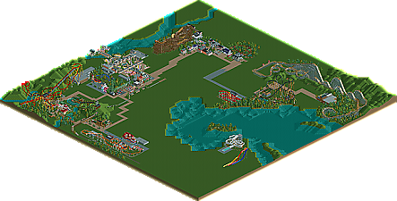
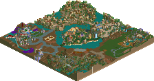
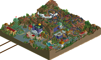
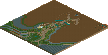
Park / Workbench Park

Park_475 Workbench Park

123 Comments

  • Maverix%s's Photo
    <3
  • MF72 %s's Photo
    I like it. That's a whip in there right? Looks very cool.
  • robbie92%s's Photo

    I like it. That's a whip in there right? Looks very cool.


    Actually, no. It's a dark ride, a Haunted Mansion ride. But that is a good idea.

    Edited by robbie92, 12 September 2008 - 08:17 PM.

  • Gwazi%s's Photo
    nice, looks really good so far
  • Comet%s's Photo
    That's really nice, I don't really get how the queue works though.
  • robbie92%s's Photo
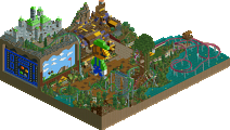
    Here's two more of the wilderness area, home to a Gravity Group woodie and a Dive Machine! The first screen shows the Frontier Theater, and the second shows more of the woodie.

    Posted Image

    Posted Image

    Comments are welcome!
  • Xcoaster%s's Photo
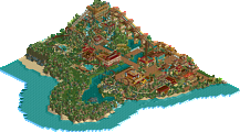
    The park still looks great. I love the colonial area. I really like that theatre, and the darkride building has a nice form, though some of the yellow is a bit bright.
  • robbie92%s's Photo

    the yellow is a bit bright.


    It's meant to simulate the same color as the walls for DCA's Midway Madness, a light yellowish beige. However, that color doesn't exist in the RCT palette, so I wanted to find a similar, vibrant color, so I went with the yellow.
  • JDP%s's Photo
    I don't know if this is the exact way to put it but I feel that there is so much freshness to this park. I see new ideas and new attempts to the game that just gives each screen its own personality. Honestly one of, if not my favorite projects going on right now. Well done.
    -JDP
  • CedarPoint6%s's Photo
    Your projects are some of my favorite things these days. Keep doing what you're doing-- no real complaints.
  • xJur%s's Photo
    x;3 (L) This parc looks so great! The first screen is sow nice. Keep on the good work dude :D
  • Goliath123%s's Photo
    You got a great park going on hear, and i especially like your Archy!
  • robbie92%s's Photo
    Proof that this project isn't dead:

    Posted Image

    Comments are welcome!

    Edit: Wanted to show this too!

    Posted Image

    Edited by robbie92, 27 September 2008 - 07:16 PM.

  • Nokia%s's Photo
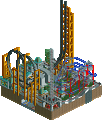
    really love that station
    +1 for trackatechture
  • Tolsimir%s's Photo
    I like screen 1.

    You've missed a deco object at the station.
  • Louis!%s's Photo
    the station just seems too plain compared to the rest of your park.
  • Goliath123%s's Photo
    Holy shit, nice station.
  • xJur%s's Photo
    The first screen :)
  • Pudding%s's Photo
    I think you should add one floor to the tower thing in the second screen, but the rest looks great!
  • robbie92%s's Photo
    Sorry for the bump, but I want to release the park unfinished. Thank you to everyone that supported this project. It took a lot of time to make, so I hope that everyone can enjoy the park and its details.

    Download

    Please enjoy, and, of course, comments are welcome.