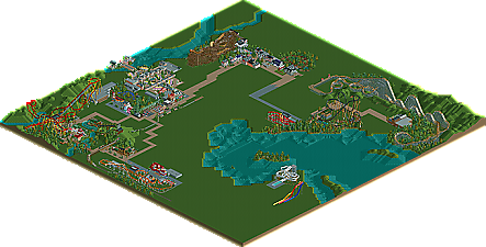
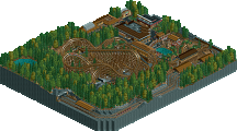
Park / Workbench Park

Park_475 Workbench Park

123 Comments

  • MF72 %s's Photo
    I really like the building on the left, except the chimneys might be a bit big.
  • Maverix%s's Photo
    As long as you build the rest of the area like that I say go for it!
  • robbie92%s's Photo
    These next two screens show more of the colonial area. The first shows the square with a giant Liberty Oak similar to the one in Liberty Square at WDW. The black things hanging from it are lanterns.

    Posted Image

    This shows off Patriot, the Intamin woodie similar to Balder. I just wanted to show the side panels on it like Balder's. Any suggestions on how to make them better?

    Posted Image

    Comments are welcome!
  • Louis!%s's Photo
    those are fab screens.
  • spartan%s's Photo
    you can make those walls on the left slanted if you raise the land at and angle. build the wall slanted. then zero clearance and lower the land back down.
  • Comet%s's Photo
    Yeah this is turning out great.
    Dare I mention the corkscrew train length being too short?
  • robbie92%s's Photo

    Yeah this is turning out great.
    Dare I mention the corkscrew train length being too short?

    Yeah, I'm totally fine w/ that. How long should it be?
  • Sey%s's Photo
    Looks eminently, 'cause you've used other windows! :p
    I'm starting to like your work! ;)

    Edited by Sey, 26 August 2008 - 04:10 PM.

  • robbie92%s's Photo
    ^What's emently? :<img src=:' />
  • Sey%s's Photo
    Sorry, I meant eminently^^
  • robbie92%s's Photo
    Thanks for the great comments. This little screen shows the layout of Patriot, the woodie, minus the break run. Behind the major support structure for the lift is a bump track similar to the Crystal Beach Cyclone, with the straightaway having bumps, although mine is gradually descending. I looked on RCDB, and I realized that the side panels on Balder muffle sound for restrictions, but they looked so cool that I put them on my coaster. :p

    Posted Image

    Comments are welcome!

    Edited by robbie92, 27 August 2008 - 01:53 AM.

  • MF72 %s's Photo
    Looks very cool with a great layout, but I'm not sure about those walls right after the lift. They look a little weird.
  • Tolsimir%s's Photo
    They look like you want to steal the peeps the look over the park ;)
  • Comet%s's Photo
    For the corkscrew if it's just a generic layout like the one at Cedar Point they tend to have 6 cars, but if it's one with like 7 inversions such as Great American Scream Machine at Great Adventure or Viper at Magic Mountain then they have 7 cars.

    I'm guessing yours should have 6.
  • RCTNW%s's Photo
    Looks good and I like the detail you are putting into your structures. As for the woodie, is there something you don't want the riders to see? Having it at the top of the hill is not the loudest part of the ride? If you are trying to cut down on the noise levels from the sourounding area, the bottom of the hill would be the loudest I would think

    Keep it up

    James - rctnw
  • robbie92%s's Photo
    Yay! More screens. I've been building and destroying areas, and I'm stuck in a rut. I thought of building a Chinese area w/ a B&M hyper or a GG-dominated Earthquake Alley, a mini-area themed to an earthquake-ridden town. However, I have no screens of either, so this is my topic's dump place!

    Posted Image
    This is the small Schwarzakopf looper I made while I had no idea what I was going to do. It's obviously generic, but mostly only the layout and the station are done.

    Posted Image
    This is a small pic of the colonial area's main square. It features the oak tree and an Independence Hall-esque building.

    Posted Image
    Just another portion of Hangman's layout. IMO the drop is cool, but I don't want to give it away... :happy:

    Posted Image
    This shows more of the Arrow. The unfinished building on the bottom is a halfway-constructed facade for a boardwalk dark ride. Don't pay attention to that...

    Comments are welcome!
  • Highball%s's Photo
    im likin that second shot. the colonial buildings are pulled off well, and the oak tree is pretty badass.
  • Xophe%s's Photo
    All these latest screens are looking good!
    The woodie looks interesting, I like the sound mufflers. I would suggest changing the land underneath the track to something other than grass, though.
    The colonial area is looking great so far. The building with the green-roofed tower is particularly good, but I don't like how some of the decorative stone pieces cover the windows...
    You seem to be making good progress. Keep up the good work!
  • zodiac%s's Photo
    you've been improving at a rapid pace, and these screens really show that. the only things i don't like are the supports on the helix in that last screen, and i'm wondering how fast the train is going through that curve before the corkscrew. other than that, i love it.
  • Gwazi%s's Photo
    more landscaping please