Park / The Good Earth
-
 10-March 20
-
 The Good Earth
- Views 5,228
- Downloads 741
- Fans 3
- Comments 20
-

-
 83.13%(required: 70%)
 Gold
Gold

G Force 90% yes Milo 90% yes CoasterCreator9 85% yes Kumba 85% yes posix 85% no RWE 85% yes Cocoa 80% yes Liampie 80% no chorkiel 75% no Faas 75% no 83.13% 60.00% -
 Description
A microcosm of life, history, and humanity on the third planet from the Sun. Seven unique themed areas traversing six continents. This is The Good Earth, a labor of love for four and a half years and the biggest effort I have put forth in LL to date.
I am happy to finally release this park on the 7th anniversary of the registration of my account on NE. Please enjoy the park! -
3 fans
 Fans of this park
-
 Full-Size Map
-
 Download Park
741
-
 Tags
Tags
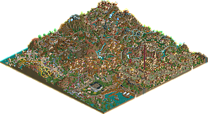
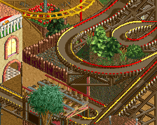
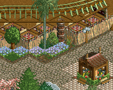
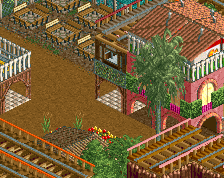
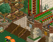
Zoomed in the park shows its codex-era young age, but the overview may as well have been from 2003. The density, the patterns, the textures... Very nostalgic. Your style always reflects this. Building in the spirit of classic LL, but with a lot of 'modern' experimentation going on. Is this postmodern LL? I shouldn't dabble in that lingo because I don't know what I'm talking about.
Anyway, the first full LL solo of the fourth decade of LL - quite an amazing feat. I'm diving in.
More like "No station fly-by? 100%"
Very good park. Well done!
This is my favorite park released in a long time. Congrats, csw.
Hope you like tags, everyone, cause I went for the record for most tags on this one.
Thanks everyone for your comments so far. I urge everyone to take their time with the park, at the very least so you can read all of the staff names.
Big thanks to the admin team and logo artists as well - I couldn't imagine a better logo for this park. You rock.
Congratulations csw.
What strikes me most about this is how varied the influences are. I can see all kinds of famous LL builders in this, mostly Twisted, mantis, Loopy, Liampie and alex. I could be mistaken but it looks like you're an avid viewer and analyst of our past LL releases, yet the inspiration you take from them is perfectly balanced, and nothing looks too overly "borrowed" at all. Like I had mentioned in the Discord announcement, you really have enough ideas and creativity of your own to blend this into a beautiful and rather interesting park. It's always crazy to see this happen when it's LL, as you'd think 20 years of people worldwide building their solos should have used up everything the game could possibly offer visually. But you're proving this assumption wrong. Your design choices and means of trackitecture are unique and beautiful, for me one of the highlights is the spot with the green paths and the station architecture to the suspended. Just fantastic to look at. Nearby is also the entrance gate cloned and used as architecture, which I'm not even sure I've ever seen before. Amazing.
If I had to mention one concern of criticism, it would probably be composition. I worry all the content in the park is a bit too intermingled and not clearly outlined enough. Perhaps that's even on purpose. I just prefer parks that are less complex in how they present content.
This park is neat.
I know a lot of people are "waiting for the aerial" - get a copy of LL going people, this deserves to be explored from all angles (literally!).
Some of the highlights for me include the whole area around Pirana. I love the layering of attractions and the architecture. Another really subtle but awesome feature is the coastline near Apollo. Yet another reason to make sure you can view this in game! Love the use of ruins here, really convincing cliffside. I also found Magnolia Bay super charming. It has a major ride feature, but the way the section is set up it feels like there's a lot of purely atmospheric breathing room. Aside from the park elements themselves, there are some pretty impressive hacks scattered through the park.
I can keep going on and on. This feels fresh and unique, which is lovely. Excellent job.
^ Can't you view sv4s in Open? At least I can, and I have never owned rct1 in any form in my life. Crashes a lot though and I dunno if it displays everything properly or not, I suspect it doesn't.
You can but it looks nothing like LL.
Very good park. I enjoyed all areas except the Asian area with the wooden coaster, I couldn't really enjoy that one.
I enjoyed most of the landscaping and foliage, but I wished it had some more breathing space.
All in all a really good submission that I enjoyed looking through.
A demonstration:
Oh wow, I figured as much but that's even worse than I expected, nevermind lol
And I really liked the name THE GOOD EARTH.
Reading the comments I tried to take the imagination to a level of another planet (lol).
»»»A microcosm of life, history, and humanity on the third planet from the Sun. Seven unique themed areas traversing six continents. This is The Good Earth«««
this is pretty exciting to see- a lush, dense semi-old-school LL park. just up my alley.
theres heaps to like here- so many details and beautiful buildings and atmosphere. I particularly like the log fort and the aztec sort of shrine thing. the central tropical area was easily my favorite though, just a fantastic warm vibe.
I think texturally I had some faults though- each area had waaay too many textures and colors, there was often nothing really properly grounding the theme. It made each building feel separate and different and turned the area into a kaleidescope of different vibes, blurring the theme and confusing my eye. I think it needed more of a focus on each area have its own distinctive textural and color scheme, especially with use of fences and details. When you have too much going on, I stop being able to interpret the objects as the detail its meant to be and just see "rct objects" on top of buildings. Its not a big deal to me, but its something that could use a lot more care and attention.
in the end, I gave it an 80% yes. I'm not sure on the spotlight bit but I'm generous with it and I just love a full, thought-out LL park. they're so rare and its just wonderful to see it again. Its not perfect but its also really lovely and full of life.
Just submitted my vote, and apparantly it was the last vote. I'm sorry it was the vote that tipped it away from spotlight. Congratulations on a very high scoring gold park and a parkmaker status though, csw! You should still expect a full review but I want to briefly address my no vote:
I think that this park is quite spectacular, unique and bold. It's a continuation and an escalation of the style you've been developing from years, also reminiscent of JJ's work. Within that subgenre of LL, this park is about as good as it has ever been. At the same time, and this may be a property of this particular LL style, it is sometimes messy, incohesive and unrefined. The greek area is the best example of this.
gotta go tbc
So close! Thank you to all who voted and commented, I never thought I would be able to build an 80% park when I started.
As for what's next...I have some ideas, but it could be a while before they see any real progress. Stay tuned!
Cool you now have your green nickname, very well, i liked
Congratulations on this. I wasn't around when LL was the way to build, but I can appreciate the complexity of this project. well deserved high rating