Park / Camarillas
-
 26-January 20
- Views 2,815
- Downloads 583
- Fans 1
- Comments 15
-
 65.50%(required: 65%)
 Design

Jaguar 70% pierrot 70% robbie92 70% WhosLeon 70% bigshootergill 65% CoasterCreator9 65% csw 65% Liampie 65% Ling 65% Faas 60% saxman1089 60% Scoop 60% 65.50% -
 Description
This is the design submission Louis, trav, RWE and me (V1) built in MP before Head 2 Head. It kinda saddens me to submit it with two of us probably gone forever and me not really being there either, but I think it deserves to see the light of day.
-
1 fan
 Fans of this park
-
 Full-Size Map
-
 Download Park
583
-
 Objects
308
-
 Tags
Tags
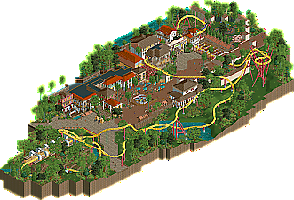
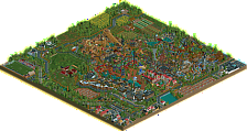
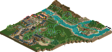
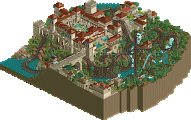
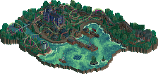
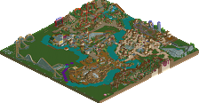
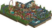
It's back; revenge of the Cheetah Hunt turnaround!
I have a feeling this is a little bit unfinished due to some missing objects and glitches I noticed, but that's minor. My favorite part is the area immediately around the station/queue. Those walls are pretty cool features. I think perhaps a bit too much of the coaster ends up being hidden at times, but it's a nice layout with clear inspiration. I do find myself longing for a few more pops of life here and there, but in general this is a pleasant release.
I really like this. Unique layout (to me at least) with some great moments like the first turn over the queue. Love the variation in pace throughout. Great archy and spatial design too.
Overall pretty solid, but not quite design level. Supports and general ride details could have been a bit better, same with the area around mid-course launch. Archy and atmosphere was solid enough, maybe could have been a little stronger around the top spin which was pretty bland for the only supporting ride.
The map was nicely planned out though, I like how the coaster interacted with the midway and the way the different structures we're placed, cant really complain about anything there.
Thanks for submitting this, was wondering what had happened to it after you showed me a screen pre-H2H8.
I can't really find anything to dislike here. Good layout, good interactions, good buildings, etc. Some more emphasis on the theme would have helped but overall I would score this right at 65%.
The queue and station building + the interaction of that first banked turn is SO good. Utterly picturesque from every angle, and it would look awesome from the ground too (maybe if I wanted to REALLY nitpick there could be some netting coverage or something under the track to protect the queue below?). Those spiky supports are so cool, and they're actually used on the tower so they look like they belong.
Foliage on the waterfront feels perfectly lush. Buildings are suitably detailed and we have the trademark dirty ultra realism with the behind-the-scenes area. On that note, the map is a good size, and you have the plaza to give plenty of visual interest in the middle of the map where the coaster's not doing much. Masterclass in macro design.
The only real criticisms I have, are the coaster colors are kind of boring and I don't see a good justification for why there are so many missing footers. Was that intentional? Lack of finish? Or something else? And... I guess the water is a bit overused since it shows up in three different places, all disconnected, some flowing, some not flowing, some with really dense foliage and some where it's trimmed right up to the edge. Maybe a fountain or some other feature would indicate that perhaps one of these is inside the park grounds, while the other is a border that is perhaps not as well groomed?
Nice design, strongest spots for me were around the square and station area which had some superb architecture and felt really atmospheric.
Layout was pretty solid, been a while since we've seen a Cheeta Hunt so a nice surprise. That first turnaround and launch by the queue provides a lovely bit of interaction and the supports there are gorgeous. I loved the stands right next to the main launch as well. Only complaint layout-wise is that the MCBR is a too abrupt, the train should have sailed through more smoothly I thought.
I felt the park was carefully and meticulously planned. Such a solid achievement.
Really enjoyed this layout. The beginning of the coaster as it looped over the queue and then blasted thru the second launch was really well done. Lovely theming in that section of the ride and it was something I'd easily envision riding. Bit interesting to have so much interaction at the start, but then mostly a windy route through a landscape afterwards.
Architecture throughout was also very pleasant. Great to see something from Louis and Trav again.
This thing is potentially great, but also being held back by unfinishedness and half of the map looking rushed. First half of the coaster is great and I really like the interactions. The main plaza is also really pretty and like others have mentioned, the queue with the coaster above is awesome.
Nice to see this thing finally released. Does Louis know?
Yes, he does. We talked with him and Trav about this and ask them if they‘re okay with it.
Thanks for the comments guys.
Great to see this done and released. It's a fun entry to look at, it has some good stuff like the archy and I really like the setting of the first launch. Some stuff feels rushed, the map around the 2nd launch especially imo, bit of a shame because everything else was awesome!
not bad, not bad. The best fit for me was by far that little alcove of buildings right in the center, surrounding the tea cups. That area is so dense and pretty with the tall palm trees and shop fronts- a really great vibe. The layout is fine, and the rest of the park is fine too- maybe feels a bit like filler to get a 'design' out of it. A bit of it is quite bare and I'm not entirely sure what the structures are going for, especially that return launch overhanging bit. I would have said this is just barely on the design edge, which seems to reflect the score. The whole map with the quality of that middle section would have been great.
So the whole middle bit was totally finished (or near enough) and is obviously the part that is full of inspiration and enjoyment. All of this was built pre-H2H (the layout actually pre-dates this by a few years even, probably 2015).
The rest was finished up by v1 in an attempt to actually get it out and released, as myself and trav weren't playing the game anymore and had no real interest in finishing it up.
To be fair to v1, he did a decent enough job, all that was done was what we agreed we were going to do, foliage & supports. Both of which aren't really exactly how I (or I'm sure any of us) envisioned, but they do enough to finish it up.
Of the main area, it's actually difficult to say who did what because we all had a hand in everything. It was an amazing time to build, and the majority was done in one multiplayer session. It was a real show of how quickly something can come together, but also how quickly it can just fall apart.
Thanks for the comments, and thanks v1 for sending it in.
Good little release, definitely design worthy
-Layout was good
-The pillars surrounding the first turnaround and entrance of the area are simple but work very well
-Foilage was great
-Architecture was good
-Supports could have been a bit better
-Queue is lovely
-Why mack trains, not that it matters that much
-Quite empty outside the main area
70%