Park / Blue Harvest
-
 06-January 20
- Views 1,899
- Downloads 489
- Fans 0
- Comments 7
-

-
 Description
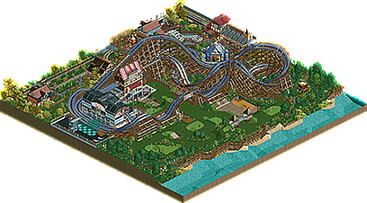
Welcome to Harvest, one of the loveliest towns in the county, or so it seems. Some say you can see a ghost from the ol' watch tower.
-
 No fans of this park
-
 Download Park
489
-
 Objects
214
-
 Tags
Tags
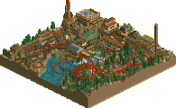
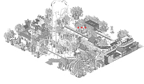
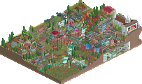
Didn't vote in the contest, so I provided a score here. This turned out really nice. The buildings have a very classy look to them. I think you hit your theme perfectly.
Creative stuff here. The golf course was neat.. love seeing some custom golf courses! The layout was really nice too.. the spike was a fun idea, along with the splash area.. I don't recall seeing a water splash in recent times on NE. The What'r Ya Chicken ride is funny.. what was going on there? I feel like I'm missing something? Still cool though. The corner with the train station felt a bit cramped though.
This makes for a perfect example relating to what I said on Crumbly Beach - Truly limited to WWTT and it just works. You seem to have a thing for making nice looking carousel buildings, something I struggle with using custom objects.
I do wish the city scene had a bit more room to breathe. I find myself enjoying this a lot more form the angle of the overview with the village as a backdrop.
The coaster and the golf course have a nice touch of whimsy - believable but with an air of "this is RCT, we can do what we want" - I appreciate that. I didn't really notice until writing this, but I love the use of launched freefall platform pieces as path near the golf course, that looks really quite nice.
In general, I would say this is probably the strongest work I've seen you put out myself. Overlook Hotel might have better architecture, but as a whole I much prefer Blue Harvest. I would love to see what you would do with a full size park.
I liked this. Coaster layout isn't the most realistic, but shows a lot of fun. The golf course was great and i'm also a fan of the swimming pool stuff around the splash area of the woodie.
What really bothered me about this is the squared shape: Everything is just so cramped and there is not a lot of room for stuff to breath. A bit better composed on a larger map, this could have been a groundbreaking release.
Nevertheless this still is a nice addition to the database though and i hope to see some more work from you in the future, especially more considered stuff!
I really like the cafe by the 'Uprising' attraction.
Her entire building is maintained in the 'mega' style. Other buildings are so nice too. Lots of them unusual, but super connected elements.
'Dip & Diver' seduces guests' technique and tactics.
Little things in the scenery of the golf course, make them strong.
I feel that I would not be disappointed with the taste of 'Pop's Pizza'.
Great park. All the best
the architecture in this park didn't quite capture me like in your other ones- perhaps a bit too chaotic and layered and it lost some cohesion. but the layout made me laugh, especially the bit that went through the pool. and the golf course is excellent. keep it up
Pool with its details was very good.
Nice work