Park / Crumbly Beach
-
 06-January 20
- Views 1,455
- Downloads 406
- Fans 2
- Comments 6
-

-
 Description
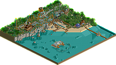
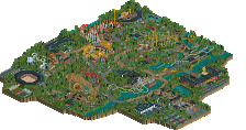
Crumbly Beach was a scenario from RC&F we had to fill up with minimal landscape changes.
-
2 fans
 Fans of this park
-
 Download Park
406
-
 Objects
307
-
 Tags
Tags

This was well done and finished 3rd in the contest beating out two other really great entries. I think you did a nice job on this contest.
Awesome park again Skiffa. The coaster was very creative and I loved the vibes like I mentioned on your screenshot of this park. The layout was really well done, and not gonna lie, I'm hoping this was a design submission! The barrier reef/floating platform was a good way of utilizing the entirety of the map given to you in the contest as well.
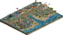
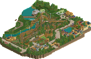
I added a screenshot of my favorite view of the park. The ww/tt rockwork integrates well here imo. The water slide, gondola, and coaster all interact a ton here.. and while its chaotic, I quite enjoy it. Nice colors too.
Wonderful carousel to open up on. While the expansion objects don't always look good, you have a knack for using them. There's a lot to like here - the surfboards are a really nice touch along the beach, and the way you did the rock walls is rather nice. I don't think I'll ever see those objects the same way I see vanilla RCT from an aesthetics perspective, but they do look convincing in this context. I especially appreciated the inclusion of smaller bunches of rock here and there. The coaster is cool, gave me a big time knock off Chinese manufacturer vibe, which isn't a bad thing coming from me. My other favorite part of the park was the reef-diving area. That's a wonderful feature, I love the floating building and the fenced in swimming area - excellent use of objects for floats.
This brings me to a confusing point - this is one of the better uses of expansion objects that I've seen, almost to the point of being a really amazing WWTT park...But it isn't a WWTT park. I kinda wish you had stuck to base game + expansion objects because I think you really have a knack for using them. It's something different. The support work adds quite a bit to the coaster, but I do still question some of the object choices (i.e. why use expansion objects for the structures at this point). I recognize that this is for an RCF contest, so I'm sure there's some reasoning there, but just something I thought of.
Great stuff, and I really hope to see a Design or Spotlight submission from you someday.
your work never fails to impress me with its crazy ideas and wacky use of scenery pieces, usually to very impressive effect and atmosphere. the layout here is wonky but has some very cool elements, especially the backwards chain drop. would love to see that IRL! once the triple launch trend dies out a bit...
can we expect to ever see a fuller-scale park from you?
Carousel is always a nice ride without a doubt.
Small rock groups here and there were very good together with the scenery in general.
This stone/wall object you used was very well positioned by the water.
I loved this park.
What a fun little park. The coaster layout is so weird but it somehow works. It does look like something modern intamin could produce although there are some weird spots on the layout (especially the ending could have been better). The trick of using giga coaster track for an inverted coaster is also something which I like a lot.
I also like the cable cars and the boats that bring people to and from the swimming area. Overall just some pretty fun ideas in this park, well done.