Park / Bethlehem Steelworks
-
 25-December 19
-
 Bethlehem Steelworks
- Views 5,374
- Downloads 748
- Fans 5
- Comments 17
-
-
 76.50%(required: 70%)
 Gold
Gold

csw 85% Camcorder22 80% CoasterCreator9 80% Cocoa 80% robbie92 80% ][ntamin22 80% bigshootergill 75% Faas 75% G Force 75% RWE 70% Scoop 70% SSSammy 70% 76.50% -
 Description
"Well we're living here in Allentown
and they're closing all the factories down.
Out in Bethlehem they're killing time,
filling out forms, standing in line…"
-Billy Joel, Allentown (1982) -
5 fans
 Fans of this park
-
 Full-Size Map
-
 Download Park
748
-
 Objects
528
-
 Tags
Tags
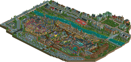
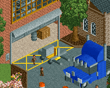
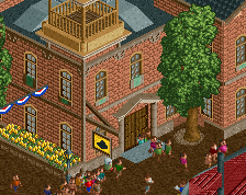
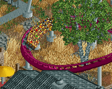
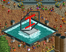
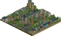
I am not sure if this mean much coming from a lurker, but I am a Bethlehem native and this is such an amazing love letter to the Steel, Bethlehem, and post-industrial US towns in general. I LOVED your incorporation of various locales into the park, such as the Hotel Bethlehem on your version of Main Street on the North Side and the old crane over the road. Even the Perkins was a nice touch. The steelwork building themselves are great and do a good job of mixing what's actually standing with your own imagination. Good job on the Lehigh buildings as well! This is an awesome re-imagining of a real location.
This is so Pennsylvania it hurts! Just took a quick look at the park and it's so good. Love the vibes and the park surroundings. Very believable amusement park conversion for a steel mill/factory.
The log flume is probably my favorite ride here. Can imagine how exciting and terrifying it would be to drop from the rafters.
The RMC station was great too. The crashed planes were a nice detail.
The kiddie area added some nice splashes of color too that helped balance out all the reds/browns of the industrial stuff.
The park surroundings reminded me a lot of Pittsburgh suburbs like Coraopolis and Freedom. The mainstreet area in the entrance had some good architecture as well.
Lastly, the university area was great. Definitely get the Lehigh vibes. The main campus building with the large tower reminded me a lot of Virginia Tech. So many moments like that resonated with me and elevated this park quite a bit. Being from Rust Belt I think I can relate to this park and I'm happy to have seen you complete such a wonderful park.
Steelworks 1 looks too intense for me.
Positives:
- Solid Layouts Throughout
- Great Atmosphere
- Good Architecture
- Cool battleship
- The major features are all well done and enjoyable
- Good outskirts
- Feels very alive
- I can clearly feel how much care you put in this
- Great bridge
Neutrals:
- Kinda torn on the foliage (especially the bright grass spram)
- Scale difference between outskirts and the park seems weird, but might be accurate. It's hard for me to parse it from RCT to RL
Overall:
Remember when I advocated for Knoebels getting silver? I think this park explains it. Unchained from the limitations of trying to accurately recreate a park you showcase how much creativity and architecture is actually within you. You deliver a loveletter to the steel industry and managed to turn it into a very enjoyable theme for a park. This is truly what the gold award is for: A player coming into his own after a already good debut. 80%
Overall I really enjoyed it. Bit copy-paste in the urban area on the houses and some scaling issues there, but the industrial theming in the park area on the rides was great. A bit more refinement would've taken it up a few levels, but really enjoyable work Saxman. It reminded me a bit of Billy Wonka's (except the candification of course )
)
"Kickin' Frat Party was great"
wow this is fantastic- probably one of my highlights of 2019 in rct. I'll return for a full review later as I have to run- for now I'll say that I love the atmosphere even if its a bit rough in places. I loved your inspirational images and found them inspiring myself... the flume ride is phenomenal though. one of the best around.
Very nice Sax. While I am not a huge fan persee of the industrial theme I can appreciate the way you executed it and the skill that went into it and overall I still think the park is very nice.
Some of my favourite parts:
- The log flume is amazing, love the military boat that it goes around.
- The Swarzkopf looper was cool.
- The area near the B&M invert and the suspended coaster is very nice. I also think the layouts are cool.
- The main street is fantastic
- I liked the train station outside of the park.
- I like the colourfulness of the kids area, cool colour scheme.
- The crashed plane theming near the RMC.
- The road bridges with the cars driving on them.
Stuff I didn't like:
- The dodgems building
- Maybe some of the scaling on the buildings outside of the park, but that is very minor.
Other than that I pretty much liked everything haha. Nice work man!
This really is a groundbreaking release in "American" parkmaking. It seems up until this point full-scale American parks are more focused on the chain and are set in a generic location while European parks lean more heavily into their surroundings, so its cool to see a park that focuses really specifically on a region of the US and makes it a central part of the park. Having worked on Haystack with you and going over source material for hours, its clear that your greatest strength as a builder is taking a place you have a strong personal connection to and really capturing the "magic" of it. Going over the readme, you did a great job re-arranging landmarks so they are composed best on the map, and I prefer this technique to super strict photorealism.
I have no complaints about the execution and it doesn't feel dated or anything to me, maybe just not "enough" to be a spotlight/high gold for me? If I had to complain about something, maybe its a bit too colorful and clean. You took the effort to add some gritty details like trash, the homeless person under the overpass, and potholes but it still doesn't feel quite as messy and falling apart as say, Tubaio. Again this isn't a huge negative, maybe just something that would have me voting 80% vs 90%.
Starting with the outskirts, my favorite part has to be the university. It really does feel like an actual university with all of the buildings feeling like they were built in different eras, and its an idea that I can't really recall having seen in a finished full park before. I wish there was just a tiny bit more variation in the houses just to keep it interesting but can understand why you wouldn't want to waste time on it. The frat party was fun though and I laughed that you actually took the effort into making it a functioning peepable attraction. A very "you" detail to include. The diner gives me crazy flashbacks to one that looked almost identical I went to in New Jersey, so props on the uncanny locational execution.
For the actual park, my favorite part has to be that the whole thing had the heavy industrial theme and was built into the actual steel plant. I enjoyed that so much more than just a generic park with interesting surrounding which seems to be a thing here a lot. Love to see rides like Ferrite that may have unconventional layouts on their own but are dependent entirely on their surroundings and that one in particular was so fun to watch. Other highlights included the log flume and all of the beautiful archy on the right side of the map.
The left side of the map was perhaps a tiny bit weaker, mostly because the overabundance of hay was super distracting to me, maybe that object is just my steel roof. Still some great moments though like the floorless layout, all the custom flats, both restaurants, and the playground.
Originally when I opened this I was leaning more towards a 75% but the longer I look its at least an 80% for me. Everything's just so charming both in composition and details and I would expect nothing less from you. I hope you can find the time to continue building full scale parks like this because an entirely post-H2H sax park would be extremely powerful.
Yep, cam about summed up my thoughts perfectly. Except I liked it even more. 85% and after deliberation, yes on spotlight. The details ut it over the top.
Really do appreciate the uniqueish theme here, quite a few charming areas like the mainstreet and kiddie area really highlight the park areas. My favorite structures were probably the college houses, while maybe a little repetitive (I understand this is sort of realistic) individually they were really nice and created a good atmosphere.
Unfortunately the archy in and outside the park was a little hit or miss for me, overall it seems your style still needs a bit more refinement, along with color and texture choice.
I do appreciate the inclusion of Laser, always good to see rides like that.
Overall, while this is probably "better" than Knoebels, I don't really know if I like it more. Being smaller size and overall a bit less expansive will lead me to give it the same score of 75%. I think for this to be spotlight level the archy and overall consistency would need to be a little better, along with the layouts being slightly better too. Theming and idea wise you're right there, just some of the more technical aspects that could probably be a little stronger, which for you I think will definitely come in time.
I love how this feels so amusement park-y while still feeling set in an actual former steelworks. A lot of what I would say has been said, but I'd like to add that I thought it was super cool how the main street was essentially a park-ified version of the town, which I found super engaging. I'm really excited to see more parks like this; not focused on amusement chains or anything like that, and it's encouraging me to keep going with my own idea along those lines. The custom rides were pretty great, and I liked the layouts of the coasters for the most part.
Sorry I don't have much more to say than others, but I think they really summed it up nicely. I think this is a lovely park.
This is a great release, i really enjoyed this, you have made huge steps lately. I especially liked the overall darker atmosphere this had, the flume and the architecture. Doing industry theme in high quality is a very difficult and you think you nailed it well. Composition was solid too, although i would have liked a bit more guidance as a viewer in the park area. For example the transition from the main street into the kiddie section hasn't felt very smoothly to me.
What i also really liked about this are the surroundings. I'm tempted to say the top area across the river is way better designed than the actual park, especially since i liked the foliage over here much more. I think the yellow gras spam put this down a bit.
All in all a great release though and as said a sign of great skill improvement. Keep it up!
With a release of this magnitude, you definitely deserve more reviews! So I'll add my thoughts as well.
The repurposing of an old steel mill as theme park is a fantastic idea and not even that far fetched IMO. You've convincingly pulled it off in this park. I love how you added the backstory of the area and town you were inspired by, it gives this some real depth and useful insight in why you made some artistic choices.
I love the integration of the rides in the old steel works. Especially with the coasters this is well done with the stations being in former industrial buildings and them weaving through the old plant. The other rides are well done too, like the ship yard flume which is really cool.
The foliage isn't really to my liking. I think it's too much reliance on tan grass and the 2x2 oak tree which isn't that nice of an object.
Allt he archy in this park is of high quality. The main street looks great, the industrial plant, while I doubt is fully correct, looks great too. Some things aren't really to my taste however, like the houses along the street. Having seen the pics you included in the readme, I'm not so sure you pulled them off that well sadly. The stone texture isn't that nice a pick for instance. I also think you could've done more to give each of them a little more extra personality and their own individual look. The frat party is a good move in this direction.
Going further on this, the surroundings as a whole are great, filled with some nice little details like the rowers, the old railway sidings, the museum hall with the exhibition at the university...
All in all, a great release. Some little points of remarks, but those are pure a matter of taste. You can be proud of this.
Strong points:
- The atmosphere
- Cool industry infrastructures mixed in with rides (the log flume is phenomenal)
- Good coasters. Driftpin gave me NEDC5 vibes and Ferrite and the RMC are also coasters I'd like to ride IRL
- Good outskirts, full of life, adding extra to the existence of the park
- Cool little details like the frat party, guy walking his dog, hobo living in a tent,...
- The station of the RMC
Minor points:
- The foliage is not so good. Especially near and under Driftpin it just feels like you clicked on the random cluster button and then spammed the brown grass object. It really hurts that whole area because it's so disturbing it isn't fun to look at it. The right side of the park, where the flume and RMC are is way better foliaged.
- The archy on the other side of the river feels quite a bit bigger than the park itself.
- Massive roof on the train station. There's too much steel roof! Where's Faas when you need him?
Overall a park to be proud of and an example how much you improved. Congrats with the gold, well deserved!
Really pleased to see you build a full sized solo and it clearly shows a lot of heart and has personal meaning as well as solidifying your talent. The concept is original and fully realised here, and even though I'm not particularly familiar with the setting you did a fantastic job of providing context with the readme. Overall I thought this was top work and like BG's park I'll go through and note my thoughts.
Opening onto the entrance area, the theme and vibe of the park is immediately apparent. The factory structure is nice and the main street has a very classic vibe with its building style. The little statue/fountain at the end of the steet is a nice touch as well, and leads deftly into the main centerpiece of the park - this is a huge focal point and you've done an impressive job of making it visually interesting and not overly brown. It provides a great setting for the coaster which swoops in and around it gorgeously.
Moving on, and the shipyard area is fantastic. I love the log flume with that structure before the drop, and the ship is lovely. The French/WWII area is a lovely change of pace and the buildings here were some of the best in the park. I loved the little details such as the tanks and biplanes, and the tank ride vehicle is really cool. I think LIM track would have looked much better for the RMC, and maybe some finer detail in the support work but given the object limit it's understandable.
The other side of the park is I think not as strong thematically, though there's only so much you can do within an industrial theme. The layouts for the coasters were pretty good and you did a really nice effort with the Riverhawk flat ride. The light brown grassy foliage in this area was an interesting choice and I think works quite well to provide contast with Driftpin, but overall the area feels a bit blander and the brown buildings get washed out as a result.
Lastly, the park context. The University setting was very well realised and there's thoughtful details all about such as the rowers on the river and the BBQ etc. The huge overhead crane for the carpark entrance is a fantastic idea too. All in all you've crafted a strong, realistic, characterful park with a ton of love which shines through, so well done and congrats on the Gold dude.