Park / Terra Fantasia
-
 25-December 19
- Views 6,060
- Downloads 824
- Fans 2
- Comments 24
-
-
 77.00%(required: 70%)
 Gold
Gold

posix 85% RWE 85% Cocoa 80% csw 80% G Force 80% robbie92 80% bigshootergill 75% saxman1089 75% Scoop 75% Camcorder22 70% CoasterCreator9 70% Faas 70% 77.00% -
 Description
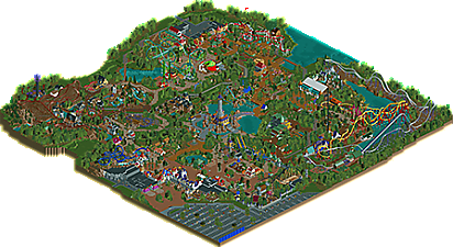
Enter a world of fantasy where 4 countries live together under the all seeing eye of a powerful wizard.
-
2 fans
 Fans of this park
-
 Download Park
824
-
 Objects
603
-
 Tags
Tags
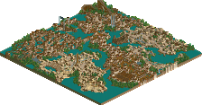
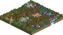
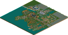
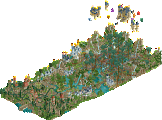
First of all congrats on finishing another big release. Despite being one of the lower votes there was a lot I liked and a lot of cool little things that I continue to find. I hope my vote/feedback won't discourage you and that you can continue building and enjoying yourself eventually.
The issues I had that kept me from voting this higher weren't related to style as obviously I'm not a strict realism fan, but came down to a micro vs macro thing. I had a similar comment on another release recently, where a high 80s/90s release would have to have near perfect micro and macro, and that while issues with either could bring a score down, not at the expense of the other. I think its important that the full range of scores on NE are used, where 90+ is a once in a lifetime park and 70+ is still an exceptional high quality release.
I pretty much agree with all the positives and negatives that Faas posted. There was a lot of great moments and a lot of individual rides/buildings/clusters of buildings that looked amazing on their own. I did feel as though I could sense some building frustration while viewing this, as a lot of the in-between areas just didn't feel hashed out to completion. There were also a lot of empty spaces that felt less like necessary breathing room, and more like you couldn't quite figure out what to do with a space. I do appreciate negative space, but oftentimes these empty spaces would break up the flow of an area and didn't really feel deliberate. I do hope you're motivated to build again in the future, and if you're gunning for a spotlight I think the best focus would be designing areas from the beginning with flow in mind, and spending some more time at the end on "glueing" everything together.
I do think this park was very suited to very nice looking snapshots so I'll include a few:
One of the strongest coasters with some really cool sightlines and well-placed elements. Would be cool to walk through this area and see it.
Thought the boarded up window was a nice little detail
Really loved this little building, colorful while being tasteful and coherent. Though the brown blocks behind it would be an example of something I would've wanted to hide a bit more to make the framing better.
Great queue entrance, the sword was another great idea I found.
Another creative station, I'd say all the stations were a big strength
This ride is so peaceful and cute, though I don't really understand how it thematically relates to the surrounding areas. Love the colorful, slightly mystical plants like the pink bamboo and the fruit trees. Wouldn't have been mad for this ride to take a little more of the surround space, which it looks like you had, and maybe to have continued the river through that area to interact with the ride with some nice bridges.
I don't have much time for full reviews right now, but BG, you can be proud of this. V1 said the right thing and i can only say it once more: Build for yourself not for us.
This is a fantastic release. It's not perfect, definitely. Even for a semi-realistic release some compositional choices are questionable. But on the other hand some really simplistic things blew my mind like the Black Knight coaster and area or the mushroom restaurant.
I'm sure people will come back to this for inspiration even after some time has passed, especially when it comes to layouting coasters and their surrounding area. For me that's the most important thing for a builder of such a release. You're experienced enough to decide which criticism you want to listen to and which you want to ignore. Keep your head up and stay with us, i know from my experience in h2h with you, that you are a wise high quality builder that many people can learn from.
I was really impressed with this. I can't seem to do the fantasy theme myself, so I really enjoy looking at people's parks who do it with such perfection. I will for sure be looking back at this to copycat a lot of things I liked for my future parks. Awesome job!
Strong points:
- Glad to see a more themed realistic park for a change.
- Good coasters. The Vekoma Stingray is unique choice, cool to see that done into rct. Phoenix was the highlight of the coaster line up ofc.
- Great archy.
- A lot of cool little details: midgets, sir Frederick Gentrick vs Logan Stevenson lol,...
- The fallen tree over the disk'o coaster is an excellent headchopper!
- I really like the weenie: the castle with the free fall in it.
Minor points:
- Park doesn't feel cohesive, it's most noticeable in the area where the rapid river, haunted mansion and the SBF Visa coaster are. Those feel like separate patches of park that don't connect well. They stand too much on their own.
- Should've added Kabouterdans to annoy Jappy.
BG, no matter the score, you should be proud of this! It's a very fun park to explore and it really tells you put a lot of effort in heart in this. You clearly had fun building this and in the end, that's why we play the game. No?! I def hope to see more BG work in the future.
Bit late but I'll go through the areas and give some thoughts, but don't take anything I say too seriously. I love a good fantasy theme so this park was a treat to view.
The first impression upon opening is that entrance building and you did a stunning job. It's majestic and colourful, and sets the tone well for the park. The opened story book just beyond is such a lovely detail as are the glittering stars on the sign, and the area feels quite Fantasyland-esque. I'm immediately drawn to the stingray coaster, Wisp, which you've realised excellently with a gorgeous waterfall/castle backdrop. The Rapunzel balloon ride is also a stand out part, great idea and great execution.
Moving on to the Haunted Forest, I think overall this was the best area of the park. The RMC, Werewolf, dominated the area and rightly so with that layout, which combined the verticality of the station and the organ music gives it a very strong presence. The area is teeming with atmosphere, with some excellent rides in Broomflight, Cauldron River Adventure and Dread Manor, which you executed nicely. The only part that detracts for me is the 'Little Witches' coaster - it felt a bit bare-bones and underthemed.
Next I reach Gnome Country, where the colourful buildings and vibrant setting provide a nice contrast to the previous area. There are cute, clever details and ideas abound, such as the mushroom and beehive buildings and the Treetrunk cafe with the leaf-covers. Dragonfly has a solid layout with nice flow, though I found the theming behind the station to be a bit lacking - adding another pond here would have worked nicely with the theme and given the queue something to do. You pulled off a lot of this area very tastefully considering the difficulty of trying to work in curves, especially the Fairy River log flume which I absolutely loved. Last thing I'll say here is that the activity and general liveliness in this part of the park stood out to me most, especially when compared to the Elven area.
Next up is the Elven Territory which I found to be a mixed bag. Both coasters are bold and it think in some places is works and in others it doesn't. The architecture in the area was quite nice but somehwat lacks cohesion, mostly with the station for Phoenix. I enjoyed touches like the Ranger training course and the midway games. As a whole however the area sums up my biggest issue with the park which is that it feels overly and unnecessarily stretched out, with a few too many bare/unfinished patches. For me this was most apparent around the station area of Eldar which I thought should have really been a bigger focal point for guests.
Lastly I end up at the park's centerpiece, the Wizard's Watchtower. The island itself feels perhaps a bit detached from the rest of the park and went somewhat unnoticed on my initial viewing but the tower is brilliant. The rocks are nicely integrated and the eye detail is great.
Overall I think the park really captures your style and imagination well, with solid rides and ideas, and a ton of great individual elements. The ride lineup is unique and very current, with the RMC, Stingray and Mack. What hurt it the most was the connective tissue between those elements, which I believe ultimately stemmed from the ambitious map size. Anyway I hope you're not too discouraged by the score because you've made a wonderful piece of work.