Park / Terra Fantasia
-
 25-December 19
- Views 6,087
- Downloads 828
- Fans 2
- Comments 24
-
-
 77.00%(required: 70%)
 Gold
Gold

posix 85% RWE 85% Cocoa 80% csw 80% G Force 80% robbie92 80% bigshootergill 75% saxman1089 75% Scoop 75% Camcorder22 70% CoasterCreator9 70% Faas 70% 77.00% -
 Description
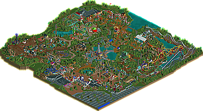
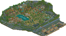
Enter a world of fantasy where 4 countries live together under the all seeing eye of a powerful wizard.
-
2 fans
 Fans of this park
-
 Download Park
828
-
 Objects
603
-
 Tags
Tags
![park_4178 [H2H8 Grand Finals] Heaven's End](https://www.nedesigns.com/uploads/parks/4178/aerialt3929.png)
well this was a surprise.... super stoked to open it.
Yeah, it seems like you went from "I need other people to help me finish this" to "it's finished" in no time! Glad you found the time to do it solo. Looking forward to opening it in game. Don't forget to add this park to the project, btw, for those sweet gallery screens.
This definitely shows skill, and is a nice Christmas surprise, but I wasn't a fan of everything. I ended up voting 70%


Allow me to explain with the help of screens I took.
In general I thought the rides were really cool, but they seemed "pasted on". Here is an example of what I mean, it looks like there are islands with rides on it, without really incorporating them into the surroundings.
This is what added to why I kept thinking this park was unfinished. It's so rough around the edges..... Here the LOTR rock actually adds to that feeling.
I really loved the idea of this bee hive, but it would have looked better in yellow imo. Now it just blends in too much with the surroundings.
I really loved this sign, shame you didn't change the name.
In terms of the foliage, I thought it was pretty sloppy. Because of how you placed the larger trees, they seemed weirdly cut off throughout the entire park. I added arrows to the examples I have of it in this screen. Great little leprechaun village by the way.
Great coaster, but the landscaping could (should?) have had a lot more care put into it. This seems really fake.
Great ride! I just think it's weird to put it in a corner and hide it behind a major coaster, instead of putting it as a centerpiece somewhere.


Sorry if I come across as really negative. I've added two screen under here to show that there were some areas I really liked!
Great square!
Cool tower!
This park is huge! So much content to explore. I agree with Faas, some parts were 'meh' and some were awesome. Overall I really enjoyed it, probably due to the large scale you built the park in, which I'm a big fan of.
Wow, a surprise to see this released so early! There's a whole lot to love here, and it clearly draws on inspiration from efteling, toverland, phantasialand, etc. I may not have appreciated this park as much had I not recently been to a few of the european parks.
I think you're really good at themeing individual rides. The log flume and rapids stood out to me- very good and great composition too. I even liked the RMC and its environment. I think putting it together into one big park may be slightly less up your skill tree. For example, the Mack looper really kills that area for me. I love the b&m hyper but the mack just uglifies that lake for me, and really throws off that area.
Archy-wise, there's a lot to love. the entrance, the central drop tower, the ghost house, the games near river quest, etc. Great atmosphere and detailing. But for every one or two great buildings, I'd say theres another 'meh' one. Bulky/boxy structures with a bit less detailing or life, etc. Its hard to put my finger on but many areas feel like there's too much variety and so some buildings work really well and some stick out strangely.
I actually like the open spaces- grass, wide paths, etc. Reminded me a lot of efteling. I was worried at first that it made it all feel a bit rushed, but overall I didn't come away from it feeling that way. It gives the park quite a unique character. There were a few unfinished patches here and there, but cest la vie. I also really loved the vekoma stingray layout, it has a great exciting ending. I love it when rides save some sort of climactic moment for the end to finish on.
If I had a hunch, I think it'll probably not quite be a spotlight, mainly on the consistency grounds. Maybe I'll be wrong, its certainly one of the most borderline decisions to make in a while... very good stuff and really lovely to see this for christmas!
Ended up going with an 80 because there was a lot of good stuff here, but man was this park frustrating to look at. You have so many good micro ideas and structures, but as a whole they just dont really work well together. The park just felt so bland and basic in how you placed rides buildings and path.
Not sure if some more terrain or if a smaller packed park would have helped but it definitely seemed to be missing something. Hard for me to really articulate what it was but it sorta seems to have been missing from your last solo too. Overall I don't think the ride design and coasters were as good as your last park either, with is usually your strongest aspect, which kinda disappointed me here. Archy wise I'd probably put this as your best work though, especially the entrance and some of the themed buildings.
Thanks for the submission though BG, hopefully this isn't your last!
it'll probably be the last as I've no will to continue and certainly not at this point. I know it looks like I cut corners and in all honesty I had to cuz of the object limit, i was on verge of hitting it rather early on and had to adapt everything I was doing as I still had half a park to build when I was very far into the limit without having actual object slots to cheat my way out of the limit like we've seen with emerald pointe. I am honestly also baffled by the negativity concerning this release and the way people have been viewing this, this park is semi realism, I never set out to make it looks as well thought out as a realistic release as BGA or southwinds and I think people look at it through those glasses, I apparently missed the memo where everything built these days has to conform to the set out rules by the NE elite to be rated anything worth above 80% instead of building something, trying to be unique in themes, approach and overal scope of a creation and it's put me off wanting to invest into a project if I'm completely honest with myself so consider this my last failed attempt at trying to excel at this game.
i hope the people who actually enjoyed it had a good time viewing and appreciated the massive effort I put into this, nothing in this park is unintentional, are parts bare? yes. are parts less worked out than I wanted them to be, absolutely, but such is life and I didn't have the opportunity to go that route cuz of the object limit wich i couldn't bypass and this resulted in what people call an unfinished look but it was intentional as I put in every detail and idea that I could spare.
that stingray is so gorgeous!
The problem is rather that the quality of NE has risen over the last decade. It's expected nowadays that a park seems finished completely. Unique ideas and themes simply aren't enough to just push a park into the super high ratings anymore, it needs finish and execution, too,
I also think you put way to much stock into the rating. If you like the park then you should be happy about it, rather than worrying about what other people think.
First off, I love the themes and overall style. I think the biggest problem this park has is a case of ObjectLimit-itis; you already know this and while unfortunate, I'll focus on other aspects.
I love seeing all these cool little obscure rides; Vekoma Stingray, SBF spinner, that crazy new Mack design. My favorite parts of the park were where you went all in with theming - the river rapids, broomstick starflyer, Dread Manor, and Wizard's Watchtower to name a few. Really awesome stuff.
The concept is lovely, it's just such a shame that the object limit prevented that concept from being explored more in depth. I really hope that you'll find time for another release in this style - maybe post-object limit removal?
So very well said, V1.
I feel like I personally need to reply since I only voted 70% on this, and I honestly think the response is a bit childish...., not in the last case because respected members of the community have stated this to be 80% work and even borderline spotlight quality.
First of all, I had the same issues with BGA as I had with your park, so for me the comparison is not far off. I try not to compare a park with other parks when I look at them though, and I didn't here.
The issues I had were purely from an aesthetic point of view and I spend considerable amount of time trying to explain it. If you take the foliage as an example, you can clearly see why I disagree with your choices there from an aesthetic point of view, instead of me trying to impose certain rules and standards. The trees are cut off at a 90 degree angle throughout the entire park. The same goes for some landscaping. If you elaborately theme certain areas and then put a landscaped area behind it with blocky, 90 degree harsh cut-offs etc. that takes away a significant part of the enjoyment of the park for me.
Lastly, if the score you do or do not receive decides the enjoyment you have from building, then maybe you should reconsider indeed.
Anyway, I advice you to look at this park in a few weeks/months from a more fresh point of view and then try to consider what some people have brought forward as criticism.
Well, I thought this was a great release. It really did feel like a real fantasy-themed park. I thought the foliage looked pretty good, and while there was a lot of bare ground, I didn't think it was too much. To those who thought it was unfinished...did you even look at the park?
I think the thing that brings it down is that some of the areas feel sparse in terms of built structures. For example, the area around the station of Eldar - there's a lot of prime real estate there that didn't get used. I understand why it must have been so frustrating to hit the object limit so early on because I think there's a lot more that could've been done with the park.
I hate to hear you say you're going to stop building, because you've always been one of the best on the site. And I think anyone who says "the score my park gets has no influence on how much I enjoy building" isn't entirely truthful. It's really discouraging when you submit a park you've worked hard on for months and it gets negative comments. I don't see that response as childish - I see it as human.
Yeah, it's hard to see this as a 70% score. Personally this park feels like it's on a definite higher level than parks in that range. The scale and scope of this park alone is fantastic - not to mention the individual ride designs and themed areas.
I can agree with some of the critiques about ride placement and bare spaces. But I think it all came together nicely. The rides themselves are very well thought out and have top-notch execution. So many little details scattered throughout.
I urge you all to spend some more time exploring this park before deciding on a final score!
I'm sorry, but it's hard to sympathize with that view when someone is maybe looking at a low gold instead of a medium gold. If this was about someone who built a park over months and then it doesn't even go to the panel I would understand, but this seems kinda entitled to me.
How is wanting people to like your park entitled? BG built what he thinks is a spotlight contender, and it seems that some people disagree. Which is frustrating and I completely understand. If I built a park I thought deserved spotlight and wound up with a low 70s score, I'd be disappointed. It's a natural reaction.
Perhaps BG overreacted a little bit, but I can't blame him, because he's clearly reached his wit's end with this game. Which happens to the best of us.
Okay, so first of all: Wanting people to like your park is obviously not entitled in itself. Nobody really disliked the park though. He still got a score in the high 70s which most players will likely never get.
Second of all: Never just assume that you built a spotlight contender. It's like assuming that you movie will win best picture or that your book will end up being a bestseller. Building huge expectations in that regard is a trap and I don't see how anyone but BG himself is to blame if that's what happened here.
Again, he got a 77% score. Many players will never reach that level. It's a sad thing that we have reached a point where not getting a spotlight is a huge disappointment.
I don't have much to add that hasn't already been said.. but first off, congrats on the gold. While it isn't a spotlight, it is still a great park with merit.
I think you do really well with your detailing and theming. Rides like Wisp and Phoenix had great layouts, great interactions, and really well done stations. The rapids ride was really nice too.
If you choose to build another park, my only suggestion is to do something smaller.. I've always enjoyed your style.
I always love your stuff BG, this was no exception. My joy in RCT is obviously the fantasy angle, the more fantasy the better IMO. That being said, I really loved some of the architecture you had here. The best display of this was the entrance building, it's awesome! I love how you mixed in the lotr rocks, with the foliage as guests are coming in. Even that little cluster of main street buildings with the opened story book were a delightful beginning to this park. It oozes atmosphere right away. I might possibly steal an idea or two for the park I'm working on.
Another highlight was Phoenix, the coaster layout was dope, the station was top notch, very creative. Even the theatre area nearby, with the waterfall and mix of dwellings was a great back drop for a play. I could say the same things about Wisp, an immersive spot in the park. The interaction of dragonfly, weaving throughout the pathways, was fantastic (would have like to see more of this with the other coasters).
Smaller details I really appreciated finding was the playground, the gnome campfire, the Cozy Gnome Restaurant was really nice too.
I'll definitely be coming back to this park to admire what you built, and pick up some inspiration to finish my own park (whenever that ends up being). Shame you battled the object limit, I had that in my Mario Kart park, it sucks. I feel your pain. Nonetheless, great park BG!!!