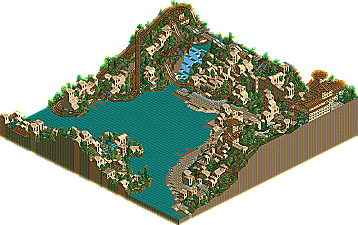
Demigods (The Edge) -
Solid and creative. But that's about it. The idea itself was great, and I'd love to see a larger park like this, but there just wasn't anything there. The coaster was just 'meh' as well... Architecture, while pretty decent, was bland and repetitive.
Stallions (Courmayeur Harbour) -
Mmm. Classic LL. By far the best woodie I've seen in a while (not that it's saying much.) Architecture was nice, the watercoaster was... well, ok. Never been much a fan of watercoasters anyhow.
I liked both parks just about equally. However, my vote has to go to the Stallions.
-EDIT- And it's tied at 50%.... gonna be close this time.
Extremly hard choice imo... both parks must have tanken alot of work, the LL one with all the track and stations used and the RCT2 one with all the landblocks and blank tile spaces (you were insane not to use the 3x3, 5x5 or 7x7 ones and use the single tile ones). In the end it came down to the coasters, that woodie was very good, and the mini coaster was sorta a letdown as a main ride, even tho it is was good and flowed with the themeing. The highlight in the LL park for me was the castle (even tho it's been done a shitload of times and once this week alreddy!), but still it was the better overall park imo even tho the Edge had the better details.
Well, I voted for an LL park, if it wins my bold prediction goes out the window in week 1
The edge =
This was very well planned and must of taken ages to do 37 years? i liked the bridges made from coaster track for some reason? but i didn't like the buildings too much, abit biggere would ahve been nice... But it did fit the name.
Courmayer harbor =
Looked nice and peaceful from the screens, but dont have rct so im gona have to go with the edge....
rct will be brought soon lol
hmmm. i really like how that Stallions park looks from the screens. i'll download it anyway to be formal, but my vote went for it. i don't much like irsi anymore anyway.
I voted for Courmayeur Harbour, the Stallions. Because i loved that wooden coaster and the castle structure opposite was pretty damn good. The Edge was a good idea, and the land blocks were pulled off very well, but the archy was a little rushed and what it was themed to was not clear.
I voted for Courmayeur Harbour as i loved it all. The wooden coaster was extraordinary. I loved the whole atmosphere it gave me. It was beutiful. The edge was nice as well. I loved the archy. the kids coaster was a bit of an anti-climax for me i was expecting some dive machine off the edge. I like the entrance, that was nicely done but it did'nt grab me as much as the LL park did.
Im not that much of a LL person but i really liked that park. The coaster was excellent and looks cool, despite the fact i dont have LL. The edge looked good as an overview with a pretty never seen before idea but i think that some of the acrhitecture let it down.
I'm not an LL fan, and the park seems very plain to me . I like parks which had some more variety. so I will go for the edge. altough it is a bit empty and there isn't that much to see I like the idea. the archy could use some improvement.
The Edge
Funny, I thought it should've been called "The Wedge" based on the strange shape of the park from the overview. Obviously a lot of land block work involved. Unfortunately though, there really wasn't much I liked about it. The overall composition lacked imo and it didn't have any defining features that made me want to pick it as the winner here. This goes for everything from the backstory (or lack thereof), to the landscaping, colors, coaster and buildings. The buildings really put me off because they all had similar forms and only used colors as the distiguishing feature. There were a few nice details here and there, like the track used for suspension bridges and the nifty little multi-colored sign I saw on one of the paths. But overall, the park didn't strike my fancy much.
5/10
Courmayeur Harbour
The composition was there, as were atmosphere and aesthetics. The woodie was decent, but I thought it spent too much time underground and was overly intense for its setting. The water coaster was nice yet nothing more than nice. I did like the symmetry between the lift hill and the first drop; that was nice. The architecture - also just nice. Some decent forms, but I didn't like the fact that the whole park was constructed with same texture and windows. I think you have to use every tool available in LL these days to make something amazing and this park definitely failed on that token. This park barely achieved the "nice" level just because it felt extremely conservative. However, the good news is I did like it just slightly more than the opposing park and thats all that counts in this contest.
6/10
The woodie will be in the "Best Wooden Coaster" category at the end of the season. It was magnificent. Absolutely breathtaking, so kudos to the person who made it.
The Edge had too much of a "Kumba PT2" feel to it. The island-scaping was amazing, but I felt everything else was lackluster, from the buildings to the rides and the theming. Courmayeur may not be super original, but it was executed superbly and just plain great to look at.
Edge- Very creative, and some amazing land block usage. The coaster was ok, but I loved the underground tunnel parts, and the archy was very nice.
CH- Very nice, and the woodie was amazing, but it was something we've all seen before. The archy and landscaping was very well done, but this park could not rival The Edge when it came to the "wow" factor, and for that reason, my vote went to The Edge.
Corky is right. The woody was fabulous, too (shame about the ratings, though thats just something I look for). It's just in this case I'd rather see something thats been done a millions times pulled off amazingly, rather than seeing something new pulled off horribly. The only thing The Edge had going for it was the cool little caverns the coaster popped in and out of.
53 Comments
iris Offline
Download "The Edge"
MIRROR
Vs...
Courmayeur Harbour by Italian Stallions
Download "Courmayeur Harbour"
MIRROR
Overviews:
Downloads
Next deadline is July 4th.
ACEfanatic02 Offline
Solid and creative. But that's about it. The idea itself was great, and I'd love to see a larger park like this, but there just wasn't anything there. The coaster was just 'meh' as well... Architecture, while pretty decent, was bland and repetitive.
Stallions (Courmayeur Harbour) -
Mmm. Classic LL. By far the best woodie I've seen in a while (not that it's saying much.) Architecture was nice, the watercoaster was... well, ok. Never been much a fan of watercoasters anyhow.
I liked both parks just about equally. However, my vote has to go to the Stallions.
-EDIT- And it's tied at 50%.... gonna be close this time.
-ACE
Edited by ACEfanatic02, 28 June 2006 - 11:58 PM.
Kumba Offline
Well, I voted for an LL park, if it wins my bold prediction goes out the window in week 1
Ge-Ride Offline
chapelz Offline
Leighx Offline
This was very well planned and must of taken ages to do 37 years? i liked the bridges made from coaster track for some reason? but i didn't like the buildings too much, abit biggere would ahve been nice... But it did fit the name.
Courmayer harbor =
Looked nice and peaceful from the screens, but dont have rct so im gona have to go with the edge....
rct will be brought soon lol
rainbow connection Offline
X250 Offline
-X-
J K Offline
JK
super rich Offline
Levis Offline
JKay Offline
The Edge
Funny, I thought it should've been called "The Wedge" based on the strange shape of the park from the overview. Obviously a lot of land block work involved. Unfortunately though, there really wasn't much I liked about it. The overall composition lacked imo and it didn't have any defining features that made me want to pick it as the winner here. This goes for everything from the backstory (or lack thereof), to the landscaping, colors, coaster and buildings. The buildings really put me off because they all had similar forms and only used colors as the distiguishing feature. There were a few nice details here and there, like the track used for suspension bridges and the nifty little multi-colored sign I saw on one of the paths. But overall, the park didn't strike my fancy much.
5/10
Courmayeur Harbour
The composition was there, as were atmosphere and aesthetics. The woodie was decent, but I thought it spent too much time underground and was overly intense for its setting. The water coaster was nice yet nothing more than nice. I did like the symmetry between the lift hill and the first drop; that was nice. The architecture - also just nice. Some decent forms, but I didn't like the fact that the whole park was constructed with same texture and windows. I think you have to use every tool available in LL these days to make something amazing and this park definitely failed on that token. This park barely achieved the "nice" level just because it felt extremely conservative. However, the good news is I did like it just slightly more than the opposing park and thats all that counts in this contest.
6/10
Vote: ITALIAN STALLIONS
posix Offline
the wodden was rather impressive. pacing-magic.
spiderman Offline
I went with the Edge.
Jazz Offline
~Jazz~
Corkscrewed Offline
The Edge had too much of a "Kumba PT2" feel to it. The island-scaping was amazing, but I felt everything else was lackluster, from the buildings to the rides and the theming. Courmayeur may not be super original, but it was executed superbly and just plain great to look at.
It got my vote.
hobbes Offline
Couldn't have said it better myself.
Silenced Offline
eman Offline
Edge- Very creative, and some amazing land block usage. The coaster was ok, but I loved the underground tunnel parts, and the archy was very nice.
CH- Very nice, and the woodie was amazing, but it was something we've all seen before. The archy and landscaping was very well done, but this park could not rival The Edge when it came to the "wow" factor, and for that reason, my vote went to The Edge.
Edited by eman, 29 June 2006 - 10:46 AM.
Steve Offline