Park / [NEDC5 - 06/10] Javan Tiger
-
 06-December 19
- Views 2,768
- Downloads 729
- Fans 2
- Comments 15
-
![Park_4718_[NEDC5 - 06/10] Javan Tiger](https://www.nedesigns.com/uploads/parks/4718/logot.png)
-
 68.50%(required: 65%)
 Design

posix 75% robbie92 75% Scoop 75% csw 70% Jaguar 70% Liampie 70% RWE 70% saxman1089 70% Camcorder22 65% Cocoa 60% G Force 60% ][ntamin22 60% 68.50% -
 Description
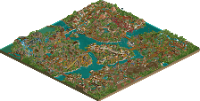
Weaving among islands and facing the beast. Inspired by Ancol Dreamland.
-
2 fans
 Fans of this park
-
 Full-Size Map
-
 Download Park
729
-
 Objects
372
-
 Tags
Tags
![Park_4718 [NEDC5 - 06/10] Javan Tiger](https://www.nedesigns.com/uploads/parks/4718/aerialm4588.png)

![park_4717 [NEDC5 - 02/10] B I T M A P](https://www.nedesigns.com/uploads/parks/4717/aerialt4590.png)
![park_4715 [NEDC5 - 01/10] Ririku](https://www.nedesigns.com/uploads/parks/4715/aerialt4584.png)


#06 / 10 — "Javan Tiger" by mamarillas
68.50%
- Design win -
( After the panel vote triggers all above panelists should confirm their votes )
My first reaction upon opening this was twofold; wow that tiger is amazing (it's almost like you planned that!!) and ow my eyes. The palette is bright. On one hand, it really makes the color pop and I do like the water of the ACGTH palette. Okay, colors aside.
My god that tiger tunnel is a highlight for me; brilliant focal point and really well done. I think you did a really good job at making the coaster the star. It interacts well with a lot of the path and some of the rides too - that custom drop tower is lovely. I'm a little less keen on the architecture. A lot of it is really quite top notch and well done, while some of it is much simpler in nature. The ferris wheel doesn't have anything for a station or even fences to prevent peeps from falling 10 feet! Minor inconsistencies, but they do add up a little. It's not really enough to detract from the park as a whole, but it's something I noticed. That temple is very nice, reminds me a lot of Mekong. Something I'm going to nitpick about is that, while I think the park elements are quite lovely, they do feel relegated to the sides in places - almost as though they're present just to be present.
Really though, all of that is kind of a stretch. I really, really like this and I'm super happy to see new faces in this competition. Congratulations on Design; you definitely earned it.
Damn, this was really good. Obviously the tiger sculpture is the star here. FK has some competition for best sculpture on NE now!
The coaster itself stands large, and the colors are ugly, but in the best way possible. Not sure if this is what you were going for, but the coaster looked almost like a Chinese knockoff, and that was super cool to me. Reminded me a bit of Tubiao.
The supporting rides were solid. The water park here was a bit underdetailed.. namely the loading area/queue for the lazy river, but it all meshed together well and made the park very believable. The drop tower was a cool custom ride as well.
You showed a lot of skill here with the hacks and the theming! Congrats on the design!!
I have to say I'm not crazy about the lifts being supported by the catwalks. Supports on the rest of the ride are solid though. I didn't really like the color palette here, a little too bright and washed out. The station building is stunning but it's also the only real building on the map. The other structures all feel so temporary and small, even the boomerang ride makes this feel like it's a county fair or something but the massive coaster and all the infrastructure for bridges and things say otherwise. I do agree with others that the water park feels a little underdeveloped. All that said, I massively appreciate seeing a theme that's very different from what we normally see, and that tiger head kicks ass.
Man I love everything you make.
Colors were spot on, map shape was nice and allowed for some great breathing room, foliage was appropriate and well done.
The chairlift is a nice touch as well. Gives the map a lot of motion!
Really looking forward to a full scale park from you at some point!
Following some of the other stuff you've shown I was looking forward to seeing what you'd make and you pulled something great out! That tiger sculpture is superb and definitely a brilliant part to open on. The whole park was very vibrant, partly thanks to the colours and palette choice, and I think you did a superb job with the theming. The supporting rides were all pretty good, and I liked the placement of the Menara tower.
I do have a couple of nitpicks, mainly being that I didn't love the way you did the catwalk with the wooden supports, it definitely would have been better to just use the steel supports throughout. Also there were a couple of strange object choices that didn't quite fit in, such as the big cambodian temple object which looked really out of place next to the station.
Overall though this is a solid entry that you can be proud of so good job.
while I didn't think this one necessarily cracked the design-worthy standard, I really did enjoy it. While the park layout is certainly unusual (maybe even mrtycooncoaster-like), I sort of like the charm. It does feel like those funny sort of pseudo-themed parks that show up in vietnam/india/indonesia/etc. And the themeing does a decent if slightly inconsistent job at selling that. The foliage added a lot to the vibrancy I think. In the end it might have needed slightly more consistency to the themeing to sell itself to me, but perhaps I was undervaluing it and I should have been thinking of it as a more realistic attempt at that sort of theme park in south-east asia.
Overall this was an enjoyable submission, but looking at each part of the submission seperately it left something to be desired. On a smaller scale some of the buildings and for example the area around the boomerang and the carrousel didn't do it for me.
I like how you put effort into incorporating the coaster in its surroundings though, well done!
Nice little park. It doesn't really feel like a design though with have too much side attractions that take away a little too much the focus on what should be the main ride imo. Nonetheless, nice and unexpected move to mirror the layout, actually. Gives your entry a nice small uniqueness bonus over the other ones.
On opening you immediately notice that tiger face sculpture. And damn is that badass perfectly executed! Props for that and for me it is the pure highlight on the map!
I do like the bright colors throughout, with the lush foliage it really conveys the tropical feel you are going for. Landscaping wise I think the map is a little too flat but on the other hand it also does work actually. The theming is not very heaviliy done but it does support the whole setting and I think is ok for this kind of park. The station building is maybe a bit too blocky (one square with those towers on top). But
You have some nice interaction of the coaster for example the turn around the launched free falls is good. The towers on their own are also quite well done.
I also want to state some thing that I didn't like that much: first of all: please never again build a curve like that in a chairlift! that is just physically so unrealistic (the pillar with the curve would just fall over when mounting the cable).
Next I am missing some guidance bars or something on the splash boats ride when it's released into the river. Also the hole for the splash boats directing from the river feels a little too unrealistic imo but I could think of a way doing this.
All in all a nice little park but I think it did miss a little the goal of setting the design into scope. Nevertheless, congrats on the design accolade!
There's a ton of technically impressive details in this park... I can really respect that tiger sculpture and the coaster station. They definitely left an impression on me. Sadly I can't say the a lot of the park, as there are definitely areas where the quality feels inconsistent. The entrance area, consisting of giga coaster track and large scenery objects, feels rather rushed. It is interesting to see though, given the builder, that this is very reminiscent those Deurklink server parks except with custom scenery.
Admittedly I also wasn't entirely sure of the bright color scheme either, but for the theme, it works well. I like the greenish tint of the water.
Personally I had a difficult time comparing this park to the other entries... it's not some crazy fantasy park, but as a piece of gritty realism with a lot of cool gimmicks, and your signature sculptures, I certainly enjoyed this. It's like Calypso Quay meets Tubiao.
The size of this is really impressive, and I like the fragmented composition. It's a bit too light on architecture, and that's only emphasised more by how monumental the station is. The spires are very well done, it's a shame they appear plonked on top of a box.
I didn't see anyone point it out yet, but I really love foliage mix. Some unusual bushes and stuff I haven't seen before (except for one jungle bush which grates on me a bit) and the flowers were very tasteful. Well done!
Foliage is perfect for me I watched each piece.
The tiger head got the best.
The impressive Javan Tiger construction, I can not make a building like that, it was beautiful and interesting details, the color was well chosen.
Haha loved the beach and the parasols, it reminded me that one day I need to take a vacation, hehe.
I was striking the carousel, it was my passion, at the time in the childhood phase.
The bow at the entrance was 10.
Great submission here, I enjoyed the colors and the effort you put into the surroundings. Well, maybe the colors were a bit over the top. Either way, an entry deserving of design and a very respectable 6th place.
Amazing stuff !