Park / [NEDC5 - 04/10] Beyond the Canopy
-
 09-December 19
- Views 2,769
- Downloads 692
- Fans 2
- Comments 13
-
 74.00%(required: 65%)
 Design

Cocoa 90% robbie92 90% G Force 80% Camcorder22 75% RWE 75% saxman1089 75% csw 70% Jaguar 70% Liampie 70% posix 70% ][ntamin22 65% Scoop 60% 74.00% -
2 fans
 Fans of this park
-
 Full-Size Map
-
 Download Park
692
-
 Objects
271
-
 Tags
Tags
![Park_4716 [NEDC5 - 04/10] Beyond the Canopy](https://www.nedesigns.com/uploads/parks/4716/aerialm4587.png)
![park_4705 [NEDC5 - 07/10] Toucan](https://www.nedesigns.com/uploads/parks/4705/aerialt4589.png)


#04 / 10 — "Beyond the Canopy" by Tolsimir
74.00%
- Design win -
( After the panel vote triggers all above panelists should confirm their votes )
This is one of the coolest concepts I've seen. Love it. I wish there was peeps though
Man. While the initial overview took me by surprise with how spectacular it is, I can somewhat see why others might have scored this lower than I feel it should have been. It was a little devoid of life a sense. I think having peeps would have helped a lot. Although personally I think the serene environment lends itself to the theme. I can almost picture myself walking around here.
Your color usage is great, and the elevation is really sold well in my opinion. Not to mention the map edge is incredibly thought out and well done to sell the theme.
Love your work and cant wait to see what you come up with next.
I agree with Josh. I adore the atmosphere and love what you've done - it's really awesome. The canopy itself is wonderful. The concept is amazing, I just wish there was a little more movement of some kind to keep me interested in the stunning environment a little longer.
Awesome job, I can't wait to see what you come up with next.
Damn.. this was quite stunning to look at. The trees and the canopy effect was great here. I agree with others that it sold the "above the trees" vibe. The clouds were great too.. really well done and the atmosphere you created was the best we've seen in the competition thus far. Not sure what percentage I'd vote on this if I were a panelist.. it's such an interesting design. I don't think the lack of peeps is an issue. Great work.. I always look forward to seeing what crazy stuff you come up with!
I'm pretty sure you didn't have a lot of time for this entry. It shows in some aspects, but I'm glad you managed to finish in this state. For every thing that is mediocre, there is something great to make up for it. Examples: coaster supports are either very long and straight down (mediocre) or suspended by cables (great). The rock arches are missing some context (do they just sprout out of the ground like that? It looks less like they're formed there, and more like they were placed there) (mediocre), but the arches themselves are looking great and you made good use of them (great). The architecture has some weird choices like wooden coaster track and sphinxes (mediocre), but also plenty of super charming smaller structures that remind me of how much fun we had with Tenochtitlan (great). Another thing to make up for the sphinxes are the pyramid walls, by the way - those look very nice. Some more things I'd like to highlight: the gardens, the fallen leaves, diagonal arches, the watchtower, and all the suspension bridges. This map is a lot of fun to explore even without peeps, which I didn't even miss until I was 10 minutes in. One more point of mediocrity: the clouds. They do not work for me. Overall it's a very good entry that excites the Roger Dean fanboy in me, but also can't entirely live up to the Roger Dean standards. And lastly, the coaster layout is great.
Got a real Avatar The Last Airbender vibe from this. Love the hacking on the pyramid bases. The sphinx head thing was a little less convincing. It's amazing how far the fallen leaves and relatively simple wall textures go to make this atmosphere feel real and lived-in. This is like a crazy MM round idea made big, and for that I respect the hell out of it, though I do not think I like it more than Nokken or Fireball. The inclusion of rides feels a little incidental and goes against the atmosphere a bit for me, though I concede that the map would feel a little too lifeless with just the coaster. Maybe roaming birds or some kind of water in the landscape would have made up for that.
The cables you put on the bridges got the best, very good.
The foliage is perfect, like it really looks like a jungle.
The Trim Palace was very cool, I liked the use of objects, good imagination
This is just awesome... I love large-scale conceptual stuff and seeing as this is from one of the best fantasy builders on the site, it doesn't disappoint. There's definitely a lot of cool features borrowed from your micros and it's nice to see them on such a large scale.
There was a lot of interesting use of scenery, especially with the pyramid bases... some of this works quite well, whereas it looks rather sloppy in other places. With that said, this entry has some of the best clouds I've ever seen in RCT.
I admittedly voted a bit lower for this than I usually do for these kinds of entries because while it's all very high quality, and no doubt design-worthy, I felt that there was a lot of filler. The vast majority of it was trees and it just felt abandoned because there wasn't much motion. Throwing a few birds flying around or something else to truly give this a sense of scale would've elevated it.
Regardless, it's still a very beautiful and distinct park. I hope to see more releases like this from you in the future.
This was one of those entries that while I was really impressed by it and expected others to vote it higher, it doesn't quite hit the mark of being a top-tier entry for me.
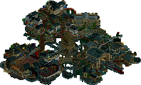
I mentioned this on Discord but this has to have one of the coolest preview icons on the site. While looking at it up close, the object selection for the clouds was a bit questionable and excessive, the overview is so perfectly blended between wispy and opaque clouds that its worth it for me. Its obvious you build this constantly zooming out and checking how everything looked and that's a difficult thing to pull off. In the macro category I would score this a solid 80-90%.
What kept me from scoring this higher was the lack of attention-grabbing moments on a micro level. I don't even think this was as much a flaw in your execution as much as the fact that there's parks out there with near perfect micro and macro that deserve those 80+ votes. If you'd included peeps and made it more of a traditional park, people would've complained that they didn't understand whether it was supposed to be a park or not, while now its pretty obvious its supposed to be like a monastery/fortress type deal.
The station was both interesting and risky, I'm starting to sense that you have an aversion to building real roofs . I like the creative use of the sphynx object but again I think the station works better from afar where you can appreciate its overall form, while up close it looks too much like stock scenery stacked on wooden coaster track.
One other thing that needs to be pointed out is how good those fallen leaves on the cherry blossom trees look. One of the biggest impacts you've had on the community between this and your Spacecrabs parks/objects is introducing objects and novel uses of them that have become commonplace and I'm sure we'll see this a lot moving forward.
The integration of the coaster into its surroundings was fairly good with some flaws. The coaster seemed a bit unsupported in places considering it was well supported in others which hurt the execution for me. It would've perhaps held my attention longer if there'd been some elevation changes outside of the arches. I definitely enjoyed the more terrain-hugging executions of this coaster like CC9's and I think combining that approach with the arches would've taken this to another level for me. However the arches just rising out of the ground did make it feel a bit supernatural, which seemed intentional.
I do have to disagree with the people saying the trees were just "filler" when they were very obviously part of the macro and its not like there was any size requirements. Maybe it would've held my attention a little longer to have some clearings and little scenes in the trees, but I'm not sure it would've contributed to your narrative or vision, so it would only be serving to pander to those micro obsessed people.
Glad to see you submit something and continue your super high quality output recently. You're one of my favorite builders on this site and I hope to see more from you soon!
Finally coming around to comment on things!
I really really loved this. I think its one of the most original designs in a while and such an interesting use of the coaster in this competition. There's been some chatter about whether the tree floor works or not- I really enjoy it personally. I think it does a great job making the canopy floor seem really far below the realm of the coaster, since RCT scale trees are so small, and it does it without much effort. We're so obsessed with high effort solutions to problems these days that I've come to really appreciate simple RCT-based tricks all the more.
The archy is great, with tons of neat details and sculptures, like the four-headed sphinx dome. I love all the bridges and the rock outcroppings, and the clouds are some of the best I've seen in RCT. bold move but IMO it paid off, and I voted it tied best with josh. Perhaps I was in the minority with loving it so much but I may be your biggest rct fan these days anyway
looking forward to more from you
I guess I just didn't feel the magic with this one - it's a very solid entry, but I didn't think it stacked up to the top 3 coasters. That being said, I'm glad to see you still entering contests after what has already been a pretty great RCT career.