Park / [NEDC5 - 10/10] Spiirokiti Piir
-
 04-December 19
- Views 2,834
- Downloads 584
- Fans 0
- Comments 23
![Park_4711 [NEDC5 - 10/10] Spiirokiti Piir](https://www.nedesigns.com/uploads/parks/4711/aerialm4571.png)
-
![Park_4711_[NEDC5 - 10/10] Spiirokiti Piir](https://www.nedesigns.com/uploads/parks/4711/logot.png)
-
 56.50%(required: 65%)
 Design Submission

robbie92 70% posix 65% G Force 60% saxman1089 60% Camcorder22 55% csw 55% Jaguar 55% Liampie 55% RWE 55% Scoop 55% Cocoa 50% ][ntamin22 50% 56.50% -
 Description
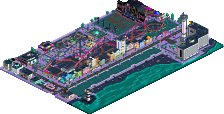
Welcome to Spiirokiti Piir, my design entry for the New Element Design Challenge #5, and in the end, essentially a mini park competing for a design award against other entrants.
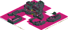
Piercing the darkness of night, it is a neon themed set of piers featuring the required and unaltered suspended coaster and a few other pier friendly rides like the Tilt-a-Whirl, 4-D Theatre and Roto-Drop. In addition to the rides and entrance hall, there is a services building and an Asian food court area, complete with many fantastic food to be enjoyed at many tables w/umbrellas. -
 No fans of this park
-
 Download Park
584
-
 Objects
155
-
 Tags
Tags


Alright finally gonna catch up on reviews now that I'm feeling slightly more alive.
First of all glad to see another release from you Kai and hope the results of this don't demotivate you too much. The score is at the end of the day a reflection of how well you executed a specific meta and not how well you achieved your own personal vision, or how much other people enjoyed what you built. Hope to see more from you, especially your alternate NEDC entry.
Been thinking about my vote for this and really think it comes down to a macro vs micro thing. An 100% park would have to achieve both of these perfectly, and you could end up with a not very satisfying score while having either very good macro or micro. I especially loved the edited picture of this you posted on the discord. I think that really showed how you planned your entry compositionally and color wise to be viewed as a painting, which seems to be a big theme in your work.
What kept me from scoring it higher was that for the most part, I didn't feel like there was anything to draw me in from a micro standpoint. I have definitely falling victim to using too many textures and ideas in my building so take this with a grain of salt, but I think you might be using too few for my tastes, so that each area of the map didn't differentiate itself. I agree with some of the other above feedback, like I thought the road lines were cool and that area was the most interesting to me, and it would've been cool to see some more ideas like that elsewhere. The theme and setting seemed a bit vague to me too. It appears to be a physical space station, and the coaster appears to be literal and not metaphorical and is supported in places, so I think I would've wanted to see some more supporting of it or have it be completely detached.
Again though I still enjoyed this and thought it was successful in achieving what you set out to. This is by far the strongest "last place" NEDC entry in probably the strongest overall NEDC contest so I hope you can still be proud of what you made.
Abstract, theme cool, glasses and neon, I love black.
For me nice work
Interesting neon effect you created by accenting only the trims and stuff. I do like how the forms become hidden a bit. I'm not usually one to complain about lack of 'content' or things to see.. but my main issue here is there wasn't much to keeping me looking for longer than a minute or so.
I wouldn't be discouraged by this outcome. I think you've done an interesting take that was still true to your style and I loved seeing that. Liked your colour choices, and the dark bed so to speak really worked wonders.