Park / Land of Shadows
-
 31-October 19
-
 Land of Shadows
- Views 3,771
- Downloads 746
- Fans 2
- Comments 14
-
-
 81.88%(required: 70%)
 Gold
Gold

Kumba 95% yes Coasterbill 90% yes bigshootergill 85% yes RWE 85% yes CoasterCreator9 80% no Jaguar 80% no posix 80% no Scoop 80% no csw 75% no ][ntamin22 70% no 81.88% 40.00% -
 Description
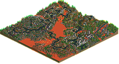
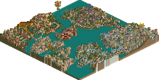
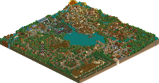
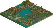
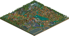
In the spring of '03, iris started a new group park called 'LOS', or 'Leaders of Old School', with 'Old School' being Loopy Landscapes. In a time of RCT2 being new and rapidly increasing in popularity, this would've been statement by the NE establishment. The park would have two maps, a utopian, cheerful one, and a dark, nightmarish counterpart. The former woud've featured mantis, x-sector, ToonTowner, Fatha' and Evil WME. Only three of them worked on the park, but it got finished and released in 2004 as 'City of Dreams'. The latter would've featured RRP, Coaster Ed, PyroPenguin, natelox and Ozone, but contributions by natelox and Ozone did not give the park enough momentum to make it to the finish line. The park was never really abandoned though. Around 2010, another push was made by Loopy and Roomie, but again the park stalled as no one knew what to do with the remaining empty corner. Luckily, this phase only lasted until 2015 when alex arrived on the scene. Eventually, Cocoa finished Loopy's area and Liampie filled all the other remaining gaps, resulting in a finished park at last.
-
2 fans
 Fans of this park
-
 Full-Size Map
-
 Download Park
746
-
 Tags
Tags
Is this real life?
I'm so happy to finally see this out there
apologies to Loopy for changing (ruining, some might say) your area
Very exciting to be included in a park with so many LL legends! what a piece of history
One by one the giants of Liam's LL Collabo folder are falling!
This is just a ton of feel-good classic NE. The suspended duelers are showstopping and the whole park has that "concept is king" semi-realism magic. Really lovely to see it finally spooking the front page.
yo this is the sequel to City of Dreams?! Oh mama.
God, what a beautiful park. This really makes me want to play LL. There are so many incredible details here that I really don't even know where to begin. It's incredible on a macro level but much more detailed on a micro level than you would expect from LL.
Coaster design is also a highlight here. I love them all, but especially the duelers and the invert. That ride just flows beautifully.
Overall this is a fantastic park. I've spent 45 minutes looking at it and I keep finding things which is rare for an LL park.
I'll probably high-vote this, I'm just warning you all now. lol
@ Bill, just remember to vote this time!!
Wraith and Banshee, flawless rides.
The architecture around the entrance is also really nice, I love the foliage directly on the black tarmac.
Great touches all around, such as the steam.
All-in-all, so cleanly composed, a pleasure to look at.
Very happy to see more LL as I've really been getting into all those styles of building. The fact that this uses the lava water instead of the default palette is also neat and rarely seen in these parks.
This is honestly the perfect antithesis to City of Dreams... even the color schemes are equally effective opposites of each other (blue and gold versus red and gray). Honestly that color scheme, and the composition in general makes the castle part of the park my favorite. The park entrance and its surroundings like the village and that suspended station (not to mention, also the layout) are fantastic.
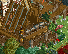
The martian area was also really cool and felt a lot like a LL version of Mt. Morbid. I also liked the trackitecture in the contamination area and the critter bog... those spider webs and that house with the wheel are nice.
My favorite part of this park though is that even though it uses a ton of different jagged land textures, trackitecture, and very different, equally crazy themes, there's no clashing at all. It's perfectly composed and a very fun to view, much needed LL release.
the best part of this (maybe of LL in general) is that this still holds up. Great work from all of you guys. I'm giving it an 80% but we'll see about spot.
It's bizarre to see this. Want to write my thoughts at a soon point.
Liam, there was in fact a third map that I started, and which then became my "Nagas" design. I don't remember too well what it was about, but I believe it was a map for the "real" oldschool people still around at that time and playing LL. I remember sending it on to someone who then never built much, and iris decided to cancel the map, meaning I turned it into a design.
Cool to see this finished, and like Cocoa said it's great to be included on a park with so many legends. 16 years in the making is really insane.
The park itself is a really odd mix of styles, so the aesthetic appeal is somewhat limited for me - but it is definitely fun to see different architecture and landscaping approaches and different scales mixed up in the same park. Scale especially actually.. when I look at the miniature castle town next to natelox's area lol.
I'd love to give a quick review on each of the areas, since its not getting a huge amount of attention (LL today )
)
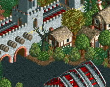
Entrance: really lovely. I adore the overgrown path with ravines on the side leading into the massive castle structure- elegant and very atmospheric. The inside is just awesome too- the compact arrangements of english huts works so well for a sort of depressed medieval village, and sets the scene for an epic park. Just full of atmosphere and creativity IMO.
The suspendeds are fine, a nice landscape and entrance to go over but I sort of wish they did something slightly unique to separate themselves from the entrance castle. The plague ride is fine but also doesn't really do anything for me.
Brings us to loopy/my area. When I inherited it, it was a more relaxed bug-based area, with a mine train layout on a mountain. It had the mine train station, giant spider, and the hidden bug cinema completed. I decided to add the creepy bog theme on top of it to try and sell a more magical-creatures-bugs-swamp sort of vibe, because we needed more weird water colors in this park obviously. So all the witch-ier stuff is me, which is most of the structures and also the denser, junglier vibe. I started this ages ago and then Liam started bugging me again recently to get it done for halloween, so we wrapped it up and here it is now.
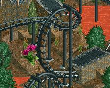
Alex's industrial area is also brilliant, maybe some of his first really excellent work here. The broken water silo that the rapids falls down is genius, as are all the structures that I would never even think of designing. The invert is classy too.
Ozone's area is fine- sprawling and old school. I like it, but it doesn't do anything particularly interesting to me, its just generally nice. The looper is below-average perhaps.
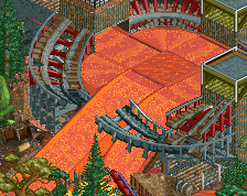
Natelox's area is great. I'm a huge fanboy but I love the open space, the composure with the little bay for the lava lifeboats, etc. It feels really ominous in a perfect way. Its pretty low key and straightforward work but so classy.
anyway, I really like this park. I think its good enough for an LL spotlight tbh- always good to remind ourselves what full scale LL parks are like (smaller than rct2!) and I think its pretty high quality throughout.
Cool to see something like this finished. Group parks are always a good time.
The alex and Cocoa/Loopy areas are definitely the best - it really shows how styles have changed over time and how much better everyone has gotten at the game. Better use of trackitecture, better foliage, more details, etc. Ozone's area is good as well, I have always been a fan of his work. Unforunately the nate and Roomie areas don't really hold up very well - waterfalls just don't work with orange water, too many green trees, among other things.
Great job on finishing it. Liam has now saved multiple dead parks, so kudos to you for that.
Two panelist votes remaining! Im very curious to see the score... Ive looked at this map in an unfinished state for so long that it's hard for me to predict. I know that some of this stuff is top notch. I'm especially charmed by Ozone's contributions actually, unlike some of you. It's beautiful chaos with some nice details like the UFOs and the landers. This is the kind of LL I wish I could produce. Nate's area is below his standards; the coaster supports kill the look of the area a bit perhaps. But some of it is as beautiful. Like Cocoa mentions, the little bay area connecting it to Ozone's area is lovely. More comments after the score!