Park / Las Vegas - 2010
-
 25-June 06
- Views 18,933
- Downloads 810
- Fans 0
- Comments 81

-
 No fans of this park
-
 Download Park
810
-
 Objects
253
-
 Tags
Tags


![park_3188 [MM2014 R2]The Mirage Hotel & Casino's White Lightning](https://www.nedesigns.com/uploads/parks/3188/aerialt2809.png)
![park_3118 [MM2014 R1] Vertigo](https://www.nedesigns.com/uploads/parks/3118/aerialt2765.png)
Download "Las Vegas 2010"
NE MIRROR
Vs...
Campi Vinobacci by The Tycoon Bandits
Download "Campi Vinobacci"
NE MIRROR
Overviews:
Downloads
Next deadline is July 4th.
Corkscrewed Offline
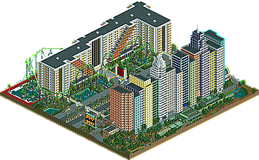
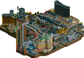
two nice parks. Las Vegas don't give me the real feeling of the gread gamble city but it has some really nice things in the lower parts of the map. the buildings are a lot the same and the side of the yellow coaster I don't like that much. If I'm right in the real las vegas the buildings aren't that close to each other. I think I had liked it better if there was space between the buildings. The other side (the large hotel) is very nice, this buildings has somethings to look at, you need to look good before you see how the building is, and the entrance of the building is also very nice. But the coasters don't really interact with the buildings, the buildings are a bit extra and there aren't really things in the buildings that make the special.
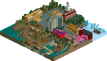
the Campi Vinobacci really gives me a italian feeling. the archy is really strong. from the overview I tought it was really unfinished but when I saw it ingame I began to doubt about it. I like the style you've going on there. most of the buildings are really nice only the part in the center I don't like because it's a bit "to" much of the good. The wooden coaster was pretty good I think. The color choise of this park was really nice to and the buildings where really nice to look at because of this.
Two very diffrent parks but I think I will go for small nice buildings and not for huge plain buildings. so I will vote for Campi Vinobacci.
Las Vegas 2010 (Tigers')-
Um... The RCT Lawyers would be having a fucking field day with this. First all parks using a year in their name like that to imply the future would require the payment of these things called "royalties" to Fatha Grinch Industries, they patented that after "Miami 2050" lost it's round in h2h2. Look it up! Secondly a group of individuals known (and once respected) as the RCT Masters (it's a club dipshit) were already building a Las Vagas recreation, with considerably more accuracy I might add. The "Manhattan Express" doesn't even slightly resemble the real ride (a little research wouldn't have killed you) and I'm pretty secure in claiming that they'll either rip that POS out or just leave it's "$12 a pop" ass exactly how it is. The other coaster was just bad. The custom supports for it were pretty though, as were the buildings. I can take 1 guess as to who built those examples of fine archetecture as well, and probably be right. I guess I'll just say he was in the Masters project too. Anyway the buildings turned out alright, particularly that original hotel, it has some pretty geometry that makes my eyes buzz enough to ALMOST win my vote. Almost is not winning however so you may instead go home and cry (or learn how to properly recreate or just create coasters).
Campi Vinobacci (Bandits')-
First off, I'm not convinced of the Turtlyness here. It looks like the style Turtle builds in and all however things are rather poorly composed compaired to other recent screens I (and only I because I'm magic) have seen. Hell Artist could pull a better Turtle than this when he was still under the name of Nem Chris... If Turtle really built this I'm terribly sorry but my statement remains. The green area in the overview was actually used though, kinda... The coaster wasn't great, actually it wasn't even good but it was unique and therefore interesting to watch once or twice anyway. The architecture and theming I would describe as "pleasent" and "inviting" but not "awe inspiring" or "exciting" or even really all that detailed. It seemed like the sides of buildings were very plain with a simple solid texture and color, which is something you can get away with in LL because there aren't any other options but in RCT 2 there's this thing called stacking that does. I know it sounds like I'm ripping on this park an aweful lot, which is funny, because I voted for it. As I said before, it's pleasent and though I feel inclined to say it's pretending to be something (or more accurately someone) it's not I just kinda like it. I would've liked it much better against "A Seige At Castle Grijs" (Grijs = grey in russian btw, how fucking creative is that!?) for different reasons (my liking that is) of course however I still "like" it.
Again I apologize as I know I'm not myself; however I did have fun writing this, a great deal infact, so much that I may continue to write like this all day tomarrow and tueday before I leave on a massive family vaction that is destined to turn out like hell (really hot and dry that is, we're going to the South West to study strange rock formations). Oh and no, you can't come, even if you (and I) wanted you to.
Ride6
Corkscrewed Offline
Man, I haven't seen this ride6 in like two years. That was pretty entertaining.
Vegas- Pretty good, but it could have been better. The NYNY side was solid but nothing special. It did come across very well as a NYNY-esque hotel, but the buildings could have been more interesting. Also, the coaster was mediocre at best. The other side, however, was amazing. The hotel was excellent, and the coaster was solid as well, as were the supports. The scenery work with foliage and such was very nice too, and adding to the atmosphere greatly.
Campi- Amazing Italian archy, and the woody was VERY nice as well. However, half the map was essentially empty, and while there was a reason for this I personally thought the vineyards were just an excuse for not having to fill the map with the archy seen in the full side of the map. This would have been the winner for sure over the NYNY side of Vegas, but that damn beatiful hotel pushed Vegas over Campi for me.
That said, I HIGHLY doubt that Vegas 2010 will win this one.
Vegas: I really loved the transfer tracks with the car coaster, looks really good. But the coasters itself didn't do it for me. However that was a nice Hotel at the B&M's side of the park.
Vinobacci: Here I liked the use of bare land. Really. Nothing special about the coasters, except for that loop that kind of bugged me... The architecture was nice and solid, but if turtle really has build this then I'm not that happy with it. That said I like it though.
In the end Vinobacci was the winner for me, just because it was more innovative. I mean I have seen some Vegas parks (pulled off great) but never a vineyard one with that cute village theme (means not much that I haven't seen that)...
But like stated before these were really solid and I'm looking forward to the whole season because that is wonderfull first week.
-X-
Xcoaster Offline
Las Vegas 2010 - I liked the idea of extrapolating what Las Vegas might be in the future, but I think it could've been pulled off better. First of all, I just don't think either of the hotels could possibly evolve into something like this. For one thing, the roller coaster thing in Las Vegas is pretty much dead. In the next 4 years I think it's much more likely that you'll see all the coasters removed than you will seeing several more added (except maybe at the Strat, where they still seem somewhat interested in their rides, even if they did just remove their coaster). In addition, your NYNY is less interesting than the actual one, in that the real one has the whole Statue of Liberty thing in front. Plus, even though the current Manhatten Express sort of sucks, I doubt they'd replace it with something else, especially when the current ride is still pretty popular. I did kind of like your coaster though. It just seemed like a fun ride, and I really liked how the beginning was on top of some of the buildings, like the real thing. Also, the various signs and entrances at both hotels were nicely done though. The Hilton reminded me of it's real-life counterpart, but I didn't care much for the coaster. It seemed unnecessarily huge, and I think they'd probably make a point to theme it a bit if they were to add it. The supports were nice though, as with the other coaster. What else... I really think you just should've stuck to one hotel/casino and just made it really awesome. With two you came into some logistical problems (for one thing, those hotels aren't right across from each other), the map seems divided into two halves, and you just don't have enough room to really develop the hotel into a whole resort (for example, can people in cars get to these places?). As it is, it just seems like two nice, really big structures with some stuff around them, but I think the hotels aren't interesting enough to make it really great. They were pretty good, but I'm not easily impressed by hotels, since they take up a ton of space, usually have nothing on top, and they often don't have a lot of variation in the textures and shapes, especially when the same thing is repeated over such a large area on the facade. So that alone wasn't enough to make it a winner for me.
Campi Vinobacci - What was the deal with the big emptiness around the front of the park? It was alright, since it wasn't completely empty, but it still wasn't terribly interesting. Though it did create a nice sense of space around the park, like what you might have it real life, as opposed to the crammed feel you usually get in Rct parks. So I guess it worked it that respect. Anyways, the archy was very pleasant and accurate throughout. The park has an excellent atmosphere. I thought you carried out the wine theme in a nice manner, and it was a good variation on the usual Italy theme. The leaking wine barrels were cute, though a little overdone after a while. Still, a good touch. I like that little pool near the entrance. Bacchus was pretty good, though I'm not big on wooden loops, especially since it was a little glitchy. And I'm not sure the tiny second lift was necessary, but it didn't really hurt. And I noticed a fairly long stretch of floating supports. Still, I thought the ride was fun and went well with the wine garden atmosphere.
Anyways, it looks like I'm going with Campi Vinobacci. Still a good round, but I thought the pleasant atmosphere of the Bandits park beat the Tigers hotels. And yeah, it was rather obvious who worked on these.
Amazing architecture. Not quite a fan of the scenery choices, but those are two exceptional buildings. The coasters, on the other hand, well, suck. Layouts that don't LOOK good, don't pace well... my apologies to the creator, but they just don't work.
Bandits (Campi Vinobacci) -
Guess the trend continues - one park with a weird name per round. Nice park. I really liked the architecture, as simple as it was. The open areas were actually pretty nice... you could've done a lot more with them, though. Hate the pathing through there too... Oh, and someone dropped the ball with the rocks on the left. Bacchus was pretty good. I was concerned when I saw the spilt lift (really, is it that hard to fit the lift on the map?) but overall a good-looking ride.
My vote goes to the Bandits... by a bit more than a hair.
Sorry folks, but architecture alone doesn't carry it's weight.
-ACE
Not bad the buildings were very good and tall... but that was about it.. there wasn't any major detail the them.. and after awhile when looking at the coasters all it was, was a long row of giant buildings. Which didnt keep me a interested as the campi vinobacci. Some skill to build them but nohting great..
Campi Vinobacci =
A very good wooden liked that alot. And the buildings were nice aswell.. each one different. The grass around the edge of the map was abit boring however along with the horrible path there. It kept me more enterained than the other park. And was more visualy appealing.
Vote = Campi vinobacci
vegas contained absoloute massive structures, the hotel was done realy quite well but as i think already has been stated it dosnt give the feel of it at all, you would expect casinos flashing lights and all that kinda crap but didnt see it in here. I also couldnt understand that little express coaster it seemed absoloutley pointless.
Campi Vinobacci really didnt give me the feel of Italy i cna see the vineyardas idea which seemed as if it was just used to take up a bit of space. Building architecture was actually quite good in place but lacked in others, but i did like the wooden which was good.
I live near Tuscany and it really looks like this. I liked the vine-feel and especially the bridge
The Vegas strip was nice too, but it just wasn't that original. The hotel was nice, but the coasters just stand next to each other and there is not much space or interaction with the buildings.
So I voted for the Bandits
"MFG
So my vote goes to : The Bandits
Camp Vinobacci gets my vote
And, that's why it get's my vote.
Corkscrewed Offline
NE Mirrors have been added for those who can't access my site (woulda done it last night but my internet at home was super slow).
We have a reason for the bareness which will be explained when the parkmakers are unveiled. In the mean time, to you two who made it... keep hush.