Park / Toxicity
-
 27-March 07
- Views 3,223
- Downloads 594
- Fans 1
- Comments 10
-
-
 56.25%(required: none)
 Design

5dave 70% MCI 70% Cocoa 65% alex 55% inthemanual 55% nin 55% Fisch 50% Liampie 50% posix 50% geewhzz 35% 56.25% -
1 fan
 Fans of this park
-
 Download Park
594
-
 Objects
141
-
 Tags
Tags
![park_3165 [MM2014 R1] Escape from Balota](https://www.nedesigns.com/uploads/parks/3165/aerialt2771.png)
Corkscrewed Offline
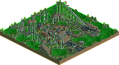
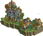
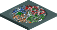
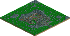
New Element is proud to present Toxicitiy, by DelLagos! You may have seen this on the Ad District. It's definitely one of the better wasteland-themed creations I've seen, and it's a promising official NE start for DelLagos, who just missed getting a Design last time when he sent in Creep!
Hopefully, we can see more work (a park perhaps?
Corkscrewed Offline
anyway,
the screens look very cool.
congrats DelLagos.
another reason to install rct2, hmm...
Looks like some good work there, i'll check it out for sure.
(and I fixed the spelling in the title...)
I think the best wasteland design was Micool's Resident Evil... crazy awesome.
But congrats to DelLagos on the Design!
The only bad thing though is that I had to download around 80 new objects, but it was worth it.
Jon
Edited by vekoma9, 27 March 2007 - 04:25 PM.
I hope, my next will be a bit better...
This wasn't the best design ever, but it was good enough, and it's good to see that a newcomer's work succeeded. Hope you keep progressing.
Congratulations!
Nice work, but lets see something other then a coaster design. How about a full park?