Park / Point West Theme Park
-
 03-November 19
- Views 4,714
- Downloads 559
- Fans 2
- Comments 25
-
-
 65.00%(required: 60%)
 Silver

csw 75% bigshootergill 70% Camcorder22 70% Scoop 70% Coasterbill 65% G Force 65% Jaguar 65% posix 65% Cocoa 60% Faas 60% RWE 60% CoasterCreator9 55% 65.00% -
 Description
Feels super good to submit this park. This is definitely my best work to date and I'm proud to say that I took my time to finish this park even in the final stretch.
Thank you to everyone who gave me suggestions on my screens and to those that inspired certain parts of this park. For your contributions a mechanic has been named after you.
And finally thank you to everyone on this site who still plays this game. It is so cool that there is still such an active community for a game as old as RCT:) -
2 fans
 Fans of this park
-
 Full-Size Map
-
 Download Park
559
-
 Objects
366
-
 Tags
Tags

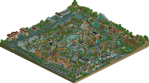
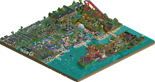
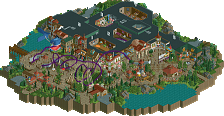
Positives:
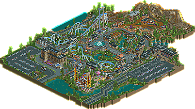
+ Really like the Hotel building next to the entrance
+ Tsunami has a cool station
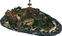
+ Rocky River has a cool overall shape
+ Overall pretty cool architecture
+ Wodden Rattler looks really cool
+ Cool Merry Go Round
+ Wild Twister
Negatives:
- Layouts somewhat lacking
- Some attractions not named
- Architecture a bit messy in parts
Overall:
Very neat park. It definitely shows a lot of promise and I think you're looking at a bright future on NE. 60%
Pretty cool park albeit maybe a little bit of a strange park.
The park is really small so it seems a bit unusual to have such a big coaster like Tsunami in the park. The layout of tsunami was also kind of weird but I also kinda liked that.
The architecture was nice albeit a little bit repetitive maybe. (Every roof has a crown moulding surrounding it in the front end of the park!). I especially liked the hotel and the other big building next to the hotel.
I thought the area around wild twister was kind of cool although I did not like the layout of wild twister itself. It seems really small and I think it would have looked better if it had been a little bit more drawn out.
Overall a pretty cute small little park. Nice work
Architecture is definitely the highlight here.
I think perhaps there's too much tall grass sparsely placed in areas that might be better served by flowers or more intentional foliage instead, and then some more 'wild' looking areas have flowers mixed in with the tall grass.
My favorite ride is the flume, it's very nicely integrated, and I like the river portion after the drop. But as an enthusiast, the coasters didn't quite do it for me.
Despite that, cool place. Keep it up. ~B-]
Thought this was lovely and full of promise. Confused about the slow pacing of the blue coaster. Very pretty looking ride, but why go forward with it when it's obviously too slow?
Little disappointed the stalls/shops and trackitecture wasn't named.. seemed unfinished to me. Also cropping the park was a bit tight for me. I'm not a huge fan of park surroundings, but it's a bit close when you blacktile only one square away from your car ride and the wooden coaster.
Other than that, everything was very pretty and nice to look at. It's just so tiny! You have solid archy and foliage work. Layouts are lacking though. Having said that, the flume here is the highlight.
Sorry this sounds harsh, I enjoy your style quite a bit. Your colors and building style are fresh and new and I look forward to seeing your next project!!
I agree with the general consensus here - there's tons of potential, and I really like the atmosphere you are going for, but execution is a little bit flawed in many places. A few examples are not naming all the rides (I know this can be hard, but just something very generic would have done the trick!), certain decisions and details regarding your archy, and the quite anticlimactic layout and pacing of the big coaster. That said, there was also a lot of great stuff in here:
- Overall park and path layout looks good, and path selection and decoration looks solid
-Overall color choices and composition looks good (for example, really liking the impact of the light blue of Tsunami)
- The flume ride and its surroundings is neat - although perhaps it feels a bit "inverted", in that the big drop comes in the beginning, and then there's just a small drop left after a lot of transportation.
- Some specific buildings are great - the gift shop in front of the woodie, the Food Stop building by the entrance to Tsunami, the big-ish building between the hotel and Tsunami, and the Sun café over the log flume are just a few that stand out. The hotel is pretty nice too, altough it seems to have major glitch issues with some wall overlaps, at least for me.
The thing that would have made the biggest difference for me is if you would have spiced up Tsunami a bit, or perhaps a lot. Even though you might have fully intended the style and pace of the layout (which is odd given the coaster type), and even if it is aesthetically pleasing, I think there was plenty of room to make the first drop a lot higher to give it more speed, with which you could have thrown in a few inversions. In fact I know there's space, because I just had to try this for myself, and even after just one pretty sloppy attempt I think it was a little more impressive, sporting a large loop and interlocking corkscrews (sorry for meddling with your stuff, but I was really curious).
Overall, good job - I rated it a 65. if you take some of the comments here into account I would be really excited to see your next release!
As a whole this was quite nice, perhaps a bit smaller than expected but everything felt complete and finished. Overall it was a very full project which is always nice to see. Even though I'm a sucker for Mekong browns you might have gone a little overkill here, but regardless you created a good atmosphere and a nice submission overall. You have great potential so hopefully we see more from you soon.
This is a solid silver imo, and would be in gold territory if it were denser and larger. It's definitely a big improvement over your last work while still maintaining a distinct style.
One thing about this park is that it's very drab and the majority of it is brown, grey, and black with a few bright colored rides standing out. Normally that would have the negative effect of making a park very gloomy and dull but somehow it works here.
If there's anything this park can improve upon, it would probably be some of the layouts. Tsunami is an aesthetically pleasing coaster that interacts well with the good landscaping that surrounds it. However the lack of airtime hills or inversions does bring it down. I can also see what Splitvision means about the flume being a bit 'inverted', although it's not at all a bad ride.
In terms of aesthetics though, it's nailed down perfectly... that hotel building, despite its glitchiness, is ace. And as mentioned for Tsunami, the landscaping and rockwork is very well done. All in all, a well-composed, high-quality park
Lovely park dude, you're improving fast and it's great to see. You're style is definitely well defined and it feels almost like bold text in RCT2 if that makes sense.
Your architecture skill is getting better, though at the moment I think you overuse the crown moulding pieces but that's a minor point. The colour choices were good overall and you've taken to that dark brown shade nicely. Just be careful as I think it tends to overpower in some places and brings down the atmosphere. Your layouts are decent, I really enjoyed the woody and its station was one of my favourite parts of the park, alongside the log flume.
Not sure if twister trains on Tsunami were necessary since it lacks inversions, hyper trains would have been more appropriate I think, or adding some inverting elements. Agree with luketh on the foliage, some more prettier gardened areas would have been nice. Hope this doesn't sound too negative haha, I really enjoyed the park overall and it shows a lot of promise, looking forward to more.
Man this park is incredible.
The hotel building at the front of the park is perfect. The colors are spot on, and the structure is interesting, but also clean and readable. I love the glass windows on the bottom level, as well as the really cool curved bit on the park side.
Rocky River is probably my favorite thing in the park. I love how flowing the layout is, and the path interactions are incredible. Nice work on the queue as well!
Only thing I'd personally change is the surroundings of the park. I think it would benefit from slightly more surroundings to give it more context.
I always love to see your work. Keep it up!
I really liked most of this park, the only eyesore is the intamin impulse imo. It kind of really upsets the rest of the palette. Can't wait to see more from you. I think you might be one of the best upcoming builders.
This park is great. I scored it a silver but the size was a big factor in that. In reality I think it's almost gold quality.
The coasters (for the most part) are great. I love Tsunami. Ignoring the fact that I don't buy the curved first drop on a B&M, the layout is perfect, flows beautifully, is well landscaped and is easily the highlight of the park.
Wooden Rattler looks amazing also. You really have a knack for making coasters look great (well... except Wild Twister, lol).
Architecture and landscaping are a major highlight here as well. This whole park just looks polished and has a great style to it.
The supporting rides also look great from an aesthetic perspective. I really like Driving Journey. It's simple but fits really well. The flume looks great but the layout feels a little backwards as it starts out with a bang with an awesome drop and then just meanders it's way back to the station at low speeds with a few drops mixed in. That's a minor complaint though.
Overall this park is great. If anything I just wish it was larger.
Looks like I might've been one of the higher votes on this one but the aesthetic here is right up my alley. Its kind of an anti-dirty American realism park in that its way nicer and has a way more high-profile coaster lineup than would be realistic for the average American park, but it clearly isn't trying to be photorealistic and so I enjoyed it. The heavy use of brown wood trim and rock made it feel like if a bougey Rocky Mountain ski resort aesthetic was applied to an entire park, which I clearly am into.
Although others have pointed out some lack of refinement and attention to details none of the things mentioned really bothered me that much. I am a bit confused figuring out what type of coaster Tsunami actually is (its a non-looper but with a looping B&M type drop) I hardly care about its flaws or weirdness because its framed with its surroundings so beautifully. The interaction with the road, lake, bridge, log ride are all so well done and pleasant to look at. That being said, it looks like you could've pulled off adding another two units to the lift and improving the pacing of the layout without making any other changes. Sending out your park to a couple people before submitting could help avoid some of those issues.
As for the lack of naming stalls and trackitecture...idk what to say if that really is a huge detriment to people lol. I personally am never clicking around on random track to make sure its named according to NE standards so that has never bothered me. Maybe the "Tower 1" and "Tower 2" crossed the line of laziness a little bit though.
Overall, I personally much more enjoy seeing slightly unconventional parks like this than the same cookie cutter realism parks over and over. You already seem to have a distinct style, and if you fine-tune and keep building like this at a slightly bigger scale I think you could be entering high gold territory.
this was a small little park, but nice. Love seeing some improvement from you. I think your infrastructure is pretty good- nice paths, landscaping, ride integration, and overall park composure. That stuff is always good to see. The architecture is fine- maybe a bit samey in some sense- a variety in building style/ theme/ colors could go a long way. For some reason your buildings still seem 'cartoony' in a strange way- something to do with the dark frames around all the edges, the windows used, the small scale- hard to pin down.
The layouts could use a bit of work- they're a bit slow and awkward in parts. But I like that they interact well with the park. the log flume was my favorite, especially the river it runs through at the end. nice shit overall
The scale is small but I think it's closer to a realistic scale - and it looks a lot cuter. I also like how everything is close together - some of the rides are pretty much on top of each other - but it doesn't feel cramped. Great park.
also - I disagree about the pace of the blue coaster - I thought it was fine.
version 1- thank you for the review and the feedback:)
recurious- thanks for the review, I agree with your point on archy definitely, I appreciate the feedback
Luketh- Thanks for the review, Your foliage and layout points are noted
posix: Thanks for the comment:) Layouts arn't my strongest asset, I liked the pace of the roller coaster but I understand that the consensus is the opposite haha so its something ill have to work on
ottersalad- thanks for the feedback, Yea the park does seem a bit cramped looking back. I never really think to name my shops and stalls but its something I'll start doing
splitvision- Thanks for the feedback, the park was originally going to be a lot smaller which is why the drop for tsunami isn't as tall as it could be. I actually intended tsunami to not have any inversions and just be a fun coaster with a scenic view and a lot of twists and small drops, I used to twister coaster and trains only because they are my favorite aesthetically . In hindsight i see why that could take away from the realism though.
G-force: thanks for the feedback:)
jaguar- Thanks for the review! I'll have to do some more work on my layouts for sure, thanks for the nice comments
Xtreme- thanks for the feedback! I agree that I may be a little too obsessed with the Mekong brown haha
coasterbill- Thanks for the comments:D I kind of wish I added a bit more to it now also, I know in the description I said i felt like I didn't rush the release but I definitely rushed the release haha
Camcorder- Thanks for the nice comments man I'm happy you liked it. Man those tower names do sound super lazy looking at it now. My intention was to have like both towers be part of the same ride called "terror towers" but I may have not pulled that off aha
Cocoa- Thanks for the feedback. Your comment on my taloria park was actually big in helping me improve my pathing and ride interactions so thanks again for that
csw- Thanks for the comments, I'm glad you liked it
Scoop- thanks for the comments man. I find myself laughing at all these comments about wild twister, I definitely see where you guys (or ladies) are coming from
IN:CITIES: Thanks a lot for the nice comments, I'm happy you enjoyed the park. I definitely want to do some sort of project with you at some point
I enjoyed seeing the details and the overall design.
MrTycoonCoaster- thank you for the comment I appreciate it. My thoughts are with and your family