- Views 1,851
- Downloads 505
- Fans 0
- Comments 7
-

-
 37.00%(required: 65%)
 Design Submission

Camcorder22 45% CoasterCreator9 45% Jaguar 45% bigshootergill 40% csw 40% posix 40% RWE 40% G Force 35% Cocoa 30% Scoop 30% Liampie 25% saxman1089 25% 37.00% -
 Description
Well...here it is. This coaster represents something I've wanted to get off my chest and onto NE for years now, I just never had the time or the motivation to finish it. I could keep tweaking on it for eternity because I'm obsessive about my own nebulously-defined idea of "perfection" but, for once in my life, I'm happy with where it is now. If I keep fiddling with it, it'll never get released.
July 23rd, 2011 - October 14th, 2019. 8 years, 2 months, 21 days. It's not a grandiose, utterly massive group park-cum-Mama Bear tribute like the Masters Palette that finally saw the light of day thanks to Kai, but this is the first "tryhard" project in RCT that I've ever properly completed. All the shit that came before was my youthful, arrogant innocence telling me I was good. Kai coming back and finishing the Palette after so long was a big part of my motivation for me to come back and finish this.
When I started this project, I was barely in high school; I've since completed junior college and I'm on my way to a Bachelor's. I've had my ups and downs with NE through the years, including getting tempbanned oh-so-long-ago, and later on a dark period that drove me away from the game when jealousy over other members' abilities overtook my wonder towards them, but I've always gravitated back to this game and to NE, because I've realized each of them really are something special, once I grew out of my immature bullshit.
This probably won't get a high score, or whatever, but I just wanted to say...thanks, guys. Y'all are pretty cool people.
...Also, bring back NE4. -
 No fans of this park
-
 Download Park
505
-
 Objects
131
-
 Tags
Tags
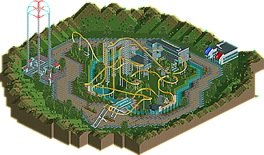
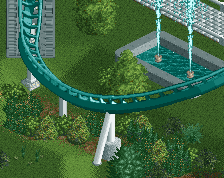
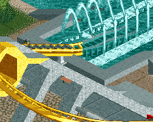
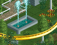
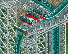
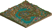
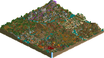
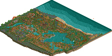
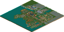
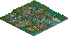
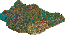
When I opened this, I was actually surprised because the coaster itself looks better in-game and the area around the track is fairly well-composed. The layout is nice, although I'm not a fan of the second holding break. I never knew splash sections worked on dive coasters and there are a few cool interactions, like in the underground area. Using that steep base block as a land texture was also a good idea.
With that said, there are some 'cardinal sins' of RCT in this park, although I assume it's due to rushing an old entry. For starters the wide path that simply goes around, rather than through the attraction (not to mention its mixed textures). The surroundings also leave a lot to be desired, using the mountain tool in excess almost never looks good and it doesn't really provide this park with context.
This park is so reminiscent of 2010 era realism and it's nice to see. And given its start date, it is a massive improvement from your previous releases. It's a nice release and while I don't think it's at the level of design yet, this release shows skill and I can see you getting an accolade in the future, so long as you work on surroundings, foliage, etc. to give your parks more context.
Long coaster, nice. Obvious focus of the map, yeee. Great stats too.
A second vertical drop is an idea I like, but it happens so shortly after the first drop, rather than acting as an mcbr to give the ride a faster pace toward the end, or something to that effect.
That quick second lifthill cuts a 165-foot drop to a 115-foot drop so soon, with a turnaround as the connecting element, rather than like an inversion or something.
Otherwise, I enjoy the coaster and its setting. Somewhat of a utopian, or at least futuristic feel.
I think the space shots (and the paths, @ what Jag said) could have been incorporated into the layout, rather than beside it.
The rest (landscape, foliage, architecture) was quite sparse, there could have been more to set a stronger atmosphere!
Getting into your writeup, I'm sure others feel differently, but to me RCT is less so about ability, and moreso having fun with the game by way of creative expression, however that looks.
If the end product is something you're satisfied with, that's what matters. This forum can think what it wants. And it will. Snarky bastards!
~B-]
This was a lot better in-game than I expected it to be from the overview. The layout is awkward but fun and the bench was very old-school which was neat. I also liked the front of the station a lot.
The layout could use some perfecting and I wish you spent more time on the surroundings as I didn't love the wide path or the drop tower but the bones are there and there's a lot to like here.
The layout somehow works and I love how vibrant it looks. Wherever you have theming with large, abstract shapes it also looks pretty awesome.
I didn't even notice this went up days ago! Whoops. Been busy.
Thanks for all the comments, guys! I'm aware of its shortcomings and the areas where it needs improvement but it was getting staler-than-stale creatively and I felt it was at an adequate place to release to say "hey, I'm still around and still improving"
plus I just feel really awkward trying to do archy most of the time so I didn't really know what else i wanted to do with the surroundings...I'm happy with the layout and the theming in its immediate area...anything outside the radius of the coaster was on-the-spot improv and it prolly shows
I took some inspiration from late-00s "hyper-futuristic" RCT archy for stuff like the midair tunnel. it looks zany but I like it and I'm glad I'm not the only one.
I think my favorite thing here was the yellow stripes on the station and the way the window broke the last one up. Cool.
the layout was a bit deadly and long, and surrounded sort of awkwardly by a loop of path in a valley. Would have loved to see more variety and context to the map.
I'm really with cocoa on this. The composition lets it down by being a ride in the middle of a path doughnut.
I think it's largely because this is an old thing and you're not 100% confident in your architecture yet, which I totally get. Sparks of some really good stuff is present as people have highlighted already - keep it up.