Park / Emerald Pointe
-
 17-October 19
- Views 9,655
- Downloads 1,141
- Fans 13
- Comments 28
-

-
 89.00%(required: 80%)
 Spotlight

bigshootergill 95% yes Jaguar 95% yes RWE 95% yes CoasterCreator9 90% yes robbie92 90% yes saxman1089 90% yes SSSammy 90% yes Cocoa 85% yes posix 85% no Scoop 85% yes ][ntamin22 85% yes G Force 80% yes 89.00% 91.67% -
 Description
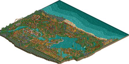
Emerald Pointe is a major, year-round theme park, beach and resort located on the Southern California coast. Starting as a small beach attracting mostly locals, it’s grown over the years to include resort hotels, a boardwalk, an entertainment district and one of the world’s premier theme parks with a large collection of daunting thrill rides and rollercoasters.
-
13 fans
 Fans of this park
-
 Full-Size Map
-
 Download Park
1,141
-
 Objects
639
-
 Tags
Tags


I think you're literally the only one that still doesn't have OpenRCT2. It's simple to install, if you're having issues you should definitely reach out to the devs and figure it out.
Congratulations on accomplishing such a great achievement! This park is purely awesome. I was struck by the size of it, actually took me two viewing sessions to view everything roughly, the amount of content is incredible.
I totally get the feeling of kind of park that you aimed for. And to me it's feeling very real. I applause to the effort of creating tons of extra signage for the park. It really does add a lot to it. Taking it back from the normally cartoonish RCT to something more real. The diagonal information tables with the current waiting times is my favourite I think.
The park is not free from flaws. Some of them due to compromises with the object limit I guess (no underwater building) some just from my point of aesthetics (I found the foliage kinda weak, to samey, spotwise uninspired and too dense). Architecturally this park is not in the top tier. Looking at each building individually, not a lot of them stand really out I must say. The touches from the custom signs however, as said, do give them their own identity though! In the end it doesn't really bring down the park for me though, because it's consistent and it delivers your style, which is good. The park has its charme. While not technically superior, the amount of content evens it out. In the end it flows together very well, maybe too well even. The different theming areas are kind of alike a lot, which results in a general mishmash of one super theme IMO (and the pointed out orangeness of the whole park).
What I also liked and found realistic was the ridiculous amount of Q-lines in the park. I mean 80% of the peeps in the park are queueing for a ride. Bold move.
I really enjoyed viewing the park. Lots of times I really could imagine myself being there and maybe even wishing to! Also your creativity in getting around the object limit is remarkable.
Congrats on the spotlight, Bill!
Congratulations Coasterbill on the Spotlight and the Elite Parkmaker. An incredible achievement! Your park almost killed my laptop when I opened the file (I know it's an old machine, but no ORCT park ever got it this far). I don't think I've even seen half of all the details you've put in this after looking at this park for an hour, but my mind is blown. This is definetely going to be a park I'll frequently revisit. It's got such a great atmosphere and it combines incredible coasters with amazing decoration. I'd love to visit this park in real-life.
I had a reply all typed up and then lost it. It was several paragraphs. Ugh. Anyway, since the park is chocked full of humor, I'm attempting to write a reply in a not-very-serious manner.
Well here goes.
*Opens park*
Alright another CB park. Yay for coaster hills shaped like Lara Crofts "pair of pyramids" chest from back in the PS1/early PC days. No offense dude but some of your coaster hills in previous parks look like triangle waves from circuits class lol. Oh and checkboard textures, looking forward to more of those because if I can make my impaired vision bad enough I might be able to claim disability on ..... something. Or just never be able to join the air force. Not sure that's a problem though.
Anyway, the park. Wow this is amazing, look at all that tan. Oh hey and a wing-rider in there. Ooh it's launched. Why isn't it launching. Is it broken down or is the block brake glitch keeping it from working.... 100+ SECONDS OF WAIT TIME dude Bill WTF is wrong with you lol. Well it's realistic I guess, damn. Hope every ride isn't like that.
Damn that's a lot of tan, really oughtta throw some darker shades in there to be more ethnically diverse dude. That tan color is just a little too white. Buildings and atmosphere are great though. Minus the fact that my almost 10-year old laptop sounds like the Red Barron being shot out of the sky while trying to run this park (shhh, it'll all be over soon little buddy ............... that's what she said WAIT WUT)
Beemer looks nice because I don't see Lara Croft PS1 tits-shaped hills yet (and frankly don't want to look and ruin the mood). Entrance is baller. Also peeps actually having to wait in line to enter the park, Bill you sick bastard. I thought they were all just objects but no, you have to make them suffer. Hilarious.
Speaking of hilarious, that strata is a bonafide neck snapping MACHINE. And if you somehow survive the horizontal-to-vertical transition to climb the tower, it'll surely finish off your weakened spinal cord as it passes through the vertical-to-horizontal transition at the bottom. That's like, more than 90 degrees of change per second, damn lol. I haven't laughed this hard in a long time. Also that airtime hill. Shit that hill probably pulls enough negative g's to straight-up undress people via yanking their shirts right off over their heads. I mean the whiplash would be painful if you're still alive at this point but does that matter? The peeps don't seem to mind it and the CPU forces them to live through the experience. That coupled with me having Open make them be happy and energetic all the time, they get right back in line with 400 other people to wait god knows how long to ride this murder machine over and over again. It's magnificent, a true hell on earth. Damn I didn't know this park would be so deep and metaphorical, props to you bill for figuring out ways to torture people in ever lasting neck-snapping agony that Satan himself would be proud of.
Wow that is the nicest chairlift and station(s) for a chairlift I have ever seem in my entire life. Shit where's Coupon he would have soiled every sock in the house and completely destroyed the Kleenex supply at the sight of this thing. It's poetic too. Long, white rods sticking up into the sky with a blob of stuff on either side. Little footer on the bottom. Oh yeah, it's all coming together. The peeps all arriving in quick succession too. (this post is going to get me banned I know it).
Aw damn there's that fucking checkered shit again. God dammit Bill, no one likes this. Why do you insist in putting this rancid shit pattern in so many places. I know you probably are proud of the fact your bowel movements somehow exited the appropriate orifice without killing you, but modeling them in RCT is something that no one ever needs to see. Damn I gotta bleach my eyes. Also ORANGE. Fuck dude. I really like this park but the sheer volume of orange is..... unfortunate haha. Also two red B&M's in the same park is equal parts ballsy, stupid, true to real life, and sad because the two previous points aren't mutually exclusive. Good job there.
Wow that boardwalk is fantastic. Minus the checkerboard anything. Fuck that shit. Really great aside from that though. And yeah like others mentioned, two hotels. Shit everywhere (mostly because brown is apparently a theme, see what I did there?). Fantastic.
Sadly I don't have a ton of time here, a lot of this is really great. But I wanted to see Bill's hidden humor and it doesn't disappoint. Another note, a viewer never really have to open the scenery menu to view someone's completed park, it's all there on the map, for the most part. But damn do you get a treat if you open the scenery tab. I haven't laughed this hard in a long time. The two custom tabs you made are fucking hilarious dude. And the fact you put all those little surprises in there. I won't spoil it here but I was laughing so hard I cried. I love it. Also the staff list is a fantastic read.
So I went through and deleted every ride, shop, stall, removed all guests and closed the park. It's worth noting there were still scenery peeps everywhere and pieces of track throughout the park. That was pretty cool, but then I took it a step further and opened up the scenery remover. I set it to delete everything but large scenery items and..... wow. Bill you're insane. There is a staggering amount of the park that's STILL THERE. Haha!
You should be proud dude. Even if a mistaken right-click can smite half the park with divine wrath, it's a ball.
There's a lot more to see but I've already started this post over once so that's all you get for now.
P.S. Your dispatch times would make the peeps hate you if I didn't have Open force them to like it. Mmmmm sadism. Sweet, sweet sadism.
Thanks so much for the great reviews!
Personally I always found it strange that people focused so hard on perfect realism like maintenance buildings, transfer tracks, drainage systems and perfect road design but then left coasters with 36 passenger trains dispatching in 10 seconds. I like having realistic wait times and dispatch times, it makes the park feel more real to me.
That said, open isn't forcing the peeps to stand in lines. Guests are staying in line because I made an invisible queue TV object and you can find it on almost every square of every queue line. In my older parks like Sunset Vista the queue lines are totally spammed with queue TVs, but in this park I decided to open the queue TV, erase it and save it with a new file name to see if it would still function and (surprisingly) it does! That's one of the few "useful objects" buried in this park full of useless crap. lol
As an aside before you all crucify me for that, path objects do not count against the object limit.
wow that is actually super useful. why didn't you make path objects that look like walls and shit? I swear I have a few sort of like that in my object folder as is
Congrats Coasterbill on what is a massive achievement. Makes me so happy to see you prove all those wrong who kept saying larger scale parks are a thing of the past. Ironically though, this comes at a cost: it felt as if you'd developed one theme or look, and then rinse-repeated it all over the map. It's a nice look, don't get me wrong, but at a certain moment into the park, I couldn't see what the point was anymore. Hence my "no" spotlight vote, which of course is rather irrelevant in the otherwise omni-positive and deserving turnout. I'm very happy for you having completed this.
So Bill, I promised you a review and the time has come for me to write one.
First of all, WOW what a park bill! What a huge achievement. Before I had opened the park and only saw screenshots I didn't really think this would become a spotlight worthy park even though the size was very big but when I finally opened the park myself I was blown away and my mind was changed instantly. This park definitely deserves to be a spotlight in my eyes. Not only is it enormous, I feel like the immense amount of detailing in this park is unparalleled on such a big scale. This innovation is what really pushes it over the edge for me and why I consider it a spotlight. The cohesion in the park is great too and I think this park really also works because of the immense scale. Many RCT parks are extremely realistic but the scale of the rollercoasters and the park itself has to be adapted in order to work in RCT, but this park just says fuck that all and uses a realistic scale and in some weird way it just works very well.
Having said that, I don’t think the park is without its flaws. I think part of the flaws can definitely be explained by the object limit but other flaws are just inherent I feel. One of the main offenders imo is the colour scheme: holy crap this park is so orange! Every coaster in the park besides the wing rider and the suspended coaster has either one of the following colours in its colour scheme: Red, yellow or brown. I wish you had made things a bit more colourful overall!
For the remainder of this review let’s take a walk through the park starting from the entrance area:
The entrance area overall is pretty good imo. I like the interaction with the B&M hyper and the fountain looks great. I specifically like the interaction with the B&M wing rider going over the lake and path, it reminds me of Furious Baco.
Going to the left we arrive at the area of the Wing rider. To be perfectly honest I wasn’t a huge fan of the wing rider besides the interaction with the entrance area and the dive loop + loop combination. The layout is fine but I feel like it doesn’t really fit the park that well, possible due to the colour scheme. I also felt like the station building was one of the weaker buildings in the park. The area surrounding the wing rider is fantastic though. I love the sculpture near the queue entrance and I also thought the catacombs haunted house (not really sure if it’s a haunted house as it doesn’t appear to be connected to the park? Or is this one of these haunted houses that only opens during Halloween?) was great. Like I said before I really like the interaction between the dive loop + loop combination and the path as well.
Moving onto the small kiddie area /area with the small flat rides. This area looks great imo although maybe a tad bit busy. Overall very well done and I love the double tram tracks to take guests up the hill.
The western area: Overall I like this area. The station of the skyride is well done and I adore the station for boomtown blast. Not a huge fan of the buildings that make up the dodgems ride though, the scale seems a bit off for whatever reason here although the show was cute. I also like the way the B&M hyper interacts with the landscape/path at this point. The RMC was nice although RMC’s don’t really translate that well into RCT imo. I love the shape of the station building but I feel like it is a little bit underdetailed (understandable due to object limit). Most of all the checkerboard pattern on this building just looks horrible sorry . The log flume was cool, especially like the queue line and the station building. I also love how it wraps around the intamin blitz coaster and the boathouse is great.
The intamin blitz looks great and is probably one of my favourite rides in the park. The layout is sick, the interaction is great and the station building looks awesome as well. Well done. I also love the mine train. I am a huge sucker for mine trains and this one is pretty cool although I do think the layout could have been better. My favourite part is the interaction with the log flume.
The area with the shuttle loop was one of the weaker areas imo. I feel like the buildings look kind of blocky and boring and overall this area is just a bit bland. There isn’t really a lot that stands out.
The area with the suspended coaster is one of my favourite areas in the park. I love the layout of the suspended and the way the diagonal lift is supported and goes over the buildings underneath. I also like the interaction with the river rapids. The foliage makes this part of the park really look like a jungle which I think is what you were going for, I can imagine that it would be so cool to soar through the jungle in real life on the suspended coaster.
The dive coaster was alright. Nothing really standout but it serves its purpose. I like the crocodile head queue entrance although I do feel like it could have been executed better.
The Arabian area was also one of my favourites. The area near the chair lift station is fantastic. (In general I think the chairlift is great!) I love everything about the dark ride, the queue, the buildings and interiors. The water coaster is also great imo and I like the sign pointing to the entrance. The ship near the splashdown is also well executed.
Moving on to the strata coaster. Yea I’m definitely one of the people who didn’t like this . Earlier I said that this park uses a realistic scale and that that somehow works. I feel like the strata coaster is the exception to this rule. Strata coasters just don’t look great in RCT imo, but I know you like it so it’s whatever
  . The placement was done in a smart way so it doesn’t really obstruct anything important anyways.
The B&M invert was cool. I liked the layout and overall I just thought it was well executed. The spinning coaster was great too. Even though it isn’t anything special I really like the way it is placed into the park. I like how as a guest you can get a clear view of nearly any part of the track from the walkways around it. The MCBR is also placed at a cool location which looks cool.
Finally the waterfront: I am a big fan of the waterfront area. The restaurant with the boat is fantastic as is the boardwalk area to the left of it with the blue roofs over the escalators. Probably the best area in the park (well not in the park, on the map) imo. I also like the restaurant in the hotel which attaches to the boardwalk although the two hotels themselves didn’t do that much for me. They were well executed but they did not really stand out.
Overall a very nice park. I can’t imagine what a nightmare must have been a nightmare to finish. The attention to detail is insane and the surroundings make this park feel so complete. I think the score is well deserved. Congrats man.