Park / Crimson Brink: Heart of Darkness
-
 16-October 19
- Views 1,464
- Downloads 484
- Fans 1
- Comments 8

-

-
 Description
"The horror, the horror."
-
1 fan
 Fans of this park
-
 Download Park
484
-
 Objects
307
-
 Tags
Tags


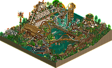
Very interesting choice to theme this after Heart of Darkness, that's a very dark theme indeed. This is one of your best parks in my opinion and it's a shame that it's a mini-park because the atmosphere is perfect... this deserved a victory though.
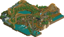
There's a lot of cool details in this, the waterfall is great with the rapids trackitecture, and that diagonal ship is impressive. The expansion scenery is used very well, you should've added some animals though lol. The layout is strange as it has two 'main' drops but the interactions are nice. I guess to be nitpicky, there's nothing to prevent the underwater tunnel from flooding.
All in all, a very nice park and I love your unique style of building, using neglected objects and executing them to perfection, there is a ton of creativity involved. It's interesting that stuff that's technically NCSO comes across as so refreshing and I hope to see more releases from you.
I love this.
Ivory Express is obviously the focus of the map and it's a ton of fun. It has some awkward moments but it's uniqueness really won me over. I do think that the supporting rides and theming is probably a level above though. Hunger Games, the drop tower and the little thematic details are really my favorite things about this. I know this is a supporting ride but I really like the aesthetic and weirdness of Violyn. It's probably my favorite thing on the map.
I wish this were larger because it's great and it's a really cool theme. You should be proud of yourself.
The steamer is very impressive! I love all the creative roof work and the supports.
very cool stuff. impressive structures and texture use as always from you, and the layout is just wacky enough to be awesome. the steamer is great too. I really like those aztec objects as rocks, and I think you use it sparingly enough here to really sell it well- maybe i'll try this idea out in my parks. Is there a converted non-ww/tt version? cool atmosphere all up.
I'd love to see something on a bigger plot of land from you! or maybe just not square
Skiffdawg you're gonna force me to buy the expansions to see these wacky creations, aren't you?
Skiffa Offline
Luketh you should, there are some gems in there. I get allot of mileage out of the corner fill pieces and the temple pieces.
I found this to be a bit on the chaotic side, but great and especially interesting. Deruklink's followers have showed that handled with care and an eye for texture, the reviled WW/TT objects actually can be used to form something pretty and consistent. Add a typicaly bonkers Skiffa layout, and you've got a winning formula. Violyn especially is my favorite here. Only thing that bothered me was the bulkiness of the swing. Great work!
I think this is nice and unconventional, probably a Design contender had it been submitted competitively.