Park / Campi Vinobacci
-
 25-June 06
- Views 18,933
- Downloads 642
- Fans 0
- Comments 81
-
 No fans of this park
-
 Download Park
642
-
 Objects
296
-
 Tags
Tags
![park_2097 [NEDC] Schwarzwald - #2/9](https://www.nedesigns.com/uploads/parks/2097/aerialt1887.png)
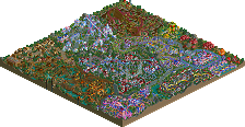
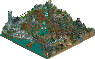
Truthfully, I'm a bit surprised we are leading by so many votes here.
The whole Las Vegas 2010 is a great concept executed here with moderate to above average quality. Overall, I really think it lacks the glitter you would see in Vegas these days; with all the lights, neon and what not that were absent. Really the only thing "vegas" about this park is its name.
Furthermore, I found the hotel impressive yet repetitive at the same time. I certainly liked the enormity of the structure and its definitely one of the more unique RCT structures I've seen in a long time. But I really think it could have benefited from more complexity. Virtually every side, window and wall were exactly the same 360 degrees around it (with exception to the elevator shaft glass which didn't break up the mononity too much either).
As for BORG, I enjoyed it and thought it flowed nicely. Nothing ground-breaking but ride-wise it was definitely better than our coaster. The Manhattan Express side of the park didn't do much for me. Again, I found the buildings to be too repetitive to hold my interest very long. Really, anyone with decent RCT knowledge can make buildings like that; its not very difficult.
However, I must say the Tiger's had the more complete park which should be guaranteeing them more votes. I admit our concept was slightly on the cliché side, but I still think we did good considering the resources and situations we were up against. And while I hate to say it, if I were a common voter in this match I probably would've voted for the Tigers here mainly due to the completeness of thier park.
Eitherway, I'm just glad this week is behind us.
Go BANDITS!
Corkscrewed Offline
It's cool. Just don't do it again, son.
Let me meditate on that a moment... Two years ago... That would've been about the time I finished the International Odyssey and was feeling cynical after I'd screwed myself over with the lack of 1/4 tiles in that park. Well that and I couldn't spell then because I had dial up and hadn't discovered "dictionary.refference.com" yet, amazing what a difference that made. However I still occasionally forget to use a word correctly because I'm thinking far faster than I'm typing and thus fuck the typing part up rather than risking damage to my thinking... Lmao. Oh and Vegas's buildings are pretty, pretty enough that I'm thinking that I should've voted for them... Except that they're also boring and Manhattan Express should've indeed been a recreation as it's a real ride at the New York New York resort thingy.
Hmm... That was a long winded and pointless ramble, I hope for your sake that you didn't read it.
Ride6
Corkscrewed Offline
Thanks for reminding me why I used to associate you two together.
And Cork, thanks for making me realize why I stopped acting like this on the boards.
Ride6
I wasn't impressed with the italian park, either. I didn't like the wide open spaces with the occasional vines. The layout of the woodie was pretty good but that lift hill was weird and it wasn't block braked for some reason. To me that's sloppy and careless. Had it been built properly this would have been a no-brainer for me to vote on. It still got my vote but I thought for a long time about it.
i think i'll vote fore the tigers, simply because their park was finished.
Corkscrewed Offline
We'll put a stop to that soon enough.
Honestly, it didn't look much like New York either.
New York would be more like DJ's pt2 park.
-ACE
Really?
Here's the real New York-New York Hotel & Casino.
Here's the real Las Vegas Hilton.
I must be misinterpreting the entire park!
They're confident and I'm confident in them. We're not the underdogs this year.
Ride6
f0' realz dogz stop h8ing 0n dis playa. i meanz itz n0t k00l to h8 on hiz spellin l00k at his keyboard.
lets helpz a brotha out and getz him a new keyboard yo.
;-) that was painful
Edited by chapelz, 27 June 2006 - 05:49 PM.
that episode is pretty funny.