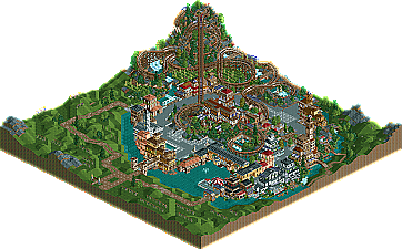
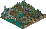
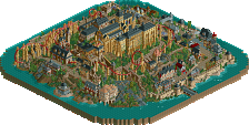
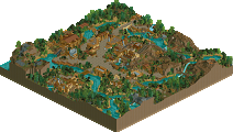
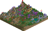
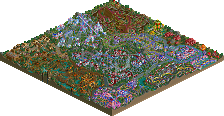
Nice parks. I voted for Las Vegas. To me, it just seemed much more believable. I mean, Campi had a nice vineyard thing going and it looked pretty realistic and all that, but then you go and throw a coaster in there on the same map? Why would there be a coaster right next to a vineyard? Its like nate's old PT1 park, only he was wise and didn't ruin it with a coaster. You had some pretty architecture, and I'm going out on a limb and saying Jazz and X250 on this one. Las Vegas just seemed more convincing. It's obvious who made this and that builder just took the Las Vegas strip, and made it seem like new hotels were constructed along with new coasters. There's nothing wrong with saying it's in the future, if anything it only makes it more convincing (and even 2010 isn't really futuristic like 2050 is, its only 3 years away!). Campi was nice, but it didn't have any point really. Las Vegas just seemed more believable as a park. Still, good job to the guys for getting a park out, and to iris for finally posting them!
Should I ban you for breaking the "don't say who you think made what park" rule?
Hard decision. I voted for Campi Vinobacci, because the archy was extremely strong and the atmosphere was pulled off well. All of the buildings, merry-go-rounds, etc. that were 'open air' helped bring an Italian Village feel to the park. Shame, though, you would have thought the ITALIAN Stallions would have made this ITALIAN-themed park!
Vegas had an okay atmosphere, pretty good archy, except on the hotel, which was exceptional, and good supports for BORG. The stations were cool too. But everything else wasn't very impressive.
Also, I liked the little touch in Campi Vinobacci where the barrels had Red Wine spilling out, although it may have been used a little too much.
I didn't like either of them at all. The Las Vegas one was a piece of crap if you ask me. Looked like something from years ago. And if thats Las Vegas in 2010 it looks like Las Vegas gambled their own city and lost. The coasters were terrible as well. Looked nothing like Las Vegas.
The other park was better and got my vote but it wasnt too good either. The coaster had good ratings and some nice spots but the park seemed to lack an atmosphere.
And haha at Ride6. I have nothing to say now. Lol. My vote was for the Bandits but I think this was a weak matchup with the parks.
I always like wooden coasters with loops in, ever since that one in BBB.
Again, I can't vote in any of these match-ups, just comment on the apparent quality of the parks. They both look pretty good. How helpful.
I voted for Campi Vinobacci - Tycoon Bandits.
Both parks are cool, but CV is more interesting, the woodie is pretty cool, and it has a nice atmosphere. (IMO)
Anyways, well done Tycoon Bandits and Ferocious Tigers.
Campi Vinobacci Well, to begin with, it has been done before a number of times, and each time before has been better than Campi Vinobacci. Disguising a half-finished mini park with a vineyard (that doesn't look like a vineyard to begin with) is clever, I'll admit; but, that doesn't help the fact that the rest of the park looks almost as bad as the vineyard itself. "Reason" or no "reason"... the park is what it is: unfinished!
My major gripe: Ponte Vecchio was pulled off horribly. The real thing is much more vibrant icon thanks to the dense architecture lining the Arno River. Here, it looks like you needed something recognizable, chose Ponte Vecchio, and plopped it down in a random spot. So much for atmosphere. Speaking of which seemed to be completely absent from the park. I didn't know that was possible with an Italian theme.
The real Italy is stunning... this park, not so much (read: not at all). Hell, even Naples looks better than this.
Las Vegas 2010 I'm willing to concede that I don't like the coasters too much, fine. But the hotels are absolutely stunning! How can this possibly be losing to a half-baked park—a half-baked, badly themed Italian park at that?
And I think it should be noted (for ride6's sake) that the Las Vegas 2010 was not a recreation (duh...) of anything, per se. You know, before he has a coronary.
Even if it wasn't my team, Las Vegas 2010 would have had my vote from just the overview.
Maybe it's just because it's going against my team, but I found the hotels in LV2010 to be actually quite simple. They look impressive from the overview, but it's just a matter of stacking a bunch of walls together. There's not a ton of complexity in massing and form, if you think about it, so while they look nice, I would not call them anything near the "best structures ever."
Oh schnap. Except I don't think they look impressive from the interview. At least the other park had some details and impressive archy.
Maybe it's just because it's going against my team, but I found the hotels in LV2010 to be actually quite simple. They look impressive from the overview, but it's just a matter of stacking a bunch of walls together. There's not a ton of complexity in massing and form, if you think about it, so while they look nice, I would not call them anything near the "best structures ever."
Yeah, that's about what I was trying to say earlier, though better put. Unless if you're building something like an arcology, which has a lot of unusual features sticking out, or something that isn't essentially just a repeated pattern, large structures can be deceptively simple. Not that they're bad, just not necessarily requiring that much more work than a significantly smaller building. And while things don't have to be complicated, in this case where the hotels are the main thing on the map, it becomes more of a deciding factor, IMO.
an arcology was the first plan for this week... that was when cbass was still on the team though
i have to say titan has a point, i don't see many people creating hotels like that. The other park is so cliché, and ok at that but nothing more. The coaster was ok from the angle the park opened up in, but when you pushed enter to look it from a side view it was beyond ugly. And, the park is unfinished. I'm not really that impressed with our park, the coasters were lacking. The hotels were nice, so were the supports. I'd say the hotels possibly could've edged being finished and all but i guess not.
my vote obviously goes to campi. i've seen vegas done a lot better in other parks like JKay's Vegas park and that recent one I saw from a Jerry Bruckheimer themed park (I dont remember who built it, sorry)
I liked the supports of the coasters in the Las Vegas park but I really, but really dislike the colors and the windows choice, it didn't fit in the park.
I much like the other park because it has nice colors and some nice buildings...
Don't get me wrong, they were both great parks, though I had to go with The vegas park, it was finished and I liked it alot. The other park was also very good, but a little unfinished, so I had to go with the Vegas park.
81 Comments
Steve Offline
Should I ban you for breaking the "don't say who you think made what park" rule?
Edited by Corkscrewed, 26 June 2006 - 11:08 AM.
Magnus Offline
I loved the empty land with the path at the one side of the park, which was the best part of the 4 h2h parks we have seen so far in my opinion.
Evil WME Offline
Edited by Evil WME, 26 June 2006 - 10:55 AM.
JKay Offline
Its good see our curse of park doing so well!
Much gratitude to iris and the other captains for granting the one week extension, as it was much needed.
Paradox Offline
Vegas had an okay atmosphere, pretty good archy, except on the hotel, which was exceptional, and good supports for BORG. The stations were cool too. But everything else wasn't very impressive.
Also, I liked the little touch in Campi Vinobacci where the barrels had Red Wine spilling out, although it may have been used a little too much.
Campi - 8/10
Vegas - 6.5/10
RMM Offline
The other park was better and got my vote but it wasnt too good either. The coaster had good ratings and some nice spots but the park seemed to lack an atmosphere.
And haha at Ride6. I have nothing to say now. Lol. My vote was for the Bandits but I think this was a weak matchup with the parks.
And thanks Cork for uploading the parks again.
Edited by RMM, 26 June 2006 - 12:12 PM.
mantis Offline
Again, I can't vote in any of these match-ups, just comment on the apparent quality of the parks. They both look pretty good. How helpful.
RCFanB&M Offline
Both parks are cool, but CV is more interesting, the woodie is pretty cool, and it has a nice atmosphere. (IMO)
Anyways, well done Tycoon Bandits and Ferocious Tigers.
John Offline
Well, to begin with, it has been done before a number of times, and each time before has been better than Campi Vinobacci. Disguising a half-finished mini park with a vineyard (that doesn't look like a vineyard to begin with) is clever, I'll admit; but, that doesn't help the fact that the rest of the park looks almost as bad as the vineyard itself. "Reason" or no "reason"... the park is what it is: unfinished!
My major gripe: Ponte Vecchio was pulled off horribly. The real thing is much more vibrant icon thanks to the dense architecture lining the Arno River. Here, it looks like you needed something recognizable, chose Ponte Vecchio, and plopped it down in a random spot. So much for atmosphere. Speaking of which seemed to be completely absent from the park. I didn't know that was possible with an Italian theme.
The real Italy is stunning... this park, not so much (read: not at all). Hell, even Naples looks better than this.
Las Vegas 2010
I'm willing to concede that I don't like the coasters too much, fine. But the hotels are absolutely stunning! How can this possibly be losing to a half-baked park—a half-baked, badly themed Italian park at that?
And I think it should be noted (for ride6's sake) that the Las Vegas 2010 was not a recreation (duh...) of anything, per se. You know, before he has a coronary.
Even if it wasn't my team, Las Vegas 2010 would have had my vote from just the overview.
Corkscrewed Offline
Titan Offline
Also, I would never ride that wooden coaster in real life, but BORG looks like a blast to ride, even if it's not super beatiful.
trav Offline
Oh schnap. Except I don't think they look impressive from the interview. At least the other park had some details and impressive archy.
My vote = Bandits.
Xcoaster Offline
Evil WME Offline
i have to say titan has a point, i don't see many people creating hotels like that. The other park is so cliché, and ok at that but nothing more. The coaster was ok from the angle the park opened up in, but when you pushed enter to look it from a side view it was beyond ugly. And, the park is unfinished. I'm not really that impressed with our park, the coasters were lacking. The hotels were nice, so were the supports. I'd say the hotels possibly could've edged being finished and all but i guess not.
Kumba Offline
yeshli2nuts Offline
Edited by yeshli2nuts, 26 June 2006 - 03:25 PM.
Ge-Ride Offline
lucas92 Offline
I much like the other park because it has nice colors and some nice buildings...
vekoma9 Offline
super rich Offline