Park / Southwinds
-
 04-October 19
-
 Southwinds
- Views 9,994
- Downloads 995
- Fans 9
- Comments 27
-

-
 83.00%(required: 80%)
 Spotlight

][ntamin22 95% yes robbie92 90% yes CoasterCreator9 85% yes Cocoa 85% yes Faas 85% no Jaguar 85% yes Camcorder22 80% yes Coasterbill 80% yes csw 80% yes RWE 80% no saxman1089 80% no Scoop 80% yes 83.00% 75.00% -
 Description
A Cedar Fair Entertainment Park
-
9 fans
 Fans of this park
-
 Full-Size Map
-
 Download Park
995
-
 Objects
577
-
 Tags
Tags
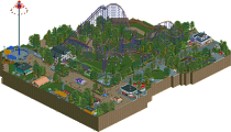
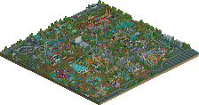
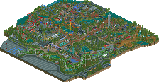
![park_3334 [H2H7 R2] Bermuda: The Lost Colony](https://www.nedesigns.com/uploads/parks/3334/aerialt2938.png)
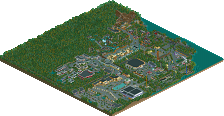
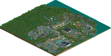
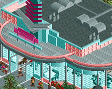
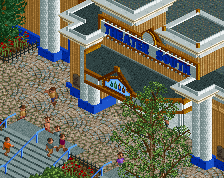
The entrance is very beautiful. Love how you've designed it, the blue rooves look great, and the red path is used as a nice accent here.
From there on, for me, it's sadly a surprisingly un-engaging park full of trees. I did enjoy most of the layouts, clearly your forte. Especially Copperhead was great. Also things like the sling shot were fun to see. This intense dedication to make custom rides work. But the park design itself I fail to get into. None of the buildings trigger my curiosity.
But that's just me. I'm sure lots of people are suckers for this kind of hardcore realism, and even my eyes can see you've nailed that pretty well. Congrats on finishing.
For me, Megalodon is the best thing on the map by a mile. The technical skill and brilliant support work here is really fabulous and something you do better than anyone else. Its almost impossible to make a clunky Arrow megalooper look good in this game and between this and Vortex youre absolutely a master of it.
Highlights aside from that were the Flight of Fear station which screams Paramount / Cedar Fair. 12E was a nice touch. I also love Rattler, the supports on Wildcat and the courtyard in front of the theater (kind of Paramount and Cedar Point Antique Car area mashup with the gazebo).
I say this a lot but I think that a lot of the SPECIFIC Cedar Fair nods might actually be missed by many with your work but I pick them out and appreciate them a lot.
My only real complaint is that Id like to see some bold color (rich, me talking about color I know). I actually miss some of the vibrancy of something like Westwinds. Thats a minor critique though and probably a personal preference thing anyway.
Overall this is excellent as always. Your technical skill is great and I never grow tired of your work. Great park!
Wow, I really love this. I expect the usual "bored-of-CF-park" crowd will (rightfully) be less into this, but for me its just amazing work. As a love-letter to the parks of the greater michigan-ohio-illinois-etc area, I can really appreciate the love and care that's gone into it. I also love the fictional history, although its funny to imagine a park being built in michigan with elements very similar to chunks of all the parks around it being made IRL.
The layouts are obviously great- probably my favorite is the arrow looper but there's a lot to love, like the hyper return leg going under the lifthill supports, the smooth curves on the bat, or the generous diagonals on the PTC woodie on the riverside. On the whole, the park composition is quite clever in that it calls back strongly to real life CF parks, but manages to have a unique layout to itself- the riverbank path with the woodie on the otherside is very interesting and somehow unique, and in general ride/path/foliage/backstage placement is very very well done. Organic, smooth, flowing, and feels like it has real history. Thats a skill thats incredibly hard and definitely underappreciated until you're stuck trying to do it yourself! Of course the archy is quite good- small but very CF like. In a way, much more powerfully reminiscent than your WoF park of my own experiences in CF parks. I have no criticisms, and anyway I would have told you in strangelove if I did. The park is charming, historical, and nostalgic in all the right ways. Just excellent parkmaking.
I can understand that Europeans might find less to swoon over. But as a theme park enthusiast who grew up in the midwest, it is really remarkable and a clear spotlight in my eyes.
Interesting to follow the three of you with my remarks. This park is a classic example of why I have a love/hate relationship with the realistic park movement/style.
-Do I love the idea of going to CP someday (never been yet)...yes. Absolutely. Top of my list in US...
-Do I have fond memories of going to Kings Dominion as a kid/teen? Yes.
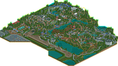
I can see the parallels here. This park screams KD, likely KI and maybe some of CP? The white bathroom and bumper cars over by the theatre. Grizzly (nice). Classic diner (for me, Makita's from the Wayne's World days). You nailed these buildings. The coasters are solid recreations of things I know from KD, KI, Michigan Adventure (CP6 reminded me) and a bit of Gurnee Six Flags for Copperhead and Megalodon. The stations are accurate again (like Lakeside) down to the pavilion style stations to the very lovely entrance. The tapering of the parking lot was a nice way to do a few things, like focusing on entering the park, but also saving on objects.
The problem? The problem is that it is also...realistic. Obviously I would want to go there, but in RCT what I keep getting nagged by is that I want to go somewhere fantastical more than realistic. The paths are thankfully not all grey and they move around a bit (not overly long in a straight line), but overall the park is flat and the coasters sit out there (in a realistic way) by themselves.
It's an amazing CF like park, and I respect the time, detail, image it is giving off...and I'd go there for real. I just love my fantasy too much. Southwinds is a very good, technically accurate (in feel) to as I said, KD and KI, but comparatively stale in parts for the same reason. I hope you understand the mixed review. I like it, but can't love it.
Congrats on your park - I'm glad you are finished and I hope you are happy with your release!
This is as clean as a baby's skin. This park offers everything i demand from good american realism work. Good coaster layouts combined with decent functional architecture. The entrance area definitely is my favorite part. This could be used as lecture material for builders how to build a decent starting experience for your projects with low object effort but much thought, well done!
For negative things i thought composition was a little bit off here and there. Especially the part between Grizzly and Copperhead felt a bit uninspired to me. Not a location i would see myself having fun in. Afterburn and the area around it were perfect in that aspect though. The interaction scene with the log flume over here is a very cool thing too.
All in all i think this is definitely outstanding work, but i agree with Kai that parts of this might have been a bit too realistic for me and it was a bit bland in places. Also - but that's more a personal wish than something that could be really seen as criticism - i would love to see you try something new and different, since a lot of this park felt like i've already seen it a hundred times. Definitely congrats on a great release though, that's definitely a good addition to your profile!
What an excellent park G. As others have already said, this park is about as good as dirty American realism gets. The details are just outstanding imo. Overall the architecture was very strong as was the foliage which felt like very typical G Force foliage to me.
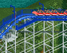
Personal favourite rides for me were Megalodon and the Bat, which both look really clean imo. Something about these old school arrow coasters just makes them look really cool in RCT.
In general I would say the whole park is very clean, and that is maybe my biggest gripe with the whole park. Everything is very clean and it feels like a more polished version of some of your older parks. The concept of this park is basically the same as Westwinds or WoF and I would like to see you try something different in the future. Don't take that as me bashing this park because I really do think this park is bordering on perfection.
So yea, overall excellent park and congrats on finishing it! I'm sure this will no doubt get a very high score!
Layouts are great - only complaint is that Afterburn is a little fast. I think if diagonal brake runs actually worked it would have been perfect. My favorites are the Arrow and Grizzly.
I think you pulled off the "dirty American realism" very well, something you've always done well. It really feels like it would belong in south Michigan.
Great job as always, it's not as colorful or fun as Westwinds but I think it's executed better.
Positives:
+ Your style is so refined at this point that it's hard to find something that is not well done or that doesn't look clean. Very high level overall.
+ The layouts are really good and I really like them for the most part. Only coaster I'm not a fan of is Copperhead, but that might be down to my lack of knowledge about that era of B&M and my lack on credits on similar coasters.
+ The overall layout of the park is strong
+ Again ,it's so refined, everything that would be there is there. I wish I had the same eye for detail that your certainly have.
+ Whitewater Falls is great.
+ Overall strong interaction between rides.
+ Chippewa Falls is beautifully integrated with a great queue line.
+ Theater.
+ Great entrance.
Negatives:
- Hard to think of any, but it wouldn't be a V1 review without them. I guess my only problem is that it feels like a pretty "standard" CF park. I would have wished to see a really unique ride (I know the CCI isn't that traditional, but still). It lacks the one big, unique coaster that sells the park, in my eyes.
Overall:
Great American Realism Park -> 85%
The layouts are fantastic. Afterburn is seriously slick and handles the tricky medium-scale size perfectly. Copperhead is very convincing and Megalodon is just a tour-de-force in hyperrealist RCT. I really enjoyed Grizzly and was almost sad to see the RMC track headed it's way, it makes great use of the diagonal track. Overall it's a park focused on thrill coasters and they're just a great time to watch. The minor accommodations for RCT don't get in the way of the park feeling like a collection of working CedarFair miniatures, from The Bat to the Windseeker to Delirium. There's a bunch of LittleThingsTM that sell the CF atmosphere for me. I love the big red arrow on the slingshot building, the people dryers, the underwater piping for the fountain at Afterburn. Charlie brown and Lucy on stage, the strollers scattered through the appropriately-purple-fenced kids area, the whole area of the Megalodon photo booth + rope ladder + theatre. I realize it doesn't take a ton of raw imagination to just drop The bat on a hillside, near-recreate the Flight of Fear hangar entry building, or remix the gyro drop + ripcord EXTREME PLAZA straight from Kings Island reference material, but I don't particularly care because that's what this park is about and it's done extremely well.
I think what sets this apart from similar ventures into hyperrealism is how smoothly you handled the places RCT's sharp edges poke through. There's hardly any awkward angles. Trees, paths, planters, everything feels like it should be pretty much where it is. You could look at this park and almost forget there's a grid; nothing feels forced just because it's RCT-convenient - although the out-and-backs feel a little forced because they're real life inconvenient. All the foliage is by-the-book; just enough interest, just enough visual identity, but never gets in the way of the viewers and even serves as a solid backdrop to highlight what we really want to see. This map has some of the most organic backstage areas I've yet seen, and in addition to simply looking good as structures there's a lot of detail to get caught up in exploring what buildings serve which purposes. The palette is subtle and undistracting, and funnily enough the kind of washed-out tan or dull wood is absolutely a CF "look".
Minor gripes: One more kids/family coaster would have been good. Mine train, rollerskater, an oddball leftover from pre-CF to give some park history. The entry area is a lot of fanfare leading to not quite enough payoff in terms of a weenie or a clear focal point; the train station almost feels like it's blocking what could be a cool sightline all the way back to the theatre. There's probably a few more buildings missing from the typical entry plaza setup as well, annual pass-guest services - first aid - last chance main souvie shop - lineskip and photo sales kind of stuff. It makes the big grand fountain walkway feel a little purposeless and empty. Similarly, the Shivering Timbers clone at the front of the park is a believable-but-still-awkward placement. Of all the terrain features and park layout decisions, the multiple drainage areas? ponds? at the empty corner of out-and-back layout turnarounds have the least going for them in terms of a visible purpose or interesting context.
Dammit I love this park so much.
Your releases are getting progressively better and I am really enjoying it. I really liked Magnum, though a lot of the stuff in there was a bit blocky (for lack of a better word). Overall it was still a rock-solid rec that imo still deserves design. Westwinds was the first real Starpointe contender, and WOF was a much more lush, sophisticated approach to the same concept, which I thought was highly successful in execution.
And now Southwinds is here are I didn’t think I would like it as much as I do. What a pleasant surprise. I love this park. Fantastic ambiance that captures such a quintessential “day at the local amusement park” feel that can be found across the US.
I know a lot of folks think Disney and Busch Gardens when the hear “park in the US,” but that’s just not fully representative of what’s actually out there. You gotta remember Disney is expensive for a lot of families. And that price really jumps when you don’t live close. For example, I live 1500 miles (2400 kilometers) from Disney World in Florida and 1800 miles (2890 kilometers) from Disneyland in California. For families like mine, going to these places was maybe a few times (or just once or zero times) before turning 18, depending on your parents’ income and spending habits. That shit is expensive.
Comparatively, a day at Valleyfair is $40 per adult. Nickelodeon Universe is $30-$35. These types of “stale,” “grey,” “themeless,” “boring” parks are all some of us have for the majority of the time. We grew up on them, we got into RCT because of them, and we love them because of the memories made at them. I’ve never had a bad day at a amusement park. Family friends always have a ball. Also keep in mind, the Midwest is, usually but not always, flat as a pancake. A rollercoaster (or any structure for that matter) that stands 100-200 ft into the air looks UNREAL to the GP. It’s like science fiction in real life. Its enough to send some of the toughest grown adults meakly slinking over to the nearest bench, feebly stammering “I-I’ll just wait here... you guys can ride and tell me how it is...” Just being in a plot of land designated to what the GP perceives as massive, intimidating, ultra-death machines of doom in the form of steel giants sent from the gods themselves causes people to just stare with their jaw on the floor.
That kind of awe and wonder (and inevitable respect derived from those) are what drove me and the kids my age to get into RCT. We wanted to build those same contraptions on our computers. Some of us have always dreamed of capturing the details of these mountains of metal that have given us so much joy and memories over the years.
And this park encapsulates all of that. As far as rollercoasters go, everything is right. The support work, the layouts, the dispatch timing, the block sections & functionality, the transfer areas, catwalks and maintenance access, stations, lines (yes we call them lines here in the states lol, I live a long-ass ways from the ocean and anyone that might call them queues), chain returns, spine extensions, on and on. Despite some calling realism “just modeling,” I rearely see other builders make transfer sections that would actually work. Or that have trains sitting on top of chain lifts waiting for a block to clear. Or dispatch times of 10 seconds making one train tailgate the other around the circuit and looks... really lazy. Few others make the effort it actually takes to correctly model a ride. To me, that makes modeling a skill just like composition or any other aspect of parkmaking.
The shivering timber’s layout was great too. It takes patience to make the wooden coaster train hold momentum throughout the circuit with the terrible friction loss it has.
I also didn’t mind the drainage ditches. Sometimes there are terrible soils in an area (read: clay) and very little elevation change. And as a result you just have to to start making drainage canals or ponds to deal with it in the event of a heavy rainfall.
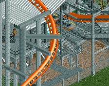
The architecture was exactly at the level it should be as well. Right within the budget of a park like this. And yeah, when you look at the buildings around afterburner and flight of fear, it doesn’t look that hard to make. But whar I also noticed is support work on the invert that doesn’t have concrete footers at awkward heights to make the angled connections. I didn’t see the water raised over the footers like in many other parks. Or a track pieces zero-clearanced into another instead of making the layout work with in-game clearences (seems to be prevalent on inverts in recent history). There was very little laziness here, everything was done “right.” I’ve seen some lazy support work hailed as “skillful” over the years, where this actually is.
It’s also nice to see the CF style get past the Starpointe era. That park was and still is amazing. But for being a CF Park, but it flirts with some slightly Disney- or Busch-esque design concepts in layout and appearance. Of course this isn’t a bad thing, but G-Force’s WOF and especially Southwinds really capture the brand from that perspective. Everything just has more room to breathe, at least it feels like to me. Pac’s Layouts in Starpointe, while undeniably great, feel.... like they came out of the dryer. Just a tad smaller scale than they should be. Not a lot, but it’s noticable to me. G-Force’s layouts and overall construction of the park feels like it’s all scaled correctly.
Another point is color. Starpointe always felt a little plastic-y in its color usage, and that’s something that’s bothered me about Magnum, the front area of Westwinds, Maverick’s Hudson Crossings, and RamSam’s Woodfall. While vibrant and eye-catching, it can be a little bit like walking around a WalMart at times with a lot of bold colors right in your face. WOF was the first CF release that didn’t have that effect and I really think the technique was finessed here.
—
This turned out to be a lot longer than I thought it would, but I really think a lot of the building techniques and details deserve to be talked about. They’re the little things that have bothered me in a lot of RCT and it’s mind-blowing to see someone doing a lot of these small things right when it comes to actual ride and park mechanics. We have plenty of discussions on park layouts, architecture, and theme, but how anything actually works seems to get overlooked so often. I think this deserves spotlight because of being one of the few to handle those details so well. To take the time to make rides that look good, work correctly, and remind people like me of why we got into this game in the first place.
Congrats on finishing this G-Force and I hope you keep building for a long time to come.
I need to look again before I'm ready to vote, but so far this is probably my favourite park in the genre. In it's gritty ugliness it's beautiful. Fantastic job.
I'm honestly not much for dirty american realism but not only is this a very 'authentic' park but it's quite aesthetically pleasing as well. For dirty realism, it's definitely one of the cleanest parks in a long time and executed to near-perfection.
As usual your layouts are great... that arrow is excellent and is reminiscent of Great America's old shockwave. The hypercoaster is also a good layout. If there was anything I didn't like, and this is nitpicky, it would be the color scheme of Rattler... it just looks off for some reason, especially around the frankly ugly and bare sand surroundings. This is understandable though given the data limit.
The RMC raptor track in storage was a nice touch... a lot of old parks used to have the 'coaster under construction trope' and it's nice seeing it used. I hope to someday see someone execute a functioning raptor in rct2 lol.
As for landscaping, you have a distinctive use of objects... the flat-ride terrain used around foliage and those huge oak tree objects tell me this is a G Force park. I love all the little details that add to the authenticity of the park... those small parking lots are great and I love the go-karts used as strollers near the entrance.
The architecture doesn't stand out much but I agree with everything Sephiroth said on that. It does the job well and certain structures like the drive-in and the entrance are very nice. I also agree with him on the scaling... this is a very large park, but it doesn't feel overwhelming at all.
Congrats on the well-deserved spotlight... it's too bad you didn't get a red name from this. it really is very well done.
I'm surprised at the scores, I expected this to be more unanimous and 85%+. 83% is still a beautiful score though. Congratulations, well deserved.
Congratulations very nice park.
Congrats on a well-deserved spotlight! I was torn between an 80 and 85, if I could I'd probably put it at an 82-83.
The biggest strength here for me was the layouts. In parks like this I tend to be underwhelmed by layouts that are way too clone-y or strictly inspired by real life layouts. However all of the ones here gorgeous, as well as unique and memorable, and I found myself being impressed with the technicality of the support work as well. The other biggest strength of this park to me was a lot of the clever interaction between rides. This really set it apart from being a collection of designs, which it easily could've been. It was obvious that you very carefully planned everything out down to the tile.
As others have said, I think you perfectly executed what you intended too. What kept me from rating this higher than 80 was that I kept finding myself wanting it to be more than that. Although I might be known more as a fantasy player I'm not the type to say realism isn't "my cup of tea". I also don't have any issue with you staying within the comfort zone of Cedar Fair type parks as others might. My biggest issue was while there was atmosphere, it was lacking in truly picturesque or immersive moments where I found myself truly wanting to be in the park. Having grown up with Knott's as my home park, that park does make a serious (though not always successful) attempt at immersive themed areas, enclosed rides, and notable variation across the park in general. I think you could continue working on parks like this but emphasize fully themed areas and attractions a bit more and that would take your work into the 85-90 range for me personally. You showed you were skilled at that sort of theming and variation in All Coasters and I think it would be interesting to see that side of your building in a full-scale realistic park like this.
Overall though, perfectly executed park that displays your abilities and clearly achieved your vision, I would just be interested to see what you could do with a slightly expanded vision in the future.
Congratulations G-Force! American Realism at it's best