Park / Ekumenopolis
-
 15-September 19
- Views 3,289
- Downloads 685
- Fans 6
- Comments 15
-
 74.00%(required: 70%)
 Gold
Gold

RWE 85% bigshootergill 80% Camcorder22 80% CoasterCreator9 75% Cocoa 75% G Force 75% saxman1089 75% csw 70% Ling 70% Poke 70% posix 70% Scoop 65% 74.00% -
 Description
The seedy parts of a dystopian megacity are about to be overthrown by an artificial intelligence conglomerate and a private military junta. The only hope left is a group of agents that must defy all odds and shut the computer terminal down before it's too late.
Look at the readme for more background information.
As a bit of a background, this has been in progress since 2013 and I'm glad it's finally complete. It was planned as a sequel to my 2010 monthly micros park, "Corrosion." -
6 fans
 Fans of this park
-
 Full-Size Map
-
 Download Park
685
-
 Objects
471
-
 Tags
Tags
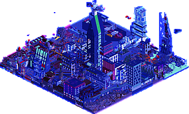
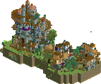
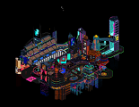
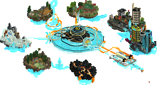
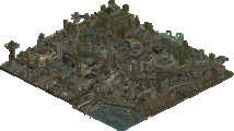
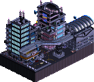
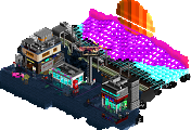
This is fucking wild. Good use of the floating cars (but the shadows mess with the animations a bit for the ones flying through the air - oh well). The wasteland looks great. Lots of Akira/Bladerunner/Ready Player One vibes. The Matrix posters don't really do it for me but the atmosphere is perfect.
Yeah this was amazing! How did you make everything so blue and dark, it's almost like you have a applied a filter?? Is it a feature in OpenRCT2? I've been gone a million years (well, since 2010) and I am mindblown over all the new features, I've started to mess around with OpenRCT2 but have just started to scratch the surface of all the new tools and possibilities.
Great execution of a dystopian setting. I loved how busy it was! Stuff happening everywhere, and the darkness made it hard to discern all the stuff you've crammed in there. Took me a good 10 minutes before I even saw the Synth Runner coaster, haha. As I've been away for a long time I am not super knowledgeable about what has now been done before (in the last 9 years) and what is still a brand new concept, but for me this was super original and just incredibly cool. Great work
^the 'filter' is an old feature but one we've only started really making use of recently. In rct2, there are different 'palettes' which tells the game which colors are available to choose from. Originally it was only a choice between water colors (turqoise, orange, green) but you can actually change really anything you want, including applying a blue filter or just straight up picking and choosing colors to change.
Anyway, this park is just awesome. Such a vibe and so many little details. I loved all the street-level grunge and graffiti and the different "lowlife" areas. Some buildings were a bit clunky but most were pretty cool and filled with awesome details, especially the detailed large spaceships. I also loved all the ridiculous posters around, really added a lot. I'm a sucker for cyberpunk stuff and this didn't dissapoint! I sorta wish there was a more iconic coaster on the map- either have some cool ones or don't have any at all with this sort of theme I'd guess. But regardless I really did love it.
Jag, it's amazing to see how good you've become. I found this hard to comprehend and take in, but nevertheless impressive.
Fuck yea. Sci-fi world created right there. A lot to take in as posix said, but worth coming back to. I look forward to it, though I fear it will distract me from writing up my park doc.
You're getting really good with mood and the darkness suits you, as it did in the MM bonus round.
More thoughts on rides later, but chaotic/nighttime/future world atmosphere? Nailed down.
You guys really have to hold me back to not vote completely nuts on this. This is exactly the kindof style i always imagined myself you would develop in, Jaguar! At my first looking onto this, i thought it would just be about atmosphere and vibe, bu then i kept coming back and coming back and found a ridiculous amount of details.
The spaceships were probably my favorite parts on the map. To also include some negative criticism in this review of this awesome park i must say i agree with posix that parts of it are a bit hard too read, but that probably also is intentional. Also cocoa had a really good point that a more prominent coaster could have elevated this a bit more.
Anyway, i think is incredible! I would not be surprised, if we would have another new green name here soon, gonna be close. Keep it up, dude!
PS: I loved the posters, they somehow reminded me of shirtless putin in Motherland haha
Its been intriguing to look at the variety of output you've had in the last year. One consistency is how daring your ideas are, and for the most part this one was a hit for me.
Unfortunately the pallette was a bit much for me and wasn't my favorite nighttime pallette. The dark sections were a little too dark and I had to turn up my brightness which made the light blues to light, and I ended up not being able to take in all the details as much as I wanted. I'd have preferred something more like Scoop or Jappy's from MM.
Nonetheless I enjoyed this a lot more than I thought from the overall. It might be one of the best city parks we've seen, and one where the city was fully integrated with the park in a way that made it feel very full-scale on a relatively small map. With these sort of parks with all the major buildings, its easy to lose track of micro and there were tons of great ground-level micro scenes to give this life. I agree with RWE's comment that I have kept coming back to find more.
Another comment that was mentioned was the readability, which I also thought is a huge challenge with these sort of parks. I think its almost inevitable with so many huge structures integrated in your park, and for the most park, you did a good job clumping all the huge structures closer together to minimize blocked angles, while keeping a few on the outskirts to keep it looking like a city.
You definitely pulled off the narrative of the park really well too. I'm not a huge person for readmes, but I looked through the park first and the post-apocalyptic/civilization in decline theme was very strong.
I wasn't sure at first but this might be pushing 80 for me, excited to see how voting turns out.
The black tower where the ROCKET is nice, it really feels like an iron tower, it's cool
The Planet Coaster poster was animal
Visitors get very dirty the paths (lol)
The idea of CONVEYOR with the shredder was fantastic
I'm in love with this whole space thing, space car, spaceship, rockets.
What I loved the most was the red and white spaceship, good use of the tracks, the angar was 10.
In fact every single piece, every detail of the buildings is fun to enjoy.
I loved the work, very good indeed.
Note: I changed the color palette so it was wonderful to see
nuts.
@Ling - Thank you and yeah those shadows are really frustrating... I was thinking of using the sagalax cars instead for that reason but they were too fast.
@Splitvision - Thanks, I appreciate it, and as Cocoa said, it's a palette. Looking forward to your space park btw.
@Cocoa - I get that, the coasters were kind of shoehorned in and not all that impressive seeing as I put them there years ago lol. Thank you though.
@posix - I appreciate it, MM was great practice.
@Kai - Thank you, and looking forward to your master's palette release too.
@RWE - Appreciate it and glad you liked it. Hopefully, just maybe I'll get green name at my next big release. And I can see the motherland vibes
@Cam - Thanks a ton, especially for the feedback. I can see how those palettes would have worked a lot better. Making stuff like this readable is hard, so cutaway view was a lifesaver for me.
@MTC - Thanks, I'm glad to hear that you enjoyed all the little details and scenes.
@csw - Thank you lol
Glad to see that a lot of people enjoyed this... wasn't expecting a gold at first but regardless I appreciate all the feedback, honestly for the longest time I would've never expected to finish this.
Sorry for the late review! Spent a lot of time looking at this.. theres so much detail here. Amazing to see how long you've worked on this project. It's great to see it completed.
I'll be honest that I changed the palette to the normal palette.. it was all a bit too vibrant and contrast-y for me at first, but it definitely set the tone. A lot of the tiny details added so much life to this. I enjoyed the USC Halcyon a lot.. really cool ship. The construction site with boulders heading to their doom? Brilliant.
You have great world building here... the skyscrapers and the mall, and the mech droids, science-y shit everywhere, and then a walled off wasteland topped off with a Target advertisement on the walls!
Great work. You have some of the best creativity in this community. Look forward to seeing your next project.
Just.... damn. Damn.
Damn. This is exactly the kind of RCT I've always wanted to make and see. You've really progressed as a player over the years and it is absolutely breathtaking. Please tell me you have more of these ambitious, unique projects in the pipeline, because I can't wait to see them.
Just....... Damn. I love it.
This is a mindfuck.
The clean, modern space city has been done a lot but the dystopian angle makes this absolutely fucking awesome. It's so well done and it makes for one of the coolest submissions that I've seen in a long, long time. PS: You actually made me read a Readme for once. That alone is an accomplishment, but it felt necessary with this. lol
It messes with you like a cBass layered park tends to, then adds the dark blue filter. Loved it, keep finding new things like the spark short out area last time I looked..and all the posters and TVs too.