Park / Lakeside Park
-
 15-September 19
-
 Lakeside Park
- Views 3,970
- Downloads 804
- Fans 3
- Comments 17
-
-
 69.50%(required: 60%)
 Silver

bigshootergill 75% saxman1089 75% Camcorder22 70% CoasterCreator9 70% Cocoa 70% csw 70% Jaguar 70% RWE 70% Scoop 70% G Force 65% Ling 65% Faas 60% 69.50% -
 Description
Welcome to Lakeside Park! This is my second full scale solo park that I started during H2H8.
The vision of this project was to continue to work on my realism, while trying to develop my own style and not go down the hyper-realism route, since I'm no expert on backstage stuff! Most importantly, I wanted to build some cool rides and try some new ideas.
Thank you to In:Cities and Roygbiv for contributing to the building process. Thank you to CP6 and G Force with advice on layouts. And thank you to the Strangelove guys for motivating me and offering tips along the way. You guys are awesome. -
3 fans
 Fans of this park
-
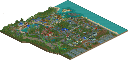
 Full-Size Map
-
 Download Park
804
-
 Objects
463
-
 Tags
Tags


![park_3199 [MM2014 R2] 42](https://www.nedesigns.com/uploads/parks/3199/aerialt2816.png)
Happy to see this released... it really gives me the same vibes that Luna Park has. The landscaping is very well-done, really quite beautiful especially by the beach.
I like the Jet Ski ride, but I feel like it takes away from the realism... doesn't look too safe and brings up a few questions for the water source. With that said, that surrounding area is top notch... the tropical section is the strongest part of the park and I think the area around the intamin is spotlight quality. The queue is perfect.
The layouts for this are definitely a strong point... the wooden is incorporated into its environment perfectly.
Overall, another great seaside park that I can see getting a gold.
Beautiful park otter. Clean and unpretentious, and with your ability to compose in such a way that navigating is easy and enjoyable. I totally didn't miss any backstage stuff. I really liked Stingray and its whole area. Shows how you transition seamlessly from more generic amusement park to dedicated themed areas, latter which tend to be harder to do. Hope to see more from you, as it'll be so exciting to see what happens if your abilities take the next step after this.
Definitely a solid park, overall, a lot of little things you did well, path amount, overall density, ride placement, things like that. Definitely shows you put a good amount of effort into trying to make this park believable.
Overall, I probably enjoyed the mainstreet, and area around the wooden coaster the most. Had a good atmosphere and felt like a true cheaper end cedar fair park. The tropical area was nicely themed, but to me not quite as believable in terms of layout and planning. Still a good park and probably the best micro of the park. The bobsled was very nicely done too, and probably my favorite coaster overall, the little land arch was so nicely done and felt totally like something this park would build.
I was a bit iffy on the floorless, it was a nice coaster, but realistically it had too many hills and airtime moments for a coaster of this type. If you look at some of the real life floorless coasters, pretty much every element is an inversion and there are very few regular hills, incorporating those trends into your park is something really to get to the next level IMO. Assuming you're going for a realistic park, having realistic layouts that could be plucked from a real park is very crucial.
Overall, a nice submission, not quite sure if I'd rate it gold, but its certainly on the right track. Just clean up some of the planning and consistency and you'll be there in no time. Your micro for the most part was great, and your more technical planning skills, so just refining the layouts, theming, and planning is really all you need.
Clean and american. Architecture was a bit different in places, i would say, but i think it helped this more than put it down. The park layout was good and everything felt quite solid composed. I also liked the foliage, especialle the tropical vibes in it, since that puts this a bit apart from other similar parks.
Solid is probably also the right adjective for all the coasters in the park. Stingray was my favorite. The Green Monster on the other hand felt a little bit weird in places. Also not a huge fan of the queue line here and how everything is attached to the Mainstreet. I think it would have been more natural to have it end somewhere else and instead give the Mainstreet one or two more buildings.
I'm also not really digging the entrance gates to the tropical area. I feel - that's general NE ciriticism - we should be more comfortable with rough area transitions.
I realyl enjoyed the Raptor carousels next to the wooden coaster. Probably my favorite part of the map. The path work over here is also quite nice and the Disko is exactly where it needs to be.
All in all a nice little park showing off a lot of future potential! Looking forward to your next one!
I thing the area around Stingray is really the highlight. I wish the other zones were a bit bigger and had more rides per. They're pretty much all just the size of their resident coaster. The Bobsled is a really nice example of those, don't see enough of them. I can't help but think a more old-fashioned wooden coaster would have made a good companion for Comet. Green Monster is pretty out of scale with the rest of the park, and the layout confuses me a bit. You go so far out of your way to have this cobra roll placement, but it's not really near any big setpiece which explains the travel. It also seems a bit under-supported, but the pacing is solid. The structures, I feel it goes without saying, are all great. Nicely detailed, good sizes, everything pretty much makes sense. A little on the Dirty American Realism^TM side for my tastes, but well-executed.
Very nice, and huge improvement over your previous full-scale parks! Although I enjoyed the micro and ideas from Elburwood, what held it back for me was the overall layout and cohesiveness, and that's where you've made the biggest jumps with this park. Agree with Posix in the unpretentiousness which I loved, its clear you were building in the style you felt most happy to build and not trying to build the next 90+ hyperrealistic Spotlight.
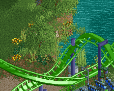
As with your past works, you have some nice but unassuming ideas, the favorite of which in this one was the jet skis track with the waterfalls. Another strength for me was interaction, some of the highlights for me being the queue for Stingray and the cobra roll over the car ride.
Layouts weren't an issue to me but improving them would definitely up your game. I enjoyed how Stingray and Comet fit within the whole park, but on their own they felt a bit low-profile and lacking memorable elements. I actually enjoyed Green Monster despite it being a blatantly unrealistic floorless layout, I think it drove home that you were building what you wanted to see and not photorealism. I definitely do enjoy re-thinking of how elements can be used in a layout, even in the realism genre.
The architecture is interesting because mostly with realism its easy to trace who's ripping off who and it seems like you're building fairly independently from all that. I think its a plus and is definitely helping you develop a recognizable style.
Although the overall park planning was good, one thing that is separating this from high 60's/low 70s and above is the uhh...mid range? Like the overall flow of the park. There's long sections of path without any rides or buildings, only to have a bunch clustered together later on, and it makes some of the pathing look a bit superfluous. I think that's a difficult thing to master but will come with more practice.
Overall I'd put this at a possible gold contender, I'm excited to see you continue to improve!
This was really fun to watch grow in the strangelove discord until its release now. Congrats on getting it done! You've really come a long way as a parkmaker since we drafted you.
I really like the park- pleasant, clean, and well-constructed. Foliage is vibrant and complements paths and rides well with pretty gardens and well placed forested sections. I like the beach setting, it reminds me a bit of a much smaller cedar point in vibe. The coasters are perhaps all a bit drawn-out which makes them slightly janky, but not such a big deal. My favorite bit is probably the tropical area, but I also really like the bobsled. Perhaps having one big themed area, a small swiss section, and then generic realism is a strange choice for a park cohesion-wise- but ultimately I don't mind. There's a lot of nice buildings and realistic stuff to gander at. Good shit!
Architecture of the buildings and elaborate colors, I loved it
The stones a little here and a little there, well positioned foliagen in the right spot and good choices of the trees, the flowers is always a special touch
I fell in love with TIDAL FALS and loved the scenery of the Jeep
All the wire mesh fences looked great
All paths where you have diagonal with other paths are perfect
Park is a total charm in my opinion
Nice work without a doubt
Can I go to your park? (lol)
Lovely, I like it a lot. That entrance fountain w/ the vanilla fountain, that's class.
The bobsled is my favorite coaster. You don't see that ride type used often. Same with the naked default merry-go-round.
Green Monster is a cool take on B&M, I especially like the first inverting element and the airtime hills in the first half of the ride. The last little helix is taken a bit slow, perhaps could have been a small helix rather than a large one.
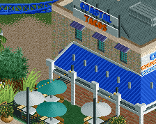
The Tide Pool Tours building is really lovely, good work on that.
As a whole, this park is fun, bright and quaint. Good stuff Otter!
Thanks for the comments guys, really appreciate it. Happy to get a silver, but dang half a percent! Oof. Maybe next time!
Just wanted to address a few comments.. Green Monster wasn't meant to be a true dirty realism B&M floorless, just a layout/train type I thought would be fun. Definitely think the last helix was a bit slow.
@Cocoa: Yeah, I agree on the theming. Part way through I considered just going for a Design accolade with the tropical area.
@posix: Not the first time you've called my work clean and not pretentious.. I love it lol
@MrTycoonCoaster: So happy you enjoyed my park. I wish I could visit it in real life too!
@Camcorder: Definitely wasn't going for photorealism, so I'm glad you picked up on that!
Thanks again everyone.
hmmm Seems kind of dumb that this isn't gold when 9/12 voted it as such. Congrats anyways.
Quick hit of favorites:
Model T is a nice old classic car ride at the front of parks like they used to do and quite effective.
Little Monster. I always like it when there is a junior coaster that is semi themed to its larger cousin. This is a nice touch for a simple ride, and in some ways more effective than the big one, which seems a fun ride but is a bit sparse on theming around it.
Bobsled: Yes. Very classic bobs feel, kinda like the one at Kings Dominion I've been on.
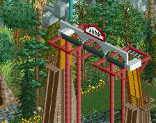
Stingray: To me this is the gem. It is the most modern ride, but also has that feel where the park decided to try theming vs. plopping a coaster down (Green Monster). This and the others have nice "American" style stations that are open with shade covers for queues.
Also, side note that Comet feels like a cousin of The Antelope that I built in KLAP, just without the interaction with pathing. I like the ride and it fits in the edge of the park, but I feel like it misses out on path interaction.
Congrats on a fun park and silver!
Thanks KaiBueno! The layout for Comet is an attempt at recreating White Lightning from Fun Spot in Orlando.. minus the ending.. that I changed slightly. The idea for that area of the park along with the Model T ride was to give more of a carnival/family park vibe.
Really liked the wooden coaster. Stingray is a lot of fun to watch zipping around with the many path crossings and the flume interaction. Didn't quite get the beach-themed hovercars?
I think my favorite bits were the flat rides. The enterprise really reminds me of the one at Hersheypark. The screamin swing and S&S tower as well - all really nicely done with the gardens and manicured grass. There's a lot of trackscaping in this park, but I think most of it works really well.
I thought Monster was a little weird. It's hard to not want things that look that much like a typically realistic B&M to fit the mold and conform to the usual elements. I do always love a "Little ____" kiddie coaster version of a headliner though.
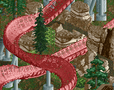
The pathway rock tunnels from one theme zone to the other felt a little forced and are kind of ugly piles of rock scenery in my eyes. The mix of LOTR and krypton rocks doesn't do it for me, especially when they're mixed different colors and there's some ruins-rocks and default rock texture landscaping around as well. I wish the stuff under stingray was at least all brown or all grey, since in terms of placement and forms and ride interaction it's all pretty cool. The bobsled rock arch is admittedly really neat.
Of the two halves, I think the beachy area is better. The generic theme park side suffers a bit from a blah straight-line path layout and path island syndrome. Not all bad though, since the mainstreet and the shops there are cool definitely cool. The whole midway with the kiddie rides and the plaza at the end of the mainstreet with Tony's feels very believable for a small american park like this. The backstage stuff that's here is nice enough, but it does feel a little half-baked. Some bits of the park seem to be aiming for that angle of realism and others are just - hey, let's put some ductwork here because you're supposed to do that, right?
Overall a fun one to explore and some hints at really exciting ride design from Stingray, Bobsled, and Comet. The places left to improve are probably park layout, a more cohesive sense of area themes and color choices, and more careful composition of individual scenes.
The front of the park was some very nice American realism but the coastal area in the park gave me some SeaWorld vibes and really elevated this for me.
I really enjoyed Comet and Bobsled. Green Monster is a bit elongated and not overly “B&Mish” but it’s still a nice ride and I feel like the previous comments have been too critical of it. Stingray is the most “New Element” coaster of all time but it looks really nice with its color palette and warm surroundings.
I feel like this is a clash between “dirty American realism” and a much brighter and more atmospheric style but it actually works pretty nicely. I enjoyed it a lot and you should all be proud of it.
The layout of the B&M could be better