Park / SS Infinity
-
 25-September 19
-
 SS Infinity Universe
- Views 2,855
- Downloads 709
- Fans 4
- Comments 13
-

-
 69.00%(required: 60%)
 Silver

CoasterCreator9 80% pierrot 80% Coasterbill 75% Jaguar 75% saxman1089 75% G Force 70% Camcorder22 65% Cocoa 65% RWE 65% Liampie 60% Scoop 60% posix 55% 69.00% -
 Description
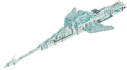
An Earth-like planet has recently been discovered orbiting the nearby star of Tau Ceti. Based on data gathered by the planet-hunting telescope Kopernikus, there is conclusive evidence that this planet has Earth-like qualities, with oceans, a non-toxic atmosphere containing oxygen, and a gravity of between 0,8g and 1g. It was given the name Eos - the name of the goddess of dawn in Greek mythology.
180 countries got together and formed the World Space Agency, with the aim of constructing a spaceship capable of reaching Eos in a mere 15 years. After many years of development and hard work, SS Infinity was completed, and the journey could begin. At the time of writing, SS Infinity is 2043 days into its journey, 4,3 lightyears from earth, with 7,2 lightyears to go before it reaches Eos.
In the words of Keisuke Akashima, head of WSA, "In the very center of the ship there will be a huge hologram depicting Eos, so that the aim of the whole journey is clear and visible all the way. That is, to go there, see how it looks, and establish a peaceful off-earth colony, the first outside of the solar system. And if we happen to encounter intelligent beings, we just hope our recent efforts in increasing collaboration can expand beyond humanity."
UPDATE: The theme park dedicated to SS Infinity's epic journey is now open for business - visit it here:
https://www.nedesigns.com/park/4761/journey-to-eos/ -
4 fans
 Fans of this park
-
 Full-Size Map
-
 Download Park
709
-
 Objects
271
-
 Tags
Tags

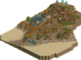
![park_6119 [NEDC6] Hydrocelestis - The Ocean of the Stars](https://www.nedesigns.com/uploads/parks/6119/aerialt6365.png)
I'm crazy and in love with these mysteries from outer space, of course there is something there, but we don't have the technology yet.
Wonderful work, well elaborated, feeling of excellent realism, I loved the details and colors and the size of the ship.
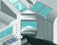
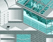
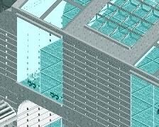
The use of glass was perfect in my opinion gave a special touch.
Sincerely congratulations for this beautiful work.
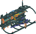
I'm always happy to see space parks, and this one is just awesome. I love the interior with the fusion reactor; the scout ships and the transport shuttle running across the ship are great. The elevators at the end are also a nice touch and there's actually a lot of cool details on this, like the little rooms with beds and control panels, and the greenery inside the ship.
One truly has to appreciate the scale of this thing... as mentioned, it's kilometer across and nearly takes up the data limit. While part of me wishes there were surroundings, this is space, and anything would look diminutive next to this.
A very cool and ambitious release. I think I remember seeing this in the ad district years ago and it's so great to see it finally finished.
I also found the background information of this park to be quite interesting. Is there a chance we'll see what Eos looks like?
Split, it's so good to see you back. I remember in the days of .... I dunno, 2008-2010ish (getting hard to remember) watching this in the AD, as well as your other releases: Lake Cerulean, Mayra and Lotusflower. I was so, so excited watching this develop back then, and again when you started posting screens recently. Such a treat to finally see. Thank you for the memories as well as a fantastic release. I'd add more, but Jag really summed it up well.
fuck yeah, this is cool. Just an awesome, gigantic structure with a cool story and atmosphere. Really cool detailing and great to see you back. I particularly enjoyed the sparseness of the stars in the background- some people go crazy and do way too many, yours felt a lot more realistic to me. great stuff
This is an amazing piece of work...putting this here to congratulate you on a fine piece. Been a bit busy lately to comment in full.
I will look thru more layers with my breakfast, but wow...awesome.
OK - so 2nd look. Wow the details, the layers, the custom scenery I didn't know existed. I like how this resembles an interstellar vessel and a mall at the same time. The glasswork and scenery pieces used for it are inspiring. The reactor is sweet, the detail of shuttles on the outside fantastic. The lights on the very tip of the nose of the ship. Love these details, of which there are almost too many to chronicle. Thanks for thinking outside the box and building this marvel.
Also...so looking forward to using the glass and escalators in the future.
Welcome back in your own comeback/finishing of old projects. It feels good doesn't it?!?
Thanks for the positive comments! Now let's see how this sits with the accolade panelists
@jaguar - I have been thinking of different ways to represent Eos, and I have one idea that I think would be interesting and that I'd want to try. Perhaps the next project after I finish the two small-ish projects that I'm currently working on.
@Sephirot - Glad you remember this from the good ol' AD! And extra glad you mention Lotusflower, which is quite obscure since it didn't qualify for design.
@KaiBueno - It does feel great to finish something! Especially when it's something I left unfinished 9 years ago, haha. I've been seeing a lot about the Master's Palette and that you just submitted that, and that has also been many years in the making from my understanding, so congrats on that, the screens I've seen look very nice and looking forward to seeing it!
Definitely something to check out using the openrct cut-away view to 'scroll' through the ship's many levels.
Really cool build Split, thanks for releasing this, and way to go on finishing this after almost a decade.
The way you did the thrusters at the back was probably my favorite part, along with the sheer scale of this massive thing.
Makes me wonder what happened to the concept creations category! This is an ideal candidate for that.
~B-]
Holy hell this is cool. I feel like I could spend hours examining this with the OpenRCT2 cutaway feature. Just a totally unique idea and great execution.
@Luketh & Saxman - thanks for the positive comments. I wanna mention that when I decided to begin working on this project again, I could not open it in OpenRCT for some reason, so I actually finished it in the original RCT2, and so did not have access to the cutaway view or any of the new tools. It would have made building this a lot easier for sure, and would have increased the quality of the interiors a lot. The parts of the interior that can't be immediately seen are quite messy and incomplete in many places, as I've confirmed for myself now that I can open it in OpenRCT and use the cutaway function. But it also sounds like you didn't encounter anything that looked too bad in the cutaway view based on your comments, so that's cool to hear!
I'm glad you spotted the thrusters at the back Luketh, I was quite happy with the smooth, high-energy output look I achieved there through some trickery with the animated fire objects and glass walls. I think it's my personal favorite part of the ship too.
This really some cool shit! That's an awesome space ship you made there, impressive on macro and micro level. With the peeps and interiors the whole thing feels alive and keeps my attention. Respect, cool entry to re entry NE.
Congrats on the Silver Splitvision, and thank you for bringing some diversity back to NE.
This was totally impressive for obvious reasons, yet I found it a little hard to take in, even with cut-away view. I think a project's concept should never overpower the viewability of your creation, which for me was the case here, and therefore limited its potential.
I get you Posix and I agree, the isometric view does limit the potential of a structure like this, both for the viewer, but also for the builder, as anyone who ever built anything large and tall in RCT knows. I had an idea for the overall shape of the ship which did not have much, if anything, to do with what works the best in RCT, and the shape ended up being more or less how I wanted it to be from this standpoint. The main exception is that the central section ended up being just a bit too bulky and "top heavy", in that it is a little taller and wider at the top than I planned, which I think detracts from the overall aestethics as well as further hinders the viewability, which was already compromised.
I think I really considered this a lot more in my latest submission (hopefully out soon!), which is also conceptual, albeit something entirely different than this spaceship. I tried to think continuously about it from a viewer's perspective, so that the things in it (hopefully) make sense and the ideas are clear, paired with being planned and laid out in a manner that works better with the isometric view. Will be interesting to see if the public agrees.