Park / The Ragnarök
-
 24-June 06
- Views 27,601
- Downloads 667
- Fans 0
- Comments 138
-
 No fans of this park
-
 Download Park
667
-
 Objects
301
-
 Tags
Tags
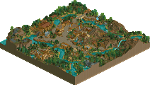
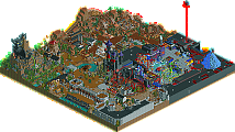
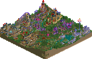
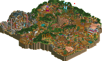
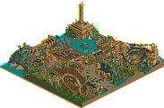
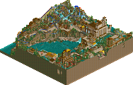
trust me that is no one and why dont you take a screen of the other half of the park that is water...
Edited by chapelz, 24 June 2006 - 12:21 PM.
also, i clicked "show results" in order to null vote but now it lets me vote again?
just considering last season's 1-vote-ahead battle...
Same reason you didn't take screenshots of the mass of trees between the entrance and the circus tent or the oversized trebuchets that are too big to be functional.
What it comes down to is fairness. If someone is going to post additional screenshots of the LL park, we're going to show additional screenshots of our park.
Corkscrewed Offline
Oh, and chapel, I think he was joking around with that.
I have no idea why FOUR of your can't access the site, but maybe try again later? It works perfectly fine for me.
However, since I want to make sure as many people can see the parks as possible, I've uploaded the park files themselves to NE. The reason we decided to post it on my hosting is because NE won't have enough to support a whole season. So basically, after this week, don't expect to find the files on NE still.
DOWNLOAD HURRICANES - THE RAGNAROK
DOWNLOAD STRANGELOVE - THE SEIGE AT CASTLE GRIJS
Edited by Rohn Starr, 24 June 2006 - 12:57 PM.
Corkscrewed Offline
Anyway, after looking through the parks, I have to renege on my earlier belief that it'd be an easy week for Strangelove. Hurricanes park was a lot better than I thought it'd be when I was doing graphics.
THE RAGNAROK:
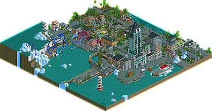
My thoughts sort of echo Ed's, except not quite to the "super duper impressed with everything" feel. This park was quite good, though. Obviously, people will compare it to DJ's park just because EM was made first, but this is definitely no copycat. The urban feel was pulled off extremely well, and I'm glad to see the elevator trick being used in skyscrapers (mostly because I claim credit for doing it first... or at least releasing it first... way back in H2H2). Anyway, the coaster was the biggest surprise. In the screens, it looked like a rush job, but it was actually a pleasant, thrilling ride. Nothing amazing, but very solid for RCT 2. And frankly, in real life, it probably would be a great rocket coaster. Xcelerator's short, but it still rocks. The architecture and theming were magnificent, and the little touches like the backed up cars, ruins, random icebergs popping up, and city details were all really nice. It's still a lot of work to execute these things. The jump track was definitely funny... mostly because it's like physically impossible to make a U-turn while jumping something.
THE SEIGE AT CASTLE GRIJS:
This was definitely the more complete park, although it did devote itself to one theme, which sometimes gives the impression of less work. Anyway, this was thoroughly impressive and already better than maybe all of the LL parks from last season (I'd say maybe two could compete with this one). Anyway, your coaster was pretty thrilling and well done, winding through everything, and I loved the catapults, castle turrets, arches, and architecture. There was definitely a ton of work put into this, and I commend the parkmakers. Going LL is always a risk in H2H these days, but you've certainly shown that LL can at least compete.
In the end, I have to with Strangelove by a HAIR. Seriously, it was extremely close for me, and I'd be ok with a tie if it came down to it.
Well done to both teams this week, though. This might very well be the best matchup this week (just guessing; haven't seen the other parks yet).
As for the actual parks, I went with Strangelove...just barely. I loved parts of the Hurricanes park, but for as much awesome stuff as there was, there was a little bit of 'almost there' throughout also. The opening scene with the tram crashing and the traffic jam was pretty awesome....but on the other hand, the coaster was very disappointing in my opinion. Then you had the buildings which were nicely executed....but on the other hand you could have done so much more with the fair in town, other then just a measly merry-go-round. Still, a creative park that was good...but had potential to be a lot better.
As for the LL park, it was very impressive in my opinion....just a little unoriginal, which seems to be the problem with almost all LL stuff nowadays, perhaps because theming options are really starting to hinder creativeness. Still, it was pretty risky going with LL in the first week of the new competition...and I actually think it paid off. I voted for this one....although if the Hurricanes park won, I'd be equally happy...they are about even. The only reason this one got my vote is cause I'm a bit disappointed the Hurricanes park wasn't as good as I first hoped it could be, cause it COULD have been so much better.
THE SEIGE AT CASTLE GRIJS:
A very composed park, if you ask me. Just about everything in the park had a purpose and tied directly into the story. I loved the catapualts and how convincingly you made the "seige" on the castle walls look. The enormity of the castle itself was impressive, even if nothing new. The coaster didn't stand out, but did fit well into the park. Basically, I saw this park as the better-composed park, mainly because it told its story better than the Hurricanes park did.
8/10
THE RAGNAROK:
Definitely a neat concept pulled off with moderate execution. The whole thing felt slightly empty to me, and a slight too much resemblence of DJ's PT park except with less mystery It sort of left me feeling that some of the pages were missing from the story. However, some really neat details in there worth pointing out, like the skyscraper with the elevator, the busy urban streets and the whole ice.
6/10
Vote: Strangelove
Corkscrewed Offline
(my bad)
Why does it say "You do not yet have access to this scenario" when I try to load Siege?
I just reinstalled the game (so I cuold look at all the H2H LL parks)
anywho, i'm probably just not going to vote. i really can't decide which i like better, and i don't really want to vote for our park just because it's ours, because that's not fair.
The Ragnarok:
pretty nice park you guys made yourselves there, i have to admit that. the coaster itself, like cork said, probably would have been a really good rocket coaster in real life, especially with that loop. i just wish it would have had some brakes instead of ending so abruptly and going right into the station. as for the theming, i really wouldn't compare it to en midvinternattsdrom. that park had more of a "what the fuck happened here?" feeling to it, leaving it open to interpretation. with this one, you guys picked a story, and made a park to go along with it. albeit, it could have been executed better, but the fact remains the same. it had several neat detail, like the tram crashing at the beginning (although it probably could have benefitted from going a little faster), and the car wrecks, the ice flows, and the elevator were all very neat details. the quarter-tile land was pulled off very well, too.
The Siege at Castle Grijs:
I'm really not sure what to think of this. i think following its construction from the beginning kind of hurt my opinion of it, since i didn't have the initial wow factor. despite that fact, this is a very well made park, no doubt. it takes a lot of skill to put together a park of this caliber, and the parkmakers really delivered in that sense. the major things that stood out were those great trebuchets, and the sheer overwhelmingness of the castle inside. the rides definitely could have been improved, there was something missing in that department. the black plague really didn't really help with the immensity of the park, and the adventure ride, while i see what you guys were going for, didn't deliver either. the only other complaint i had was that sometimes the foliage just seemed careless, like you guys threw it in at the last second, or rushed to get it done.
one (well, not technically ONE) of things i really liked was all the details you two put in the park. the destroyed village to the side was pulled off prety well, if you ask me. usually, destroyed stuff just kind of sucks, you managed to make this actually look good. same goes for the destroyed sections of the walls. another factor i liked was all the nooks and crannies in the castle, like the upper pathway thing that chapelz pointed out (for those who caught his screens), and the building just inside the gates.
it's a very close match, and i'm still not sure who i am going to vote for. both sides have their strengths and weaknesses, it'll come down to a very slim margin for which park wins. nevertheless, it was a great way to start off another great season of h2h.
edit: immensity is already a word. ;(
Edited by tracidEdge, 24 June 2006 - 02:41 PM.
Nevermind, I forgot to reapply the Drexler patch.
The reason for this is I think that it was a very neat, well-organized park compared to the Hurricanes' entry. The medieval theming here was spectacular, especially for an LL park... Also, it was a full-complete park, and not only quality, but also the quantitiy of the park makes it deserve the win, IMO.
~Jazz~
Well, it just worked right when I unlocked the mega scenario... So you must complete all the scenarios of rct1...
Click me
I thought it would just be a cheap rip off of En Midvinternattsdrom, but it was quite impressive. I really enjoyed the second half of the rocket coaster, and some of the architecture was quite nice. But it just seemed like a typical, bells and whistles type park nowadays, and I could easily tell the 2 contributors. Don't get me wrong though, it was really nice. I just wasn't that interested for some reason.
So yes, I voted for Strangelove. On this side, I'm too sure on the contributors but I've got a damn good idea. Anyway, the park was lovely. There were so many details I've yet to explore, and I don't just mean 1/4 tile shit piled on to the outside of a meaningless building, I mean creative uses of track as scenery, and the like. It was very close, but some incredible touches like some arches made of wooden track were fantastic and won me over. Despite the fact that I am praising the park, it still had its flaws. For example, the Black Plague's lift was crappy as the land underneath it wasn't realistic at all and was a cheap way out of supporting it. Also, I found the brick sidings to land a bit much. Even so, I still enjoyed the LL more.
Great job to both teams.
I must say, though. How could there have been 82 votes cast already and only like 30 replies...?
Also, when the winners are revealed, could we find out why this was all delayed. I really don't care, I'm just really curious.
RMM Offline
Strangelove for me. The Hurricanes park could've been a lot nicer but it seemed bare, rushed, and not put together too well. Strangelove was more of a complete park even though there was nothing groundbreaking.