Park / Wonder of the World Park
-
 08-September 19
- Views 2,574
- Downloads 579
- Fans 2
- Comments 10
-

-
 52.50%(required: 50%)
 Bronze

Cocoa 60% Jaguar 60% bigshootergill 55% Camcorder22 55% RWE 55% CoasterCreator9 50% Faas 50% G Force 50% Ling 50% saxman1089 50% Scoop 50% chorkiel 45% 52.50% -
 Description
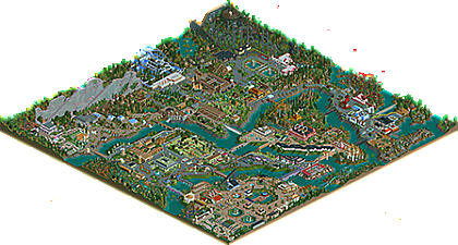
Fictional park built based on all my experience, everything I've learned so far, here in the NE with the comments received.
I still consider myself a trainee, but I can't give up, this challenge is the fun of it all.
I confess that it is very crazy to make these parks, I like big parks.
I hope I have created cool things that you can enjoy.
As always I ask for sincere comments, this is welcome. -
2 fans
 Fans of this park
-
 Full-Size Map
-
 Download Park
579
-
 Objects
624
-
 Tags
Tags


I think you're really starting to develop as a player... this is a big step-up from your previous parks. The biggest improvement would be the breaking way from the boxiness excessive symmetry, there's a lot of diagonals and it's a joy to see... really makes this aesthetically pleasing.
The layouts also show improvement but there's a lot of awkwardness, like with the straight sections on the bobsled coaster. Manic miner is also very strange but I can't say that I dislike it.
As for the architecture, there's a lot of legitimately good forms in many of the buildings. The interiors are a nice touch and you managed to make a lot of weird objects look good. The steeplechase area is very pretty and I don't know why but for some reason, this park gives me Mario vibes. I wasn't a fan of some things though, like the glitching trees or areas that were fenced off but didn't need to be.
All in all, a fun map as usual and as mentioned before, a huge improvement in park layout. The fact that this is 180x180 also deserves credit.
I love the colors. I love the water throughout. To me I don't care where it came from, I'm just glad it is there. The green food court is classy and has nice detail. The simple glass with white, pink and grey building for Hyper is fun too. There are a lot of details here that bring this park alive, even if some of the coasters visually look clunky. The theming for the Monster trucks, the arches over the pathways, the carnival lights on buildings, the bridgework.
Best one tho: Rocket. That's a wonderful layout. It sprawls with jarring turns, kind of like Space Mtn, but also like some of your other rides. The nice thing that it does is It visits 3-4 areas, diving under water here, flying over there. So fun looking.
Whatever the glitchy trees are though (purple here, white there)...don't use it again. They are more distracting than helpful. Regular trees would be better.
In a time where RCT realism sometimes forsakes fun, you've managed to get enough lovely details in a large map and still fill it with crazy, fun, RCT coasters, just like what all of us built when we first opened the game.
This is a park I would want to visit in real life, it is so full of life...
Congrats on a nice park!
love you
Wow MTC, you've developed a lot. When I looked at this park it reminded me of my first visit to Lowlands Festival (a Dutch Music/Theatre/Art-festival). The flickering lights, beautifull strange buildings and sculptures and all the fountains just make for a very creative/magical/arty atmosphere. I love it!
You have the guts to use a lot of non-regular objects. Sometimes that works (around Giga) and sometimes it doesn't (glitchy trees). But when I visit your parks I always get inspiration to do something with new or different objects. (I got the idea for the Circus Balancé canon from an artsculpture in your Palaces-park).
My favorite parts are the area's around enterprise and around the Arizona and Texas rides. I think the more denser foliage gives the area a lot of atmosphere.
I hope you keep your own style and use of non-regular objects and will be able to mix these with some more regular foliage and layout choices.
I think this is a big step up for you! You've really taken some advice to heart here. Firstly- the environment is very good and way better, with lovely rivers, trees, etc that felt more natural. It also separated the park into nice areas with distinct themes (although I'll admit I'm not sure what each one actually was!). The areas each had lovely and different atmospheres. Coasters were better- they flowed better and had more curves. Still a lot of straight sections of track and could use more interaction with the environment- but an improvement. Your buildings are also looking good- great use of detailing and some well defined architectural styles. I'm really liking it! Maybe even a silver from me. My favorite bit was around the "san francisco train"- lovely atmosphere there.
I think your coaster designs are starting to hold back your very quick progression in other areas. Lots of awkward long runs that don't go anywhere, turns and hills taken far too fast, not nearly enough banked turns or interesting elements/path interaction.
Yay! Bronze! Congrats man!
If we all have this passion then you understand me, I was really happy, my heart was in my hand (lol), I honestly thought I couldn't get a bronze.
THX for the observations important in the comments, for:
Jaguar, KaiBueno, Jene, Cocoa, Ling and In: Cities.
And also to all the other members who commented on the screens of this park.
What can I say more? I love this site
me too
I thought I'd commented on this!
Overall I like the composition. Some quite bare segments of the park, however.
An honor to see some vortex elements on the mine train.
While I appreciate the large scale, some of these layouts could be better paced. Like GIGA, for example. Lots of straight track, it leaves me wanting more airtime hills.
Despite that, the stats on these coasters are all quite good.
Looking forward to more work. You definitely have fun with the game, and that's reflected in the final creation.
~B-]