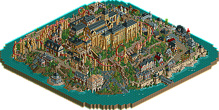
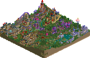
Park / Mont Saint Michel
-
 06-July 06
- Views 17,947
- Downloads 1,532
- Fans 3
- Comments 58
-
 83.00%(required: 70%)
 Gold
Gold

RWE 95% no Cocoa 90% no Jaguar 90% no Scoop 90% no Kumba 85% no Liampie 85% no bigshootergill 80% no G Force 80% no Ling 80% no CoasterCreator9 75% no posix 75% no Xeccah 70% no 83.00% 0.00% -
3 fans
 Fans of this park
-
 Download Park
1,532
-
 Objects
425
-
 Tags
Tags
Stallions also made a great efford, but my vote goes for TB.
Well done.
Firebrook was also good just not as much. it looked very incomplet around the edges and the large estate building, though well done, could not stand up to the large church in the center of Mont Saint Michel.
one thing i didnt like about Mont Saint Michel was the path color. that path blended with the building too much and made parts hard to tell the buildings from the path. maybe a different path would be better.
FK+Coastermind
Captain to captain, I feel like I need to defend this comment, even though there might be some truth to it.
I somewhat agree with you on the whole "less is sometimes more" comment in general terms. But in this case, I think every peice of scenery was placed with precision making the whole concept feel organized and meaningful. If you look at the real church, it is cramped and overloaded with material, so its hard for me to agree that his park was overdone rather than merely trying to be accurate.
As for your comment about the coaster, not sure how you came to that conclusion. I thought the coaster was implemented very well and fit nicely as a coaster could be into this setting. It's also a bit unorthodox, which to me, made it more interesting.
I haven't looked at the stallions park yet, but certainly will as soon as possible. I do admit that the mansion building looks amazing from the screens.
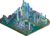
something about me really like the stallions' park, i don't know why. there were several flaws to it, besides the general look of unfinishedness. that green mansion was definitely the highlight of the park. that and that gold coaster. i liked that a lot, too, though i would have liked to see more than one car on it. the schwarzkopf i didn't really like, for two reasons. one owould be the series of unbanked turns before the lift and the brakes. surely you could have thought of something else to bring to those two elements more gracefully. the other was the fact that the fastpass didn't even go to the entrance, let along attach to the regular queue.
i don't know, i think i'm going to vote for the stallions, though it doesn't really seem like it will help. =\
From the overview the green building in the Stallions park does look very beautiful also, though in the screen closer by it still seems a bit undetailed.....well.., will have to try and get it working asap to see it in game and have a look at the coasters/rides that were fitted in.....(room enough for that anyway, I would think, as the park seems a tad flat and unfinished....?)
Will edit this one as soon as I could see Stallions park ingame and bring out a vote...
I found a lot of things about the stalions park I didnt really like. The architecture all around the park was quite bland. That includes the big mansion and the station for the water coaster. The flume part of the coaster should have been one level higher so it looked like the boat was on the water and not on the track. Also, it was annoying waiting about 5 minutes to watch the coaster because it broke down every other second.
I'm of the mind that any estate that is built into a theme park would retain some of the open areas within the grounds. This would be to keep the open, airy feeling that the estate grounds would have had prior to becoming a theme park. I would have liked to see some more cars/trains on The Voyage as well as the water drop being more in line with the coaster's path.
Now, I didn't have any problems with the coaster breaking down. I installed the RCT2 Reliable patch and the coaster ran just fine.
But saying that, my vote still goes to MSM just because of how much I liked the view when I opened the park.
Mt. Saint Michel: Architecture was it's only strong point here, IMO... the coaster was actually below-average and could have been executed better, and the foilage was just nice. While the park as a whole is quite amazing, the entire thing seems sort of crammed in and forced. A bit overated, but definitely the dominant choice here...
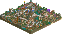
FB Estate Theme Park: Not bad, overall. The mansion is nice, but not brilliant by any means, however... it seems somewhat monotonous and drab, and it lacks variation in both form and colors. The coasters were definitely original, but odd... nothing in the park seemed to flow, and it seemed like the mansion was the only main feature.
~Jazz~
Though, what the fuck was that invert? Seems that few people can build decent rides anymore...
-ACE
Mont Saint Michel was created by Emergo and Six Frags
Firebrook Estate Theme Park was created by Metropole and Supertrooper
The final score is 69-14.
West Division Standings:
1.Tycoon Bandits 2-0
2.Hurricanes 1-0
3.Italian Stallions 1-1
Holy shit, you two. Sleepers of the year?