Park / Spree Park
-
 23-August 19
-
 SpreePark 2.0
- Views 5,351
- Downloads 687
- Fans 3
- Comments 22
-

-
 68.50%(required: 60%)
 Silver

bigshootergill 70% Camcorder22 70% csw 70% G Force 70% Jaguar 70% Ling 70% Poke 70% SSSammy 70% CoasterCreator9 65% Cocoa 65% RWE 65% Scoop 60% 68.50% -
 Description
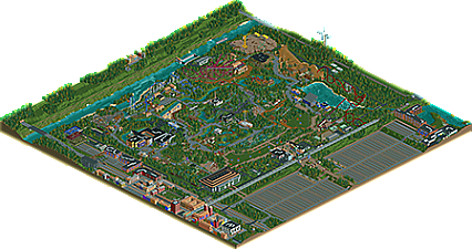
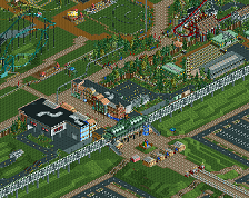
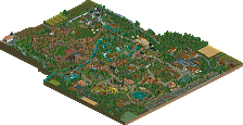
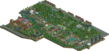
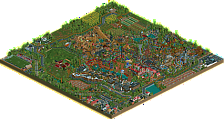
Spree Park, aka 256x²
OpenRcT Only.
Best enjoyed when breakdowns, vandalism and littering turned off. And let those peeps ignore intensities...
4 Years on the making, I hope you enjoy.
Otsdarva made the Star Flyer and helped me with the Mack-Launcher layout.
Logo made by Jonny93 11.000 years ago. -
3 fans
 Fans of this park
-
 Full-Size Map
-
 Download Park
687
-
 Objects
365
-
 Tags
Tags
![park_4113 [H2H8 R3] A Year in Winkelheim](https://www.nedesigns.com/uploads/parks/4113/aerialt3858.png)
Congrats on finishing this huge, huge map! Doing outskirts with NCSO seems like chastisement, but it's cool to see. So many coasters, Skyride and Bandit where the best imo.
Only the people who've finished a map this size know how hard it is. Congratulations MCI.
You've recreated the "Germanness" in a charming and truthful way which was warming to see. This also had some unexpected macro intuition and skill that I loved seeing, such as the Mega Looping placement against the high main path. Beautiful. There were also glimpses of good creativity, such as the Picknickschirme, and the greenhouses. Both convincing and clever.
This feels like the end for you and RCT MCI. Is that true or am I getting the wrong impression? Best to you.
ill need to look more closely at this later. the overview looks amazing
The sheer size of this alone makes it a praiseworthy release... serious parks that break the 200 tile barrier are very rare nowadays and you managed to add a lot of cool details without hitting the object data limit.
I really liked the invert and the train outside the park. The wild west area is also very strong and that dark ride is beautiful... something that's not done very often in NCSO. The landscaping was also for the most part very good. Everything is clean and placed where it needs to be. The small details like the lock, and trucks and greenhouses were nice as well.
My only real complaint would be that the quality seemed inconsistent in certain areas... the buildings in the outskirts had very flat facades for instance, and the brick resort, while very nice, seemed as if it had unfinished landscaping behind it. This is very understandable though because the obj limit.
I'm not sure what I'm going to vote on this but I might vote gold due to the amount of content and good composition.
This was really an impressive release MCI, not only a huge map but one that was full of content. Personally probably would have preferred more inside the park and less emphasis on surroundings, but thats pretty minor. Love the focus on coasters too, that really elevated the park and made it seem much more professional, perhaps even more memorable too. Not sure if you'll ever do a big project like this or LBaTP again, but you've definitely honed a skill for these style parks.
Maaaaan this is impressive! I really enjoy this map. Congrats on finishing something so large and overall very pleasing to the eye. The elevated rail came out looking so cleanly! I think your surrounding infrastructure is almost as impressive and convincing as the park itself.
Excellent work.
@Jaguar: I hit the limit twice. The Park should be just a handfull of objects under the limit.
I dont know, tbh. Still got some projects in various stages of "barely even started", that I kinda want to finish, but I dont really have any motivation/inspiration to do it.
firstly, congrats on finishing such a huge endeavor- lord knows i'm nowhere near doing such a thing in my rct career. mad props.
the park has a lot of bare space but i think it works well for the type of park you were going for. of course theres lots of nice things in it- the powered mine train, the rapids, the invert, gci, stadiums, lots of nice foliage, etc. theres also a lot of colorful but ultimately bland/themeless flat facades and huge rectangular boxes which sort of bring it down for me. a lot of the park seems so rigid- although there are certainly elevation changes and rivers and whatnot, they often stay in straight lines and even then it doesn't really do anything to the actual layout of the park. in many ways, the park feels like little bubbles of flat path around rides or trees. the outskirts felt similarly blocky and rigid to me- I know you were having object issues but IDK, i probably would have cut some buildings and redistributed. I do love the train line and giant wind turbine though. overall, I wanted to really love the park, but it just felt held back by the composure and the "bland-ncso curse".
maybe that sounded too negative but there was still a lot that I liked, which I said at the beginning. I think a tighter, more controlled park with more inspiration would do you a world of wonders. Focus on the themes/atmosphere/composure. my favorite park from you is by far inselfeiber. now thats a cool piece of geography to build with! And maybe let yourself have a few pieces of custom scenery!! sigh
^ There are custom ride and path objects in this park.
I tend to agree with Cocoa's sentiments, but I also think a lot of those complaints come from necessity, because this is built on a macro 256x256 scale.
For what it is, a maxed-out NCSO park in RCT2, this is very commendable. It's huge!
Should you continue, or later find more motivation to build, I think it will be far easier for you to return to a smaller scale, like in your other work. 256^2 seems like a monumental challenge thinking about the way I build, but you pulled it off exceptionally well, with a surprising amount of detail, which is quite a flex.
I'd love to see a list of other finished 256x256 parks. I don't think this could be done with a bunch of quarter-tile custom scenery.
Monstrous!
So glad you finished this. Truly awesome scale wise, and most of the architecture did not suffer from the object limit. Loved the invert; I could watch that thing for hours.
Much love, MCI!
This park already had way to much custom objects in it for my liking...
After deciding to go "full scale", there was no turning back. The whole point of this, was to finish a map this size.
Inselfieber was made by Jonny93 by the way, I only did the woodie and the launch-coaster in that park.
I'm sorry to hear, that you didn't like it. Thanks none the less for the feedback. Always welcome.
@Luketh: Yeah, i had those object in for "comfort". But after a while I noticed that I didn´t need them, but at that point I had built too much to remove them (try finding invissible objects to delete on a map this size
@SuicideCarz: Thanks mate! Glad you liked the Invert, I'm really pleased with how that one turned out.
I have just looked over this park, and it is truly a commendable project. The map size and the effort put into the park surroundings, really makes this park come alive and flourish.
I've always struggled to fully embrace the German Ncso aesthetic; but I think here it allowed you to make some interesting and original design choices, such as the use of open grassy space and the care given to flower beds and pots. But I also think that aesthetic can hinder you in terms of producing fully fleshed architecture. The archy colour choices and its level of theming, I sometimes found a bit questionable.
This park is a great feat though, and it was a lot of fun to explore - I think it deserves a gold.
the railway is really nice
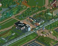
Great stuff here. I agree with Fred that Bandit and Skyride were the highlights here. You have some great layouts here. But, It's a weird park in that you have a couple log flumes, and two looping coasters that have the same colored track. Other than that, the archy was really well done in places. The entrance plaza/train station was nice. Spreeblitz and its station were really cool. Impressed you were able to finish such a large project.
After such a long time of waiting, I just missed the release of the park. Shame on me. Before I start with details, let me congratulate you on finishing this huge project. I have followed it through the years and have always been a big fan.
 .
.


At the beginning I would like to take a look at the coasters. They are all fantastic in my opinion. My personal favourites are Bandit and the Inverter. But on the whole all coasters are realistic looking, have a good flow and can convince me.
To the Theming: Sure, in some places you can see the object limit, but overall the Theming is great. First of all I want to mention the cool ideas in many places like the crane, the windmill, the barriers for the railroad and the playgrounds. And there are so many more... Then there are many high quality places like the Mainstreet, the rafting area, the creepy area and the Inverter and Bandit station. Some of the bigger buildings i'm not the biggest fan of, but that's only because my Theming style is very different from yours and I always have to have everything encapsulated ten times to look nice for me. So don't worry about hat
The planting is also great, I don't want to imagine how much time you must have invested in it. When I look at the whole landscape, I love the wide open spaces. It feels really natural
All in all I can only say, "Hats off to this achievement! You have really created something that you can still think of in years to come.
It would be a pity not to see any more projects from you in the future. I love your theming style and your coasters. If it gives you a motivation boost, we can also start a small project together again, as we often did in former times.
Congratulations on finishing! The scale of this park is absolutely breathtaking! The NCSO (but not rides) really forces a lot of old-school RCT atmosphere in there with the swings of realism. The park is a bit out of scale with the peeps (too big), but that's a product of that NCSO commitment. Everything is beautifully in scale with each other and the atmosphere is off the charts!

Loved the placement of rides relative to paths and the signs for them. The use of barrels for the supports on the invert was really inspired and the waterfalls in the trenches were an incredible touch as well. The park surrounds also felt appropriately German within my limited experience of Germany. Really tough to capture that without custom objects, and very inspiring that you managed not just to cope with those limitations but thrive with them.
I'll have to spend more time looking at this to really appreciate it and learn from it. Very inspirational! Thanks for seeing it through to completion!
Oh, this got a score already? Well, congrats on the accolade and the great achievement in finishing something this big. Takes some serious discipline. I must say I was a bit sceptical at first, regarding the size of the map. I could see it possibly hurt the atmosphere and the overall feeling, but it didn’t. In some places there is a ton of atmosphere and beautiful scenes. And I think you did a very good job filling up the map.
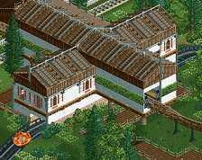
Some of my favourite things in the park (and outside) were the entrance building, the lovely little old timer ride, the small turquoise coaster (Maikaeferflug), SpreeBlitz, the soccer arena and the backstage railway area. I love those lollypop lamp posts and gumdrop spotlights! Bandit deserves to be mentioned as well. A beautiful coaster in a beautiful setting! What I also really liked was the TramAnimatronic inside of the log flume building. So cool!
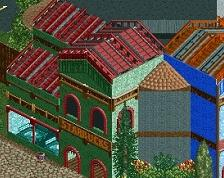
Where I see room for improvement is in the architectural area. I mean, you can clearly see that you’ve spent quite some time on some of your buildings, and they aren’t bad by any means. However, they do come across sometimes as uninspired. Especially the large structures (the Neutron Run, Spree Park Arena and those large brick buildings for example). On the other hand, ncso architecture is really challenging. I guess what I’m looking for is some sort of playfulness.
In terms of voting I think I would’ve voted 70. I think it’s good enough for gold. It’s a park that I genuinely enjoy exploring and I think you should be really proud of yourself and your achievement. Hope to see more of you in the future!
Wow - impressive, and braver than I am. I don't think I'd dare anything over 150, or the old 126.
I think other than some coasters I loved (Mega (reminds me of a non looping Schwarz I made but never released), Condor, Nightcrawler) and some that were OK is that this park feels so refreshingly old and new at the same time! Take it from me, I'm old, and from back in the old era!
This has all the sensibilities of trying some detailing without going overboard like some modern efforts hyper focus on. The hotel is detailed sufficiently, the store/building/ride fronts vary, but I love that some of the buildings ARE big, but in the right places. I like for the fact that you don't go single, you at least stick to 2x or 3x paths and don't go over wide with a million tiny buildings and instead embrace open greens, swaths of trees.
Simple as it is, the path under flume, dip under train, bridge under monorail near the beach is excellent. It may seem minor, but I liked that.
Oh, and I love the speed boat stadium. Fun little action there!
Congrats on finishing and a silver - maybe you'll be able to finish the new coaster in 2 yrs!