Park / Clockwork Cliffs
-
 02-September 19
- Views 1,160
- Downloads 422
- Fans 0
- Comments 5
-
 Description
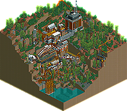
Clockwork Cliffs is a small, steampunk-themed factory park built on a steep set of cliffs. The park is anchored by a large B&M floorless: Shadenfreude, winding through the terrain and buildings. The two other smaller coasters: Immunizer and tictac, are unique launched-boomerang B&M coasters.
From a personal aspect, Clockwork Cliffs is my first attempt at using custom scenery. I'm really happy with this park, I think it's unique, interesting to explore and it has some interesting coasters. -
 No fans of this park
-
 Download Park
422
-
 Objects
141
-
 Tags
Tags
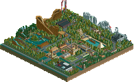
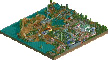
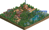
For future reference- if you're going to build something this all it would help to use a larger map and black-tile out the edges so it can be viewed up close.
Besides that my main complaint is that it pretty much only works from one angle.
Otherwise I really like this! Shadenfreude's layout is delightfully confusing. Really fun to follow the train view just to keep track of where it's about to pop out of the cliffs again. Tictac is a cool little concept and I don't think I've seen anything quite like it. It's almost like a fishook, but with the spike reversed? very cool.
The textures and macro landscaping are also great. I really liked the use of the various gear objects. The movement from that along with the peeps running around really gives this a sense of life.
Exciting stuff! I really look forward to whatever you do next.
Agree on the tall corner issue, due to iso view in rct it makes it hard to zoom in at the top of the lifthill, otherwise this was a lovely microish sized thing. Shade's layout is a constant mystery, which I sometimes prefer and works well with this theme. The colors here fit the steam punk theme.
On the downside, Immunizer is completely lost here, as it barely peeks out at all. Indoor coasters are fine, but I almost didn't see it the first time.
I like this... it's a definite improvement over your previous parks and it's always nice seeing fun, conceptual fantasy stuff. The white and brass industrial buildings look good and the overall color scheme is very nice, especially with the martian land texture.
Aside from the viewing issue, the biggest weakness in this would be the landscaping imo. Using the same trees, at the same angle, adjacent to one another really detracts from this. The terrain could also be smoothed and more sloped in certain parts, especially the bottom where it suddenly drops.
I thought the coasters had nice interactions though. I do agree with Kai that it would be better if immunizer wasn't almost completely underground.
Regardless, there's a lot of promise in this and it's an enjoyable, wild fantasy park, something we do not see enough of outside of contests... so I'll be looking forward to seeing more releases from you.
Id say the park is 'unrefined' but there's still a lot to like here. First, take ride6's suggestion about blacktiling! I can't see the top part of the map
The actual golden factory structure is excellent. Really a nice vibe and great use of the rusty rooves. The landscaping needs work- its a cool idea but way too much flat, blocky land- use slopes and shit! Those jungle trees work wonders for atmosphere though. The layouts are a bit weird/hard to follow but I found the tictac drop trick quite entertaining.
Some room fore improvement, but already liking what's here! I as well will add to the 'bigger map' suggestion, just blacktile what you dont need, it's not easy to see the op of the map like this.
The buildings were nicely done, also clever use of the expansion roofs! They actually work in this setting and een manage to look good.
The foliage and landscaping could've been better though. Some more variation and underbrush would've helpen in that regard.
All in all a fun release. It's creative, and I appreciate creativity.