Park / Nemesis
-
 02-September 19
- Views 2,906
- Downloads 532
- Fans 0
- Comments 12
-
 59.00%(required: 50%)
 Bronze

csw 70% G Force 65% bigshootergill 60% Camcorder22 60% Cocoa 60% Jaguar 60% Ling 60% RWE 60% Scoop 60% CoasterCreator9 55% chorkiel 50% posix 45% 59.00% -
 Description
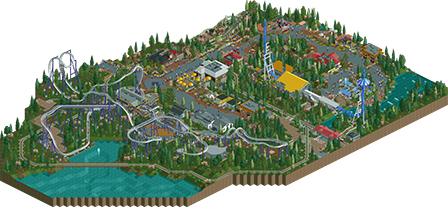
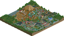
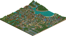
Nemesis is a B&M sit-down coaster with 6 inversions and a top speed of 59/mph. I also added on to the feature coaster with a few other things including a Intamin Impulse Coaster, a Zamperla Junior Coaster and a couple other shops and restaurants. Thank you all for your previous suggestions and I hope you enjoy it!
-
 No fans of this park
-
 Full-Size Map
-
 Download Park
532
-
 Objects
327
-
 Tags
Tags
![park_4119 [H2H8 R4] Incident at Billy Wonka's](https://www.nedesigns.com/uploads/parks/4119/aerialt3859.png)
Nice little layout. Definitely have some good ideas here, just a bit off on pacing. I think the first inversion and then the cobra roll were taken a bit too slowly, but its a minor blip to me. The coaster interacted with itself well and I liked the drop next to the water, but would've liked more interaction with the paths. The coaster is tucked behind trees and 1-story buildings. Everything here and if we include your Maverick recreation, your work is very promising!
This is a great submission Jak, and shows huge improvement from Maverick. Its quite interesting really, feels like you take a bit of inspiration from older NE realism, from the likes of Nokia, or Comet back in 2009-2010 era before NE really settled into the CP6/Robbie realism styles that we still use today.
The foliage is probably the most awkard bit for me, seems a bit random and isn't quite as convincing as the rest of the submission. Maybe look a bit more at high scoring realistic parks from the last few years to see how they clump foliage and manage density.
Archy wise you have some good structures here, but perhaps rely on walls a bit too much. Shotguns always said that a lot of cso players get tricked into exclusively using actual wall objects for their buildings, when deco blocks would be more convincing and liberating.
Finding real life reference would really help here too, just to get a feel for how real buildings look and are shaped. Because aesthetically you do a good job, just that some of the shapes and structures aren't quite convincing in a realistic sense.
Overall, nice work, and like I said a big improvement. Look forward to more.
I agree completely with G Force... this gives me huge 2010 realism vibes and it's great, especially with the roof textures, fences, and heavy use of deco blocks. Because of this, the architecture can get really flat and blocky.
Nemesis has a good layout and I think the park as a whole is very clean. With the exception of the landscaping of course... the trees and bushes seem haphazardly scattered and the terrain feels awkwardly jagged in certain areas.
Nevertheless, this is a very nice release, the surroundings could just use some polishing as the inconsistently placed foliage makes it difficult to focus
nice stuff, although I'm not 100% sure if i'm voting for a park or design. presumably design?
Its some good, standard realism work. Nothing out-of-the-ordinary but pleasant nonetheless. I like the layout and the lively vibe for sure. I think the foliage is the point to work on the most next- its sort of patchy trees scattered randomly, and I'm not a huge fan of your tree selection anyway My fave bit may be the tea ride- the colors and layout of the shades work well for me.
It is a spotlight submission.
Thanks all for the compliments and suggestions! And yes gforce you’re absolutely right. Some of my favorite parks are some of those older classic realistic parks so I do take a lot of inspiration from them. I’ll definitely try to up my architecture and foliage in my next project. Thanks
Nice submission Jak! I think your architecture has already improved a lot since you posted the first screenshot of this project. So keep up the good work.
Try looking at spotlight-parks and Deurklink's Git Gud video's on youtube to develop your foliage and architecture skills. I've learned a lot from those.
Great submission, foliage was lackluster and layout was a bit awkward in spots but everything else I loved. Nice job.
Why is this not a design submission?
Congrats on the bronze!
This is 85% of the way to a really solid layout. Needs a bit more speed in the first half, a proper cobra, and a straight brake-to-station track and you've hit a very believable small B&M.
One thing I think needs improvement is the foliage; try to place it in ways that enhance the scene and in natural patterns rather than applying the same mix equally in all in empty areas.
I really enjoyed this. Nice work! I echo ][ntamin's advice about the foliage. It's an annoying thing to get right but it really does help you get to the next level once you get a handle on it.
I really like the coaster aside from maybe the awkward turns between the first drop and first element. It's a B&M so the flowier the better. Otherwise it gets a thumbs up from me.