Park / Circus Balancé
-
 02-September 19
- Views 3,223
- Downloads 578
- Fans 2
- Comments 11
-
 61.00%(required: 65%)
 Design Submission

Cocoa 70% posix 70% CoasterCreator9 65% Jaguar 65% Liampie 65% bigshootergill 60% G Force 60% Scoop 60% Camcorder22 55% Faas 55% Poke 55% RWE 55% 61.00% -
 Description
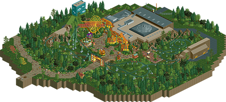
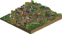
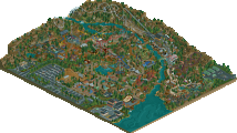
My idea of what the next rollercoaster in the Efteling might come to look like.
-
2 fans
 Fans of this park
-
 Download Park
578
-
 Objects
267
-
 Tags
Tags

Never been there, but Efteling looks a lovely park. I love the manic outdoor speeds and the slower encircling of the indoor tent itself. The lift thru Ferris structure is pretty and i like the reversing then forward again hacks. Otherwise it is a high speed knot of dark green steel - love it.
Great job.
Lovely stuff. Great surroundings and very believable ride. What would've helped here would've been named staff and other elements to give the narrative of the dark ride aspects.
The scenery is some of the most interesting I've seen thus far. Coaster is hacked very well and has a very unique layout. It's pretty quick though, I would probably slow it down but this is well done.
This is a pretty beautiful design... I love the circus themeing and especially that ferris wheel support. The landscaping is also great although I'm not sure about those dark tree trunks. Indoor area is cool as well.
Not sure how I feel about the layout itself... it's a very long coaster but it just feels too fast paced where it just whips around the track without much variation in speed. There's a lot of long straight sections at the beginning as well which seems like a poor fit for spinning cars. Then it accelerates around the helices before the indoor section.
It's not a bad ride though and there are a lot of cool interactions with its surrounding. And as mentioned before, the theming is great, especially around the caves with the reverse sections. It could just do with some tweaking.
Hey, nice little design!
Yeah, I agree a lot with Jaguar here. The layout is decent and different but the pacing is off in my opinion. On the other hand, I don't mind too much. It's a gorgeous and atmospheric design regardless. The theming is super. The ferris wheel and that whole thing is very creative! So good job. I think we'll see a lot of great things from you in the future. Keep up the good work and good luck with the vote!
I really enjoyed this. Not sure how much I see this fitting in at efteling but that doesn't change my attitude- its a really cool design with a neat story worked in. The circus ending is a great idea. I think it does have some pacing issues perhaps but overall not a huge problem. The atmosphere is great and the big circus tent is very well done. Nice work- I love your darker, more mysterious and magical atmospheres
Pacing issues indeed, the second launch seems very random to me. I still think this should be a design. Befitting of a circus theme, this piece shows some good showmanship with big setpieces like the dark ride scenes and the big cannon ornament, as well as the camelback over the entrance gate for example. You also get kudos for the foliage, that works even though you made some choices that I usually think work out disastrous. There's also some little things that stand out positively to me, like the dome shape of the roof and the little wall with park map/poster on it where the park starts. Those things add a lot of character for me.
Lovely little submission with lots of atmosphere. I liked the path with the patches of dirt and the foilage was nice too (pine tree trunk color is off)
Love this
This looks great!
Great idea, works well.
I think the poorest part in this submission is the coaster.
Agreed with above comments, the pacing is too fast, why the chainlift (50mph) through all the helixes on the last outer part? The layout itself I find questionable, especially for a spinning coaster.
Supports could have been better.
If you take more time for your coasters, Im sure you will deliver great stuff!
You have such a great talent for theming and atmosphere, just the finer details of ride design that could be improved a bit.
This almost feels like concept art, where the coaster isn't entirely realistic, its more about the concept and style of ride. Quite fun to look at actually.
Not sure if its quite design worthy in my book due to the shortcomings with the coaster though, I always say that the coaster is the most important part of a design, and I followed through that here. Maybe I regret it now because this is really nice, but regardless this was a super cool submission, and you have a lot of potential.
The rest is certainly not bad though, keep building!
Thanks for the feedback guys.
I recognize the pacing problem. To be honest, the coaster was meant to go 10 km/h slower. It used to be slower, but during the build of the surroundings the cars suddenly wouldn't get over the airtimehill at the entrance anymore. I tried all different kinds of stuff to fix it, but it wouldn't get over anymore. At the end, the only thing that seemed to work, was to make the launch go faster. Now when I open the park, I can slow it down and it still works fine. So in hindsight it was probably just a glitch. Hope you guys can look past that a little bit.
I had a lot of fun building this coaster. Trying to think of a layout and style based on rumours. I also learned a lot building it. Still hope it gets a Design accolade, but I can understand if it doesn't. Guess I'll just have to wait and see.