Park / LunaPark Adelaide
-
 13-August 19
- Views 7,461
- Downloads 790
- Fans 14
- Comments 28
-

-
 87.50%(required: 80%)
 Spotlight

Fisch 95% yes CedarPoint6 90% yes CoasterCreator9 90% yes G Force 90% yes robbie92 90% yes SSSammy 90% yes Cocoa 85% yes Jaguar 85% yes Kumba 85% yes RWE 85% yes Scoop 85% yes pierrot 80% no 87.50% 91.67% -
 Description
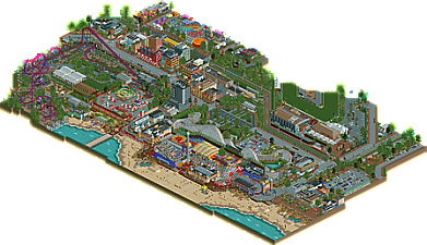
I wanted to create something inspired by architecture and locations in my home city of Adelaide.
Using motifs and layouts from LunaPark Melbourne and Sydney, with some artistic license taken to include some exciting roller coasters, I hope you all enjoy exploring LunaPark Adelaide. -
14 fans
 Fans of this park
-
 Full-Size Map
-
 Download Park
790
-
 Objects
577
-
 Tags
Tags
I think this is an important release because it proves that smaller parks can have enough content to be spotlight. Congrats on the accolade, I've always enjoyed your parks and this is no exception
> Hits object limit
> Smaller park
Pick one.
Is it meant to be Glennelg or am I way off?
Love it mate
This was great. Really liked the horse race outside the park.
And the Mack was just so fun to watch...
You really nailed the Australian feel, and the city architecture was just gorgeous. You really make me want to visit Adelaide, dude
I felt like the main/old luna park bit was actually the least interesting part of the map but the entrance and big dipper were lovely, I think I felt like there just wasn't enough Luna Park? In terms of the old preserved buildings and stuff. I really liked all the modern stuff though, and the DC rivals coaster was really cool!
You really deserved the spotlight, this was such a joy to check out and you can really feel the love poured into it <3
Congrats on the Spotlight, Stoksy. Incredible build! A map full of life and atmosphere – totally my cup of tea! There is so much going on in every corner and there is more than plenty to explore. Every time you go back and have another look, there is still more to discover.
I love how the park is surrounded by a city and an ocean. I don’t know why, but I think context adds a lot to the viewing experience. The park itself is really well done. Perhaps a bit chaotic but still has this lovely vibe to it. Some beautiful architecture, amazing custom flats (Tumble Bug and Moon Ranger to mention a few), and lovely coasters. Big Dipper for example. Definitely a sweet layout. What I like most about it, is the brake run in the backstage area. Looks very tasteful somehow. Obviously, you did a great job with DC Rivals too.
I like how pretty much every building in the park has a real purpose. There are attractions, restaurants, shops, toilets etc. The concept of park owners taking good care of their guests, appeal to me. What I also think you did very well, is the playfulness with colours. I appreciate that you sometimes balance the strong colours out with some more muted ones. What I would suggest however, is to be a bit careful about the usage of grey. I don’t have a problem with the colour itself, but rather with how it’s used. For example, the Tumble Bug building is a bit hard to read since it blends with the path. With some other colours I’m sure you’d bring more depth and clarity to the picture. But honestly, it’s not big deal and it’s only a suggestion.
As for the city, it’s fair to say that I love it. Just as the park, the city has this lovely vibe and feels very inviting. Great atmosphere. I really adore the effort you put in, in the activities along the sidewalks; seating areas, restaurants, shops, bus stops, tram stops, beautiful greenery etc etc. I also really adore the tram shed. It’s so nice! I’m sure you made Jappy happy.
Fantastic work, Stoksy. I’m sure I’ll go back plenty of times just to discover more things and to enjoy the atmosphere. Hope to see more from you soon!
This is stunning. I love everything about it. Fantastic work!
Such high quality through out the map. The big coaster fits really well and the supporting is great.
The city is full of atmosphere and little things to explore. It really took a long time to probably only see half of it.
Some of the stuff I liked the most
Probably the best I have seen. Technically great plus its even on top of a building
Really like this view, that coaster must be awesome to ride!
Great detailing in backstage areas
Real life backstage is awesome aswell.
The theming on this coaster is fabulous
Zamperla makes great rides, and this one you did a wonderfull job with
This map is full of great facades
Lovely stoksy