Park / LunaPark Adelaide
-
 13-August 19
- Views 7,461
- Downloads 786
- Fans 14
- Comments 28
-

-
 87.50%(required: 80%)
 Spotlight

Fisch 95% yes CedarPoint6 90% yes CoasterCreator9 90% yes G Force 90% yes robbie92 90% yes SSSammy 90% yes Cocoa 85% yes Jaguar 85% yes Kumba 85% yes RWE 85% yes Scoop 85% yes pierrot 80% no 87.50% 91.67% -
 Description
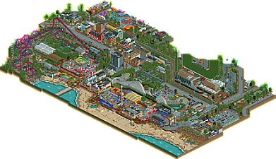
I wanted to create something inspired by architecture and locations in my home city of Adelaide.
Using motifs and layouts from LunaPark Melbourne and Sydney, with some artistic license taken to include some exciting roller coasters, I hope you all enjoy exploring LunaPark Adelaide. -
14 fans
 Fans of this park
-
 Full-Size Map
-
 Download Park
786
-
 Objects
577
-
 Tags
Tags
This really is incredible Stoks, the eye for detail, atmosphere and fresh feeling here is really something we haven't seen before. Just love the context that the park has, it really pushes the whole project to a high level.
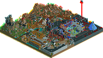
The DC Rivals coaster really came out fantastic and adds the icon that the map needs I think. All the theming and surroundings you've added to it really put it over the top.
There are so many little things that I could talk about, the midway facades, the beachside atmosphere, the infrastructure, the custom flats, the signs, etc... Well anyways, congrats on finishing, I know it took a lot of effort in the end but it really paid off. The level of "finish" here is really quite special.
There are few things I could critique, perhaps your spacial scaling of things, but with a park like this its extremely difficult. On the more macro side theres hardly any blemish anyways.
To me a clear 90%, the spotlight vote will be a bit tougher, but I'm leaning towards yes at the moment. A map that feels this full, complete, and fresh deserves it I think.
my body is ready
fucking hell this is so good
It definitely is the most real australian park ever released here. I mean I'm a huge shadowlands fan but it has nothing on this. Its just chokas with tiny details that feel so real, from the foliage to the way the streets are adorned, to the surf livesaving flags, just so amazing to see. I'm gonna show all my friends, maybe they'll finally appreciate rct lol.
the luna park section is fantastic and so accurate to the real one's layout, although I really miss the backdrop of the harbour and bridge which is so foundational to the atmosphere there. btw, you mention in your readme that lunapark sydney used to have a big dipper ride... surely you know it was actually relocated from adelaide? DC rivals is also solid, a crazy strange thing to exist in real life in that form but its still such a good coaster that I'll look past the weirdness. I drove past it recently IRL and it was devastating not to pop in...
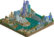
the city is also phenomenal- I've never been to adelaide but I can just tell exactly what its drawing from. the easter show sucks IRL to be honest but you did a great job with it for what its worth.
anyway, spotlight from me... gonna have to up my game...
I don't even know where to start, very amazing.
gee! it is indeed a gift, I know it is a game but it is a Godsend to have that skill and sense of imagination, it makes me want to transport me to the park and have fun.
The structures, design, layout, colors, flowers, trees, paths, roofs, fences, buildings, rides, all amazing.
The horse race I was amazed, haha very cool.
Liked the electric bus (I think you call it that).
Well, I need to appreciate more, I was excited to see this work.
This is absolutely brilliant! Wow. It´s incredible how you nailed all these very different parts (lunapark, city, beachside, horserace, transportation and of course the DC Rivals coaster) with so much eye for detail and atmosphere and also make it feel as a logical whole.
Alfy Offline
Wow this is so amazing. So detailed. I literally spent an hour looking at all the details. Can't believe you made this in under 300 hours.
If there’s one thing where I found you didn’t use the map to its fullest potential, then it’s got to be that you cut right through the shoreline. I think doing 15 tiles more in the direction of the water would’ve helped to really establish the beach front atmosphere. So I wish you would’ve done that, mainly because it could’ve underlined that atmosphere and the general setting a bit more. But what’s there is obviously absolutely stellar. Clear Spotlight for me.
Wow Stoks another stellar park your sense of detail and realism are second to none. I love all of the parks I have from you and this one is no different.
Congrats on finishing this beautiful piece of RCT. You've handled hitting the object limit really well, it doesn't seem like quality or content got lost. Knowing how frustrating hitting that object limit can be I can only take my hat off for you sir.
The atmosphere is really great, I can see myself walking around there. You've managed to make ugly fair rides look good for the viewer. I think it was a great choice to add the Super Rivals coaster in. It's a great coaster and it's the big eyecatch coaster the map needs.
The outskirts are so fine, some great archy to see there. Looks like you've put quite some time and effort in those! A park to be proud of, spotlight if you ask me mate!
Amazing indeed.
A sight to behold, crawling, perhaps even tickled with details that both belong in a theme park, and are at home on the beachy fringes of a coastal city. Excellent, I'm there in-game as I see this.
If I want to point out further particulars sometime, I'll edit this post & say so, but folks should really just download this thang.
Such a perfect microcosm. Sets the whole scene. Speaks for itself.
Bravo, Stoksy. Really fantastic!
Congrats Stoksy! Well deserved spotlight.
Some of the realistic little touches are insane, and at the same time the park always stays playful and creative. Plus, the park shows a great knowledge of both contemporary architecture as well as contemporary urban design.
I would've thought it'd rank even higher. That said, you definitely put out a standout project with this one, and an 87.5% score is obviously incredible good!
Went to vote on this, opened up the page, and realized I missed it! Great work, I don't have much more to say than the others so far. Well-deserved spotlight.
Congrats on NE Spotlight! For what it was, I really enjoyed it and you pulled it off very well. Just, it's not a theme type I am a big fan of. To me it was a spotlight vote I was on the fence about, but I almost always be nice and go with the yes and did here.
Short feedback, but I am going to snipping tool spam the Discord with little things from it, lol
Thanks again everyone! Now for the hiatus...(hopefully it won't be for too long)
-Stoksy "No. 1 RCT player in Australia"
I really like how urban surroundings with a lot of traffic and movement are becoming more and more popular... first we got bumbly beach and now this with a really cool and dynamic setting to explore. My favorite building would definitely be that postmodern-style tavern at the edge of the map.
As for the actual park... I enjoyed DC rivals and the woodie has a good layout as well. The amount of detail put into some of the buildings, especially those on the boardwalk, is mindblowing. The structure surrounding the wild mouse is especially great. The entrance is also well-done and accurate.
I kinda wished there would be a scenic railroad but the wooden out-and-back was probably a much better choice. The only real thing I would've changed would be expanding the beach area so we'd see water in front of the boardwalk but of course the object limit gets in the way of that. Speaking of the beach, the landscaping is great and I really loved the tidal pool.
All in all, a very well-deserved spotlight.
Oh boy. Where to begin?
I guess with my "negatives" since there are very few and they're more general:
- Color Saturation: I think it's more a product of RCT than anything but a lot of parks in the realistic style tend to have a lot of highly saturated colors. I guess in an idealized view this makes sense and it might just be my rust belt filtered perspective, but it seems like some softer / faded paint colors would suit things better.
- Landscape: Is a flat slab - which suits the location - so I'll shut up now.
Things I liked:
Both DC Rivals and Big Dipper's layout show an appreciable effort made to get the banking of turns to flow. Banking while inclined before turning,unblinking after leveling out, etc - as appropriate. Makes the rides "feel" smoother and more real. Not sure how realistic it is for Big Dipper to have 3 trains (rather than just 2), but if it helps with peep friendliness I'm down with it.
The City / Park Surroundings: Amazing!
I particularly liked the pull-offs for the Bus Stops, the City Hall Building, Cinema, M'Ville Raccourse Sign, and both the Warradale Hotel and Ibis Hotel buildings. The Ibis even has a working elevator! And it's probably the most convincing hotel building I've seen in game... maybe ever?
The park itself is packed with juicy little details too.
The lights all over the log flume really nail the classic Coney Island Park vibe. The Silly Serpent NAILS how that model of coaster rides. The Space Shuttle sculpture in the middle of the shuttle cars ride, the canoe rentals on the beach, and the Crystal Palace building are all astonishing works of art. So many custom flat rides seamlessly pulled off as well! Beautifully integrated into the park.
I also love how compact everything feels and how the park and city merge such that it's somewhat difficult to tell where one ends and the other begins. A lot of old-school pay-per-ride parks were (and are in the case of Knobels and Indiana Beach in my limited experience) like that.
Really cool! And a much deserved spotlight!
This is a very detailed gem and worthy of recognition - congrats on the Spot. Not something I would build, and likely for the other audience, but I can see and appreciate the level of work here.
I won't go into too many details since I don't know the archy of your area, but it is a nice varied cityscape, and I love the entrance to the park itself. The wooden coaster is my favorite, especially the flags on the lift and the double out and back (albeit at an angle). Rivals wasn't my kind of ride or theming, though I did like the Joker building a lot.
The other favorite was the mouse and midway feel, just wish it was a wooden one.
Congrats again - I know it's satisfying to finish of an old project, and probably even more so about your home town.
Amazing stuff dude, really enjoyed it. Your attention to detail is stunning. The urban areas were full of great details.. train crossings, traffic lights, power lines, the variety of different sidewalk planters. Just so much thought went into this! And everyone has already mentioned the architecture.. its simply bonkers how much detail you packed in this!
The Luna Park area was pleasant. I enjoyed the colors actually. The subtle trim changes on Big Dipper were neat. The Wild Mouse was done really well. Must've been a bitch to support and detail that. Hell, even all of your custom flats look like they took a lot of time to perfect! Also, the rock work and tidal pools along the beach were very nicely done.
Lastly, I'm glad I could've seen the progress on this the past year or so, and I thank you for that. Look forward to whats next!