Park / Fujin
-
 20-July 19
- Views 6,326
- Downloads 837
- Fans 8
- Comments 25
-

-
 82.00%(required: 65%)
 Design

Steve 95% SSSammy 90% saxman1089 85% Scoop 85% bigshootergill 80% chorkiel 80% CoasterCreator9 80% Faas 80% G Force 80% pierrot 80% robbie92 80% RWE 75% 82.00% -
8 fans
 Fans of this park
-
 Full-Size Map
-
 Download Park
837
-
 Objects
696
-
 Tags
Tags
![park_3143 [MM2014 R1] Parkouroaster](https://www.nedesigns.com/uploads/parks/3143/aerialt2757.png)
![park_2403 [H2H6] R3 - RevoLLutionists - Concrete Jungle](https://www.nedesigns.com/uploads/parks/2403/aerialt2138.png)
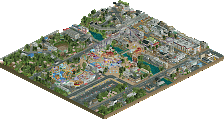
this is naughty
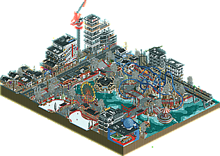
Awesome. The track merges could be a little cleaner but mostly excellent. Supports are clearly thought-out and the interactions are just absurd. The little black roof bits on some of the bridges look like they're floating (and some of them appear to actually be floating) - some thicker supports here to help make that clearer might have helped. Most of the snow and ice is great, especially in the water, but I'm not totally sold on the foliage. You have some of the snowy tree objects, which look quite good, mixed with some other trees which don't look like they're snow-covered, they just look like they've been wrapped in white. The Lombardy Poplar trees are the worst offenders I think but they all kinda look that way. I would have swapped a few of the trees for more of the snow-covered ones (there are a ton, and surely getting one or two more made could have been done too). There's some white water missing underneath the queue. And... that's about everything I can think to criticize. This is excellent.
I just came in my pants.
You already know my opinion on this park. Great to see it finally released - love your work.
above is what it looks like when you invisible the overlapped track, and i also fixed the order of the transfer track and brakes. i urge everyone to do this.
this is classic leon. im so glad you're actualising your potential. too often we see amazing builders who never finish shit.
Nice tip Sammy. It's so simple, but absolutely fantastic to make that little tweak. Never thought of that before.
Killer work Leon!!! Looks like we might have another "Parkmaker" to add to the list of NE greats!
PS: Gotta agree the foliage mix is a bit weird, but at the same time I also applaud trying something new.
Quite torn if this shouldn't have been a spotlight submission. It looks like an H2H park to me. Good work, just not my RCT. Feels like when you started out you had more originality in your style.
I think this is pretty original though^. Although I can see where you're coming from.
I don't think we've seen a theme like this attempted in rct with this level of details, worldbuilding, and ideas executed this well. The icy look is done so well on this map and is very convincing. The colors are very soothing and flow together nicely as well.
I could try and nitpick every little thing, but to be honest I really enjoyed this park and am going to be happy with keeping that impression of it.
Great work Leon - congratulations buddy.
Really awesome work Leon, I know there was (and is still) a lot of questions about the tree-colour palette but it definitely did not take away from the excellent execution.
All the architecture was brilliant as usual (probably the best construction site we've ever seen), the ice-sheets turned out amazingly well (another unique touch), and while we've seen asian themes a million times this felt like a step-change from the past (more in the style of Tubiao/BGA rather than more traditional attempts).
Ironically, it was probably the layout which prevented this from hitting the 90s. Didn't quite have the punch/focus needed to reach the El Encierro/Kumba/Thunderclap tier. Right on the border of 80-85 for me.
Great to see a solo release from you Leon, hopefully there's more to come *cough*Legoland*cough*
I like this a lot.
This is just . . . wow! Very creative and realistic. I can just imagine myself being there. Congratulations!
I can find myself in the negatives you guys pointed out, I knew the trees were a bold choice, and that some wouldn’t like them, but I decided to go with my gut and keep them. I will take the advice you gave me to my future projects!
<3
unoriginal? boggles my mind how someone could think that. sometimes I think people hate just because they want to.
Congrats on the design, it's a great park. I think the score is perfectly fine. The whole park is executed on a incredibly high level. What I like a lot about it is how real it feels. You put the right details to live up the outskirts without making it dominating. Apart from the two appartment houses on the otherside of the tramline all the architecture is truly great. The shopping center is very cool, especially like the escalators on the front side. Must be a cool vision to stand there and look outside onto the scene. The two buildings beforementioned seem a little like filler and I think they disturb more by hiding viewing angles on the coaster than they add to the cramped city feeling. Also, of course, the casino is another highlight although it seems a little small for a casino. It seems like that the cutaway actually really is on the wall of it.
Construction site is ace, too. I don't want to mention all elements that you put there, I think everywhere there is cool stuff to find.
Bold move to add the winter theme to the park (especially with nearly 40 degrees outside these days ). I get the right atmosphere but some parts don't work too much for me. As others mentioned before, also in your screens I'm also no liking the white trees. Also the white ruins don't sell the piled up snow to me. On the contrary the skating rink and the ice in the pond look great! I think the pallette works in your favour here with being toned down and without a lot of hue it supports the winter feeling.
Great job overall and congrats on the parkmaker status!
This is great. Congrats on the design and the parkmaker! I'm very glad you're finally showing off your potential and finishing stuff. My favorite parts have been the architecture, as well as the ice skating thing. I also really loved the way you've done the water itself and worked around it. The waterfront development going on with the train track and that swinger ride really is top class.
The first thing that really bothered me with this is the category it was uploaded in. Looking at this everything screams spotlight submission to me, i know that there is only one coaster but that one isn't really the main focus here. Although the ride was executed well nad had some nice interaction, i spend much more time looking at the rest of this. This made it really hard for me to judge this.
The other thing i wanna point out is the foliage and the 1k rocks. We shouldn't make it meta that stuff like that is needed, but i think someone could have done some much better objects for you to execute the snow better and more realistic. Especially those long thin trees are looking a bit weird to me like that.
Overall i think this is still an amazing submission and it definitely shows in parts why you're rated by a lot of people as one of the best builders here.