Park / Lakeside Gardens
-
 20-July 19
-
 Lakeside Gardens
- Views 2,501
- Downloads 616
- Fans 1
- Comments 9
-
 Description
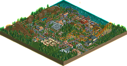
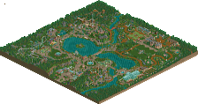
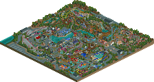
A small botanical garden turned amusement park.
Fictional history of the park:
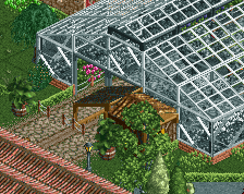
The botanical gardens were originally established during the early 18th century. During the years leading up to early 20th century various greenhouses were built and destroyed/torn down, today only one remain.
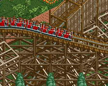
The first attractions in the modern sense of the word were built in the 1920s when a carousel and a wooden coaster called Garden Giant (located at the exact spot of the current New Garden Giant) were added to the park.
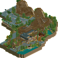
During the late 80s the owners decided to focus more on the amusement park side of things, started adding flat rides and in the mid 90s a B&M sitting coaster named something generic and unimaginative like Vortex or Raptor was built. A year or two later the unfortunate Garden Giant, an classic coaster by the time, was burnt to the ground by SATANISTS. The park instantly decided to build a replacement coaster and the result was the New Garden Giant built by CCI. Building two large coasters put a strain on the parks economy and nothing much was done for almost a decade.
Then it happened, the park announced that they would be opening a new coaster the coming season! The locals were excited. Speculation ran wild on the web. The park then converted Vortex (or was it Raptor?) into a floorless coaster, renamed it Inferno, gave it a new paint job and opened it as a new coaster.
After the tremendous coaster disappointment the park moved some flat rides around and built a thrill area beside Inferno, which is nice.
THE END -
1 fan
 Fans of this park
-
 Full-Size Map
-
 Download Park
616
-
 Objects
310
-
 Tags
Tags

Awesome park Narc!
I like a park with a storyline.
The coaster layouts are quality, especially Garden Giant, and I like all the garden elements throughout.
The blending of custom objects that fit with the base game's aesthetic makes this seem very believable as an amusement park within the limitations of the game.
Looking forward to more! Consider me a fan.
This is really lovely. There's something about that little forested hill in the center of the park that makes this feel so well-realized to me. The garden aesthetic is consistent but not overdone, exactly the way I would expect given the history you've described. Very bright and colorful, lots of music, overall just extremely lively. The foliage outside the park is excellent too, extremely charming. My one complaint is Inferno is a little over-sized for a park like this, and it's quite slow.
I really like the style of mostly NCSO mixed with a handful of custom objects to make it feel more real, like supports and catwalks. It almost evokes an early RCT2 sense of "realism", but with more modern sensibilities about how to space things out and style buildings. Overall, really great stuff. I wish it was bigger, or other greenhouse/garden areas were still on display - it would help give the park more character.
This was a great little park narc, its clear you put a lot of thought and care into everything which is always great to see. Loved the semi-ncso object selection you used too, it was really a great balance overall. The two major coasters were both great too, and really anchored the parks identity and atmosphere.
Overall, probably would have liked to see a bit more archy and more elaborate archy in general, though I understand its technically a "garden" first, but I guess I felt like you could of integrated those two aspects a bit better to make it feel a bit more believable.
Anyways, great work here, lovely stuff.
I wonder if New Garden Giant literally had the same layout as the old one, but built by a different manufactuer
I'm so pleased that you guys like the style. Architecture, and mainly larger buildings, is without a doubt my weak point so that's definitely fair criticism and something I want to get better at doing.
While I admittedly have not spent much time thinking about the original Garden Giant I don't think such a fast and tall layout would have been realistic during the 1920s. It was probably similar to Big Dipper at Blackpool, but slightly shorter.
this was pretty pleasant, and quite refined. I particularly enjoyed the big glass building. I would have loved to see more of the lake that its on the side of though! put the "small park" atmosphere with some context and you've got a winner
I liked the layouts, the B&M was a bit slow in some parts. Doesnt really fit in a park like this either.
Wasnt a big fan of the gardens, they can be executed better.
Overal it had a pleasant atmospheric feeling to it, and the diagonal paths make for some more realistic pathing.
Inferno, the beemer, looks great dude. Loving the colours and the interaction with the surroundings even though it's simple. It's a nice and organic looking area, and that's definitely not an accident - it's talent. The whole park is organic like that. I also like that despite the park being quite generic and down to earth, you managed to incorporate original choices like the coaster colours, the glass, and the gardens. Reminds me a bit of what alex showed early in his career.
Great little park, you're definitely one of the best new players of the year in my eyes.
Fun little semi-NCSO park with som great ideas like the swan rides and the different type of gardens. It looks like you had fun making this and I hardly find anything to critique in this. All I can say is, keep going, you're making some great RCT already.