Park / Green Valley Adventure Park
-
 14-July 19
- Views 1,567
- Downloads 461
- Fans 0
- Comments 4
-
-
 Description
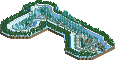
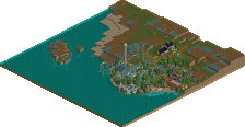
Despite working on many different projects off and on in the past, this is the first park I have ever finished in OpenRCT2, and I'm decently happy with the end result. The park is very small, containing two rollercoasters and a few flats. Lurker is your classic arrow looping rollercoaster, and Backwood Blazer is a GCI Terrain woodie. Other than that I just tried to bring the atmosphere together and create a cohesive area, and that's pretty much it!
-
 No fans of this park
-
 Full-Size Map
-
 Download Park
461
-
 Objects
155
-
 Tags
Tags
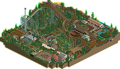
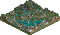
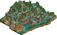
Great little submission here, quite an atmospheric little map. The integration of the WW/TT objects is quite well done too and really pushes the atmosphere. Nice work.
That's a fat pack on the backwoods blazer, I could see myself roll it irl. Also like the first element of Lurker, ride design was good on both coasters I thought.
Foliage is a bit sparse in places, try clumping it together a little tighter on the next project, which I look forward to.
I cant decide if I like the layout or think its a bit weird and janky. Maybe both. The whole park reminds me a bit of efteling, which is a good thing. The archy is a bit of a mess from building to building but on the whole decent and lively. The main drawback I'd say is foliage/landscaping- the dotted bushes on grass/dirt just add a whole lot of clutter and mess. Patches of grass with clumps of thicker, taller trees and underbrush would add 10% minimum to this park.
by the way, this composition is really good with the queue roofs:
keep it up!
I agree with what has been said by the people above me... Very nice atmosphere, bit messy, layouts both janky and likable (the trench drop on the woodie is great!), mediocre foliage... Not a spectacular park, but it's pleasant and shows a ton of potential!