Park / Rapa Nui
-
 30-July 06
- Views 37,026
- Downloads 925
- Fans 3
- Comments 165
-
 72.00%(required: 70%)
 Gold
Gold

G Force 80% chorkiel 75% Cocoa 75% In:Cities 75% posix 75% RWE 75% bigshootergill 70% CoasterCreator9 70% saxman1089 70% Xtreme97 70% Jaguar 65% Scoop 65% 72.00% -
3 fans
 Fans of this park
-
 Full-Size Map
-
 Download Park
925
-
 Tags
Tags
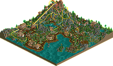
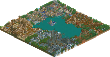
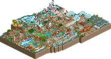
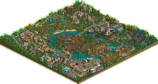

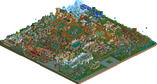
RATINGS formula: Theming = 35%, Coasters = 28%, Architecture = 17%, Naming = 10%, Atmosphere= 10%, Overall = 100% ::
ISLA MAGICA:
Theming - 7.5 x .35 = 2.625
Coasters - 8.7 x .28 = 2.436
Architecture - 7.9 x .17 = 1.343
Naming - 7.0 x .10 = 0.7
Atmosphere - 7.1 x .10 = 0.71
Total - 7.814
RAPA NUI:
Theming - 8.1 x .35 = 2.835
Coasters - 9.0 x .28 = 2.52
Architecture - 7.7 x .17 = 1.309
Naming - 7.0 x .10 = 0.70
Atmosphere - 7.1 x .10 = 0.71
Total - 8.074
Vote = Tigers
would be at least 45% in my book.
tigers.
why?
i liked the bright yellow flowers.
i voted tigers. both were the same in just about all aspects, kind of boring actually, except for one. the tigers' park was prettier.
also, the demigods' park had too many pointy trees, which is really pretty ugly. so is all that dirt. it would have looked better if it were that dull sand, or something.
Corkscrewed Offline
And hey, I'll be the first to admit that I'm more biased towards theming than coasters, although I definitely consider them more importantly than most people do (IMO).
EDIT: Damn, I must have missed the boosters. Where are they?
-ACE
Funny how close they are. For me, the landscaping just seemed better on the Tigers. The whole park came together more for me and seemed to have more meaning (if you can say that) to it. I can see flaws in both parks, it just comes down to a preference thing, and that would be for the Tigers.
(being on their team helps things, but still... I liked that one the best)
The rather noticeable trim brake right before the corkscrew also bugged me.
No offense taken. The statue was made simply by enlarging a statue from the game SimGolf, and it obviously was enlarged beyond its abilities. There is a smaller version that I had made (one tile), but the parkmakers wanted the statues to be prominant structures. I too feel that it doesn't look great (though I wouldn't say it's the worst I've seen), but this really was the best I could do for the size they wanted.
Tigers - I really liked this park, it had a great atmospher and more rides then the other park. The coaster was neat, not that much better then Isla tho. I think my fav part was the map on the q-line, great detail with that. The archy was not so much better, but it had enoght to keep me happy. Also that flume was great, nice work on that.
Easy Vote IMO, Tigers
I have to say that both parks were quite similar in some aspects.
Isla Mágica:
It was pretty good...my favourite thing was the coaster, it was interesting and it had a really nice layout. The buildings were elegant, but they were too simple and kinda boring (talking about wall textures, rooves, etc.)...besides, they looked like they had been randomly placed in the park, I mean, they looked like "functionless" buildings...a building over here and a building over there, but the style was nice and they created a pleasant atmosphere on the park anyway.
The foliage was ok, and I like the landscaping, you made a good job developing the land levels and mountains, etc.
Napa Rui:
I didn't like too much the coasters...specially their layouts. The wild-mouse coaster just looked boring, with a repetitive layout, which IMO wouldn't make a person to enjoy his/her ride.
The floorless didn't look boring, but there was something wrong with the layout, that I can't find out right now. Anyway, you made a good work with supports, although you could have removed the original ones (Lowering the land, well, you know)...
The architecture was pretty nice with good structures, and I like the objects you selected for making the buildings.
The foliage was ok, nothing special.
Although both parks were similar in some aspects...basically, what there was missing in one, the other had it I mean, the parks completes each other.
Sadly, I have to decide my vote...and it goes for the Ferocious Tigers, I just felt their park was better.
Anyway, both parks showed a lot of efford, well done.
Edited by RCFanB&M, 30 July 2006 - 09:09 PM.
Bad luck Iris, but that park = <3 for me.
Ride6
Sorry Tigers
inVersed Offline
Corkscrewed Offline
IF Iris' team falls to 0-3, it's going to take a comeback even bigger than what the Flying Germans accomplished last year to make it to the playoffs.
God damn if we didn't get lucky. It's rather amazing, in retrospect I could've lost the whole championship for my team twice. I wish I knew what magic I was running on then, I could use some now...
Ride6