Park / El Fuego
-
 11-March 07
- Views 5,380
- Downloads 696
- Fans 0
- Comments 27
-

-
 71.25%(required: none)
 Design

5dave 80% Liampie 75% MCI 75% Poke 75% Sulakke 75% Cocoa 70% Fisch 70% inthemanual 70% nin 60% geewhzz 55% 71.25% -
 No fans of this park
-
 Download Park
696
-
 Objects
224
-
 Tags
Tags
Edited by tracidEdge, 12 March 2007 - 01:05 PM.
Heh heh heh heh.
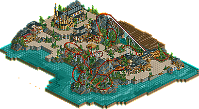
I liked it a lot Faceman. You're architecture style is really impressive.
Anyway... Your arch was really nice along with your landscaping. Great stuff there. However that just goes show that having good landscaping and arch can win you a design spot because im pretty sure that it wasnt the coaster. The fact it had some pacing issues and odd verations of elements killed the design for me. Sorry if thats harsh but thats just me... glad you got the design tho.
-JDP
It's a Design, which I thought meant the COASTER was what mattered most. Yes, yes, I know it needs to have good scenery, and landscaping, but it seems the focus on the coaster has been lost a little. Some (recent) designs have had good layouts (i.e. KINDRED, Tolan), but the focus has become more on the surroundings than the actual ride itself.
You're welcome.
But how come I couldn't convince you to fill the bare land somehow? ^^
This was definetely design-worthy.
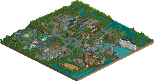
It reminded me a lot to Port Royale (egg_head), and I don't think that it's anything bad at all, even more when you style looks like a very good RCT player's style. The architecture was very well pulled off, I mean, you could make your buildings look good without adding tons of details, you could handle well the structures, so as a result, you got some very nice buildings, specially the church, which I think it was almost perfect. I also liked the colors btw.
The landscaping created a beautiful effect, you made a good job with it. I just didn't like empty part next to the lifthill...it was like "huh?".
Anyway, congrats on getting design (again) and hope to see more from you soon!
Personally I found the pacing quite weak throughout. It can't imagine that it'd be all the exciting to ride with how slowly it runs through everything. The layout is realistically viable though, and not bad on it's own. It just doesn't gain anything by watching a train run though it. The architecture, landscaping, and theming are all objectively impressive but nothing the park really impresses me personally. If I was in command would I've green-lighted it as a design? Yes. Quality wise it's completely worthy, but that doesn't make it all that good.
Ride6