Park / El Fuego

Park_46 El Fuego

27 Comments

  • Kumba%s's Photo
    Posted Image

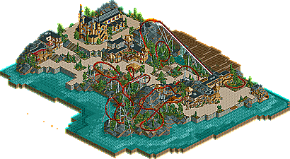
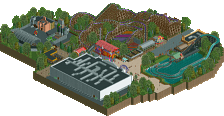
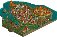
    It was not that long ago that Faceman got an NE Design for his awesome spin on Dueling Dragons and maybe some people wondered if that was a fluke? I think we found our answer today as Faceman gives us El Fuego, one of the best designs we have ever had with it's solid layout, great architecture and beautiful landscaping.
  • Jazz%s's Photo
    I liked it. It had some great landscaping (although why was there that that long stretch of flat land next to the lift?), and the foilage and atmposphere was pretty nice. However, the design itself was lacking, IMO... it got off to a nice start with plenty of speed, but it completely looses all of it's pacing by the time it gets to the cobra roll (which it just barely gets by) and slowly makes it's way through the rest of the layout. The ending also seemed forced, and it was a very abrupt ending to the brake run. The architecture was good, in some areas, but obviously too inspired from other architectural builders... especially with the buildings at the top left corner, which seemed way too similar to Mount St. Michel from H2H4.
    Congrats nonetheless though, although it seemed that the theming is what did the job here instead of the coaster, which should be the primary focus of a design.
  • RCTNW%s's Photo
    This was one of the best designs I have seen in awhile. The architecture was top notch and the church was outstanding. The coaster itself was great to look at (even though it had pacing issues). This will be one I keep for awhile and aside from the pacing issues, I found nothing wrong with this entry. Great job faceman and I look forard to seeimg more from you.

    James - rctnw
  • Gwazi%s's Photo
    Yeah, tbh it wasn't all that great. Although it was nice, the archy seemed a little inspired by MSM (Not necessarily a bad thing), and there wasn't much theming to the coaster itself. Though the landscaping was good, I don't understand the empty land near the lift hill. Like I said, it was nice, but I don't think it quite deserves Design. Sorry Faceman.

    I do hope to see more from you, however, as you have great potential.

    Edited by Gwazi, 12 March 2007 - 02:09 PM.

  • RCTFAN%s's Photo
    I see too much of other people in this.
  • Tom_Dj%s's Photo
    sorry but i don't think this deserves an ne design from the screens it just looks like a copy of MSM. but i'll have a closer look to it later
  • Kumba%s's Photo
    Id say copy of port royal. Still really good tho, I see nothing wrong with taking influence form other people.
  • lucas92%s's Photo
    I thought you just stick out Egghead's work to a design. I don't see any originality...
  • Lloyd%s's Photo
    Let's face it guys, i very much doubt he was trying to 'copy' peoples work, the guy just built what came naturally. Give him a break already.

    Faceman, you've already proved that you're good enough to merit an NE Design, (with duelling dragons), so be proud of this one too. The architecture was nice, fitting, and yes the church was well done. The coaster itself was above average, much better then a lot of people could do, the only thing that let it down were the pacing issues. Overlooking that, and the inexplicable bare patch of land by the lift hill, i enjoyed this, and despite what people say, it's a well done, NE Design.

    Congrats!
  • zodiac%s's Photo
    I'm really getting pissed at how people are saying "pacing issues". It went 10 fricken mph through the cobra roll, and that's basically it. So deal with it.

    I liked it. I'm liking your style, even if it is like other people, but hell, it's not your fault. Looking forward to more.
  • Ling%s's Photo
    It looks really nice, but I can't help noticing quite a bit of similarity in track design to Aria. Probably coincidence, but just wondering. The church was very nice, although as bit small, and the rest of the archy and the atmosphere had a very pleasant feel; great job, faceman.
  • Milo%s's Photo
    Man... I really hate the path selections, way too bright. And the "inspirations" are pretty obvious. But seriously people, stop bitching. It's not like people don't use other people's work for inspiration.
  • tracidEdge%s's Photo
    oh man remember when everyone gave artist a hard time for ripping off of people.
    good times.
  • vekoma9%s's Photo
    I really enjoyed this design. I thought it was good. The design was solid, and tricked me of where it was going xometimes. I thought the landscaping was really good. every design you give faceman, gets better and better. Like that aqua trax you made. That was awesome.
  • Todd Lee%s's Photo
    Not bad at all! Not as good as Atlantis, but hey... I guess you had to go with something that could get some recognition this time. ;) Pacing issues?? I'd say pacing issue.. (singular) The cobra roll was the only weak point. Sure, it went slow over the top of the following hill, 1 or 2 people may recognize the cause of that... The use of an actual MCBR block brake section that works and flows well is somewhat of a dead idea around here. It's hilarious that one of the VERY few coasters that actually flows well, (ie - train doesn't stop at the top of the lift so the riders can take a break and eat a peanut butter and jelly sandwich) is one of the coasters that 99% of the boards complain about. Most peeps here couldn't build a proper block-brake coaster if their lives depended on it.And as far as the themeing resembling others works, give me a break.

    Edited by Todd Lee, 11 March 2007 - 11:45 PM.

  • Brent%s's Photo
    Uhhh, I guess it's nice that the site's being updated more often now, but this isn't nearly like anything in the past that would've garnered this "achievement." I mean, it's nice and all... but this "award" should be a bit pickier.
  • posix%s's Photo
    heh, tracid, my thoughts exactly.
    faceman, congrats and well done. you deserve it.

    and those people going on about originality; seriously, none of you have ever produced anything worth looking at or in the slightest related to this word "originality".
    so just give in already.
  • Faceman%s's Photo
    Thanks for all the feedback
    and special thanks to Cork and Kumba for putting this up.

    Also I would like to thank Mifune for his help...

    - Face
  • ekimmel%s's Photo

    The use of an actual MCBR block brake section that works and flows well is somewhat of a dead idea around here. It's hilarious that one of the VERY few coasters that actually flows well, (ie - train doesn't stop at the top of the lift so the riders can take a break and eat a peanut butter and jelly sandwich) is one of the coasters that 99% of the boards complain about. Most peeps here couldn't build a proper block-brake coaster if their lives depended on it.


    Preach on, Brother Todd. I couldn't agree more.
  • Carl%s's Photo
    I am going to join in on this Block (Brake) party as well, cause I agree with Todd and ekimmel here.